Improving your website content’s accessibility can be a huge undertaking. Don’t panic. There are small, less time intensive changes you can make so your content becomes more welcoming for visitors of all abilities.
And the best part? You don’t need a web developer to get started.
What Is Accessible Content?
Accessible content is inclusive content. It means that anyone, regardless of their abilities, can consume your content. In practice, this means making sure that people with hearing, visual, mobility or cognitive disabilities can use your website.
Is Accessible Content Necessary for Our Nonprofit?
It’s easy to think, “We don’t serve people with disabilities. This doesn’t apply to our organization.” But pause for a moment and consider a striking statistic from the World Health Organization: last year, they reported that 1 in 6 people worldwide live with a significant disability.
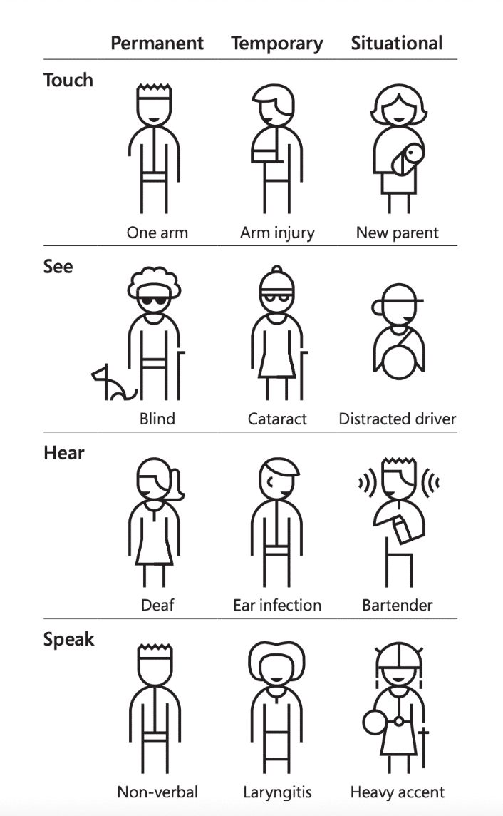
That number likely doesn’t account for many people living with temporary or situational disabilities. By that I mean those dealing with an arm injury, a noisy environment or other short term disabilities like the ones shown in the graphic below from Microsoft’s Inclusive 101 Guidebook.
Hopefully that’s enough incentive to spend more time focused on how people with disabilities experience your content. These individuals may not represent the community you serve, but they almost certainly include your potential donors, volunteers or staff members.
Want to dive deeper? We have a blog post dedicated to why you should care about website accessibility standards.
Tips for Creating Accessible Content
While I’m going to cover guidelines that are great for individual pages of content, there are site-wide accessibility standards and guidelines to consider as well. But tackling things on a page-by-page basis is an excellent place to start.
Using these tips, you can create and format inclusive content that follows web accessibility guidelines.
Make Information Clear and Logical
It just so happens that creating accessible content overlaps with creating good content. Are your points clear or does the content leave visitors with questions? Do your points and the information you include follow a logical progression?
You also want to make sure that the name and placement of the page within your overall website structure is clear and logical based on the content. Otherwise, your visitors might not ever find it, and all this time you’ve spent on content creation will be wasted.
Include Text Alternatives for Non-Text Content
It’s crucial that every visitor can access and understand each type of content on your website. That’s why it’s essential to provide text alternatives for all non-text content, such as images, videos and audio clips. Whether it’s by adding alternative text attributes (or “alt text”) for images or a transcript for videos, offer a way for those who can’t see or hear the content to still gather its meaning.
Choose Your Image Alt Text Based on the Situation
While it’s important to describe images within your page content, there’s a difference between images that are informational and those that are purely decorative. If the image is important to the content, the alt text should briefly describe the image. And, if the image is linked, it should note where the link goes, rather than describing the image itself.
Hot tip: try to avoid using phrases like “image of” within alt text. Assistive technologies like screen readers denote that automatically.
If the image is purely decorative, or it shows content that’s repetitive with text on the page, there’s no need to include descriptive alt text. You can tell screen readers to skip over it by adding an empty alt attribute (alt=“”). Conveniently, if you’re in the WordPress editor, leaving the “Alternative Text” image setting blank automatically outputs an empty alt attribute. If your website doesn’t output that empty attribute, some screen readers will read the file name instead. Trust us, no one wants to listen to that.
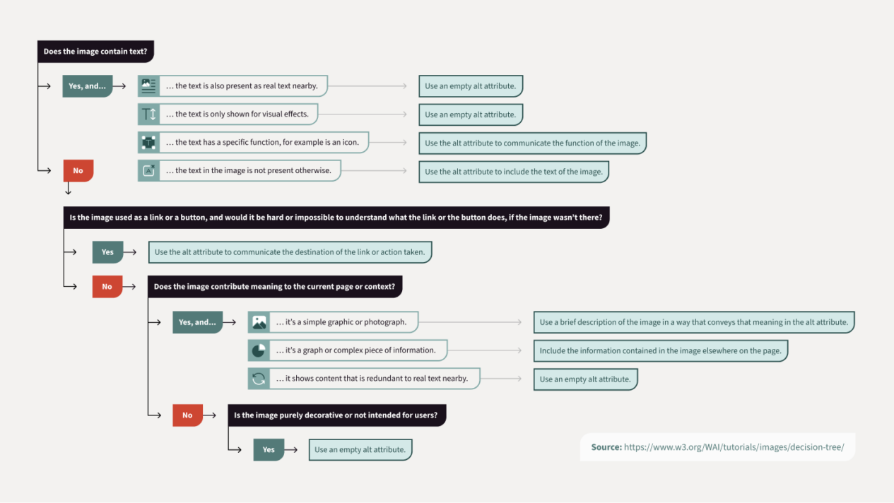
For a more detailed breakdown of how to handle image alt text in any situation, check out our decision tree below. It should guide you to the right approach.
Stay Away from Images with Text Inside
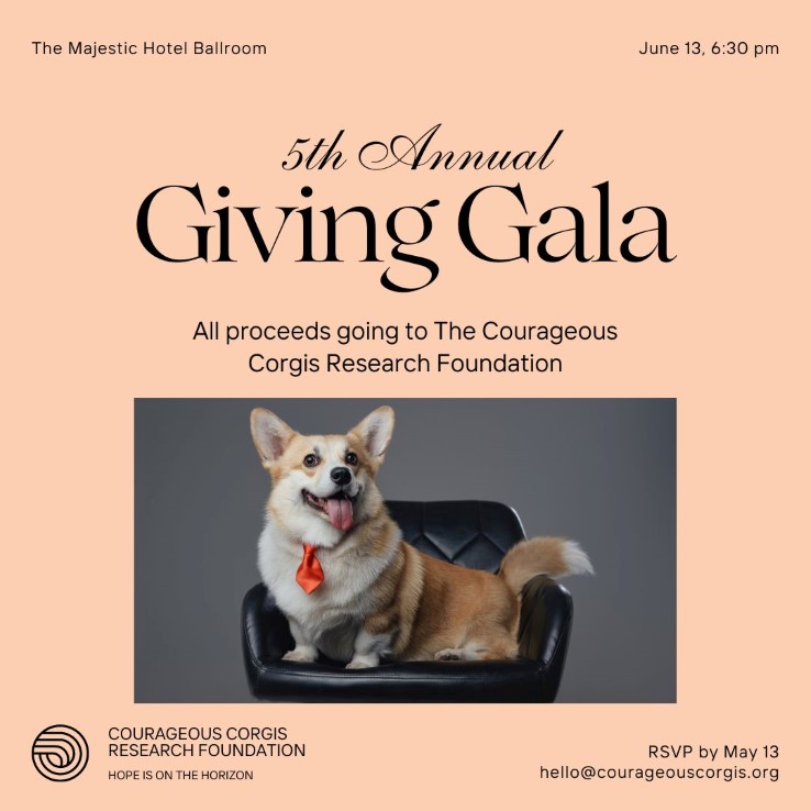
Steer clear of housing text within images whenever you can. Tools for those with visual disabilities, like screen readers, can’t read text within images. Instead they’ll rely on alt text to convey the meaning.
Here’s an image you might find on a nonprofit’s website. Do you want to guess how much of this text a screen reader can consume? You guessed it. None.
Follow the Heading Hierarchy
Using headings throughout your content makes it easier to scan and follow new ideas as they’re introduced. And your website’s heading styles aren’t just for looks.
The heading levels are one of the primary ways those using assistive technologies navigate content. So mixing up the heading structure won’t just be visually confusing. It also makes consuming content more tedious for those with disabilities.
Your website should already be set up to automatically use a Heading 1 (h1) for each page’s title. Within your content, start with a Heading 2 (h2) and work your way down through the headings (h3, h4, etc.) until you begin a new topic. It’s okay to repeat the same heading multiple times in a row, but don’t skip as you move downwards.
Here’s one example of an accessible heading order:
- Heading 2
- Heading 3
- Heading 3
- Heading 4
- Heading 2
- Heading 2
- Heading 3
- Heading 3
Using this post as another example, “Tips for Creating Accessible Content” is a heading 2 and is followed by “Make Information Clear and Logical” and “Include Text Alternatives for Non-Text Content” as heading 3s, and “Choose Your Image Alt Text Based on the Situation” as a heading 4.
Define Acronyms and Abbreviations
On the off-chance that you have a reader that doesn’t yet know the acronym or abbreviation you’re using, always spell the whole word or phrase out and include the acronym or abbreviation in parentheses the first time it’s used.
After that, you’re all set to go on using the acronym or abbreviation for the following mentions. For example, you would first mention the National Organization for Rare Disorders (NORD) and then refer to NORD for the rest of the page or post.
Avoid Excessive Text Formatting
You might think that using all caps or italics is a great way to draw attention to key pieces of content. But it can be problematic in terms of content accessibility. All caps can be harder to read for many users, including those with visual or cognitive impairments. And some readers with dyslexia may find italicized text more difficult to read due to the slanted letter shapes.
In general, try to avoid excessive text formatting. Bold text can be effective for emphasis when used sparingly, but if everything is bold, the emphasis is lost.
Aim for clean, simple formatting that enhances readability for all your users.
Link Your Content Descriptively
Links should be distinguishable from the rest of your content so that users can see and click them. To help those with visual impairments, that means they should be a different color from the text, as well as underlined. This tool can help you find an accessible color for links.
Your links should also make sense out of context. Many people who use screen readers will tab through the links to skim the page content or find a section of your site they’re looking for. Link text like “click here”, “learn more” or “see details” doesn’t help those folks find what they’re after.
To follow best practices, instead of “click here to donate now” where “click here” is linked, try cutting the beginning and linking “donate now” directly. This approach requires fewer characters, it’s easier for those using screen readers to navigate, and it more clearly describes where the link sends visitors.
Don’t Autoplay Audio Clips or Videos with Sound
Screen readers communicate page content to those with disabilities through audio. The content and its structure are read out loud through speakers or headphones.
If a video or audio clip immediately starts playing sound when users land on a page, it may make it challenging for those users to hear the screen reader’s output at the same time. This could cause difficulty navigating the page or finding the controls to pause the sound.
Whenever you include an audio clip or video with sound on a page, set it to play only when the user activates it. And if you absolutely must autoplay the sound, either stop it automatically after a few seconds, or provide an easily discoverable control to turn it off.
Get the Web Page Accessibility Checklist
Download and use our checklist to run through these important inclusion items each time you create or update a page on your website. The checklist also includes some bonus accessibility resources for additional learning and site-wide updates.
"*" indicates required fields
Audit Your Content’s Accessibility
Even if you follow all the tips I’ve outlined, it’s easy to miss something. Your page could include countless images, headings and links, making double checking everything incredibly time consuming.
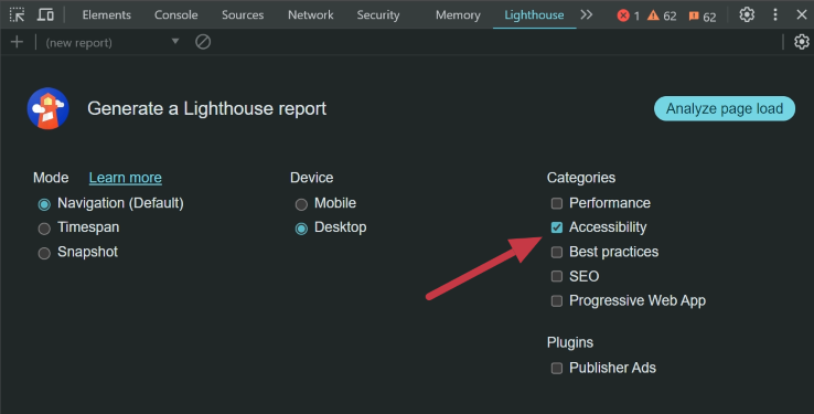
Well if you use Google’s Chrome browser, you’re in luck. It includes an accessibility testing tool called Lighthouse built right into it. Just follow the steps outlined on Chrome’s website to run your accessibility audit. Make sure the “Accessibility” category is turned on so it matches what’s in the screenshot below.
Once the audit finishes running, you’ll get a score and a report outlining areas to improve.
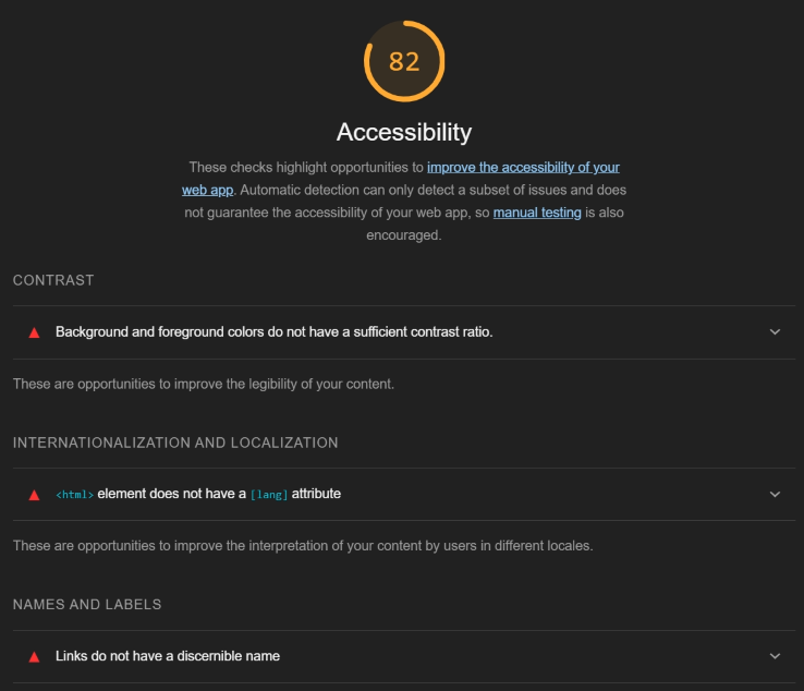
Some of the report might look technical, but don’t get too concerned. You can expand each error to find a detailed description with links to learn more.
Start with Baby Steps Towards Inclusive Web Content
I know it seems pretty daunting to work through your whole site with these guidelines for inclusive content in mind. So start with baby steps.
Focus on creating new content utilizing these tips. Then revisit the existing pages on your site in terms of importance to your organization and supporters. Donate, Volunteer and program or service pages should be first on the list. You’ll quickly see that all those small changes add up to much more accessible content.
Making an effort to work through and upgrade your web content this year? Have a question about whether or not a web page or formatting habit is accessible? We’d love to hear from you in the comments.
Nice article with great tips. Thanks for sharing
Thanks, Mahesh! Glad you found it helpful.