There are many elements of a website that come together to make a compelling final product. When discussing nonprofit websites, one of the most important aspects is the donate button. Putting a bit of thought into the way you show visitors how to donate can make a big difference in the effectiveness of your online fundraising efforts.
Below are three suggestions to keep in mind to get the most out of the donate button on your nonprofit’s website.
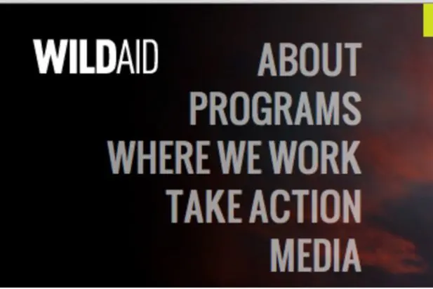
Make Your Donate Button Stand Out Visually
It’s important that your donate button stands out from the rest of your website immediately. You can make this happen in a variety of ways depending on the design of your site, but some possible ways to do so include:
- Use a different color than the rest of your navigation
- Give it room to breathe by physically setting it apart from other buttons and links
- Make it larger than other elements of your website’s navigation
- Use a larger, distinct font
In the image above, the nonprofit organization WildAid uses a yellow box with large, black text to make their donate button stand out.
People will likely want to know where and how to donate before they actually decide to do so. Make it obvious.
Ensure Your Donate Button Stays in the Same Place
Put your donate button somewhere that doesn’t change as a user navigates your website. Sure, you can link to your donation page from multiple places on your website. But you want a visitor to know where that button is whenever they decide they’d like to donate. Generally, the upper right of a website’s header can be a great, visible spot for a donate button that won’t change from page to page.
Put Your Donate Button “Above the Fold”
You want your donate button to be immediately visible to a visitor when they land on your website. Putting your donate button high enough on your website so it isn’t cut off by your monitor (also known as content that’s “above the fold”) can help ensure every visitor will see how to give. Again, the header can be great since it will show up on any monitor, no matter the screen size or resolution.
Regardless of your design, make that donate button stand out in whatever way you think is best. True, not everyone will ultimately donate to your cause. But at least you’ll know it’s not because a potential donor couldn’t find where to do so on your website.
do you have any suggestions as to what third party service I should look into for online donations. Specially the transaction aspect of things. I want to be able to offer donors option to do a one time gift or automatic monthly withdrawals. Thanks for any info you can give.
Thanks for the comment Josiah. In terms of a third-party service to use for donations, I can provide some links to some of the ones we’ve come across. But I’d recommend setting up a time to talk with each to determine if they’ll meet your needs and what it’ll cost (both upfront and on an ongoing basis).
A few to check out:
Classy
Network for Good
Qgiv
CharityWeb
Hopefully this list is a solid starting point!
Hello,
What are your thoughts on whether or not it is best practices to have a Donate button with a default “monthly” or recurring option, vs. having the default be non-monthly/recurring. Seems having the default be recurring could be perceived as a bit of a hidden trap.
thanks for any insights
Hi, Paul. I’d tend to agree with you there. We typically don’t recommend a default for donation frequency. Instead, we make it a required field and let the donor choose either a one-time or monthly donation. You can see an example of this on our demo’s donate page: https://airy.wiredwebsites.org/get-involved/donate/.
Hey, please help I have been trying to add this button for 2 weeks. Can you assist me.
Hi Edith. I’m happy to do what I can do to help out. Are you trying to add a donate button to your organization’s website, or elsewhere? If you could provide a link, I’m happy to give it a look, but your best bet is probably going to be to reach out to whoever built the site to see if they can add it in for you.