
What’s the point of your nonprofit website? If we had to guess, it’s to spread awareness of your organization’s mission and ultimately get people to take some sort of action on your site, like submit your contact form, sign up to volunteer or make a donation. You don’t want anything to get in the way, and fixing key web design issues is crucial.
Common Web Design Issues
Any action someone can take on your site is called a conversion. And you want conversion opportunities to be as easy to find and as simple to complete as possible. We’ll walk you through 11 common web design issues and how to avoid them to boost conversions on your nonprofit’s website.
1. Making text a low contrast color
First things first. If users can’t read your content, they’re not going to convert on your site. Even if you have 20/20 vision and can read the text just fine, it’s important to keep in mind that many of your site visitors may not.
Making your site as accessible as possible to people with all types of vision impairment is a great way to make sure you’re not excluding people (or missing out on potential donations and other support!). When the text on your website is not readable in contrast to your website’s background color, visitors will not be able to see your calls to action—no matter how strong they are.
We suggest using tools like WebAim to make sure you’re selecting colors that will be easily readable on your website. Once you load the WebAim site, paste in the hex code for the color of the text you’d like to use, as well as the hex code for the background color your text sits on. WebAim will let you know if the colors you’re planning to work with are high enough contrast to pass accessibility standards. You can also use the provided slide-scale to darken or lighten each color until they pass, so you have an exact idea of what color to make your text.
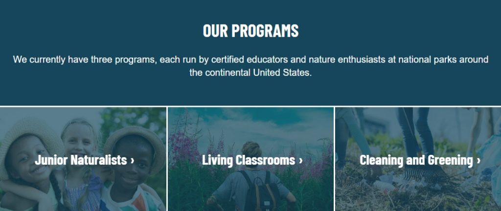
2. Hiding your links
You want potential supporters to explore your content, learn as much as they can about you, and ultimately convert. So, it stands to reason that you want to make sure people know where they can click.
Underline any links within your text and choose a color for links that stands out. We suggest selecting a brand color that is easy to read (as explained above). Blues, darker greens and purples are usually great options. Stay away from yellows for any sort of text. You can also add a symbol to the end of solo calls to action, like an arrow or caret for an extra cue that the text is a link. See an example of these symbols in the program links depicted below.
3. Not having a responsive website
It’s important for users to be able to easily digest and get to all of your content, especially from a mobile device. In 2018 it was expected that 57% of all internet traffic would be from a mobile device, and according to the Next Generation of American Giving Report, the number of donors who give using smartphones has been on the rise since 2013. Bottom line: if your website isn’t mobile-friendly you could be missing tons of conversions.
Talk to a developer to get the conversation going about a responsive website that displays well on any device. Some website platforms may even have responsive design built-in.
4. Setting a pop-up to show immediately
Give your site visitors some time to digest when they land on one of your web pages. Let them see how valuable your content is before you interrupt their experience on your site with a pop-up. We suggest setting any pop-ups you have running to display at least 10 seconds after someone loads a page. This way, they’re able to soak up some of your content before you make an ask of them.
5. Adding a prominent image carousel
A study by Nielsen Norman Group shows that half of website users will completely skip over anything that may be perceived as an ad, like a large image carousel, even if the carousel houses helpful information or important calls to action.
Image carousels are usually large in file size, making the page it’s displayed on slow to load. This is bad for the human attention span, as well as SEO. Need more proof a carousel is not the route to go? Image rotators often exclude users with visual and/or mobility disabilities, making the page non-accessible.
6. Not using the homepage to say what your organization does
Visitors will not take action on your site if they don’t know what you do. Write a single sentence that sums up what your organization does in a nutshell and feature that sentence prominently on your homepage. The last thing you want is for a potential supporter to land on your homepage and wonder about your mission or how you help. Don’t bury the information! Make it known upon first glance.
7. Using poor quality images
Images can be a powerful tool throughout your website, but when users come across grainy, low-quality photos, it’s tough to elicit any emotional response except “bleh.” Visuals on your site should enhance the message you’re trying to get across, not distract from it.
Invest in a photographer or find a volunteer that might be good with a camera to shoot some photos for your site. A few high-quality images can go a long way when it comes to conversions!
8. Long, detailed forms
We get it. Sometimes it’s necessary to have a relatively in-depth form. But for basic calls to action like signing up for your newsletter or donating, try to keep things as short and concise as possible. Only include information that you absolutely must. The shorter the form, the more likely a site visitor is to complete the action at hand.
Do you need the first and last names of everyone who signs up for your email list? Probably not. Especially when cutting those form fields could result in more subscribers.
9. Using generic button text
Remind your supporters about the results of their action. Don’t leave anything to question. Instead of using “Submit” for the button on your newsletter form, try something more direct, like “Sign up”. It tells them exactly what they can expect to happen when they click the button.
For a donate form, title your button “Complete Your Donation” or something similar so a user knows that they’ve reached the end of the process.
10. Writing content that’s hard to scan
People probably won’t read every word on each page of your website. This is especially true for calls to action hidden within intimidating walls of text. By using headings coupled with small, digestible paragraphs, users can quickly scan your text to zero in on the information they’re looking for.
Formatting text in this easy-to-read way also helps the accessibility of your website. (We use this term a lot because it’s important!) We can’t emphasize enough that working toward accessibility within your website content and design enables you to build a stronger community of supporters.
11. Not prioritizing your calls to action
As you’re writing content for your site, there are probably multiple goals you have in mind. You might want people to sign up to volunteer, enroll in programs and advocate for your cause. It’s not to say that you can’t ask users to do all of these things, but it’s important to prioritize which calls to action go on what pages. Focus on one main action for each page.
You might ask visitors to apply for programs throughout the program pages of your site while adding a donate call to action on pages about your organization’s impact. You’ll see your conversion rates rise when you strategically place calls to action in areas that make logical sense rather than overwhelming people with options.
Getting supporters to interact with your website is a huge goal of pretty much any organization’s web presence. By following our advice for common web design issues, you’ll hopefully notice that more website visitors are taking actions that drive your mission forward.
Have you overcome any of the web design issues listed here? Did you notice an uptick in website conversions after the fix? Let us know in the comments below.
Thanks for all the incredibly helpful information! As a new Development Coordinator for a relatively small non-profit, this gives me a good checklist as a beginning point.
So glad this was helpful for you, Gina! We love to hear that!