
Persuasive and painless. This one-two punch can be a good way to think about crafting signup forms to grow your list of subscribers. It’s about immediately drawing people in and then making the signup process quick and easy. And content has a lot to do with that.
Signup forms shouldn’t be an afterthought. Any occasion where an email address is requested on your site — whether it’s to subscribe to a newsletter or sign a pledge — presents a valuable opportunity to be specific in a succinct way. Because anytime you’re trying to grow your mailing list, you have a small window of time — and space — to get people’s attention and convert them. Let’s take a look at how you can optimize your signup form to help grow your mailing list of subscribers.
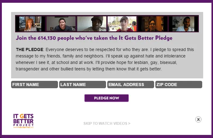
Social Proof
Call it herd mentality or safety in numbers, but when people see that other people are doing something, that can motivate them to do the same. That’s the definition of social proof, and it can be a great way to compel people to sign up. Social proof works best when it relies on numbers — the bigger the better.
It Gets Better Project uses social proof in their signup form. Showing there’s a large number of people who have already pledged their support validates the organization and lends some credibility – and people will want to be a part of that. Fear of missing out is a real thing, and social proof touches on that in a powerful way. If more than 614,000 people are part of this movement, it must be pretty great.
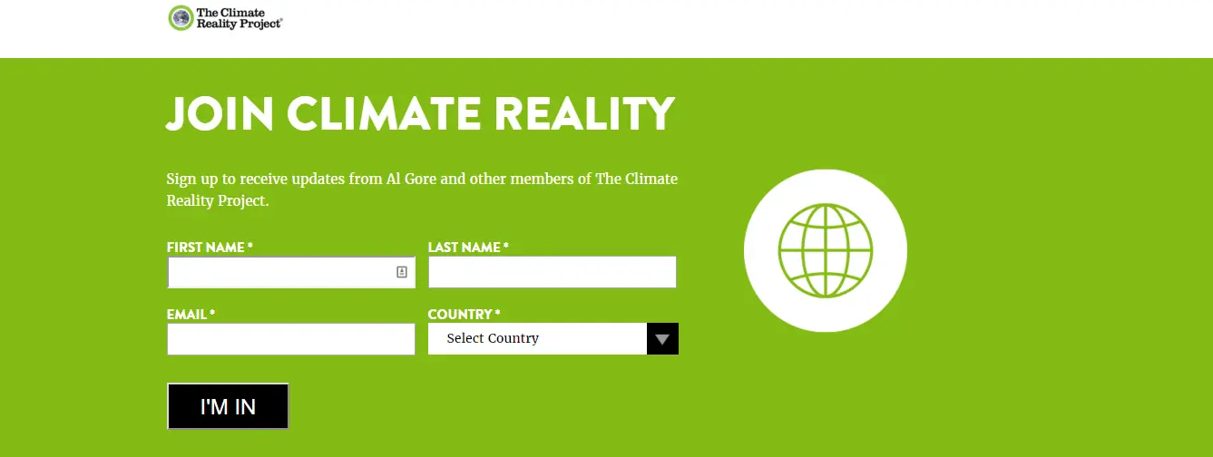
Go Beyond the “Submit” Button
Alas, the generic “Submit” or “Sign Up” call to action button. Avoid it if you can. Your call to action button shouldn’t default to these words. Why not reiterate what people are agreeing to with this last step? Since the button is normally prominent (or should be), this can be a good way to draw attention to the action you’re asking visitors to take.
The Climate Reality Project has a simple signup form that works for a couple reasons. Sure, name dropping Al Gore can be effective. But I also like the “I’m In” as a call to action. It’s inclusive, even passionate, about affirming your involvement with this organization. Other alternatives for the text in your call to action button could be “Make a difference” or even “Count me in.”
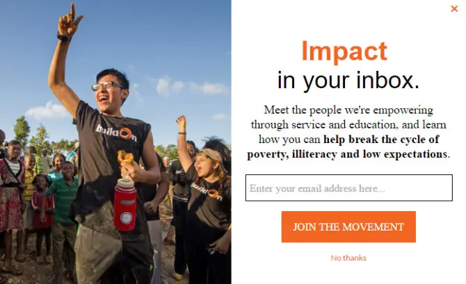
Illustrate the Incentives
Make it easy and clear for people to see the benefits of signing up. Providing a clear value proposition — what’s in it for me? — is important to establish upfront. Give your subscribers a sneak peek of what to expect after signing up. Show that you can solve a specific problem for them. Offer an exclusive benefit. Make it worth their while.
BuildOn’s form does a nice job of outlining two major benefits of signing up: real impact stories and ways to get involved with the organization. But I also love this form as a good example of some other best practices. The heading is punchy (and alliterative!) and there’s only one form field to make the process quick and easy. And the use of color is deliberate, with a nice orange button prominently displayed to seal the deal. Speaking of the button, I love how “Join the Movement” is the call to action. It really conveys a broader message about your involvement just by providing your email address.
Clear, Relatable Messaging
Oceana has their sign-up form prominently displayed on the homepage. I like this content for its simple, clear messaging. It uses a cause/effect approach that shows how your involvement could have far-reaching implications and relates it to something that many people can relate to: food.

By keeping in mind the best practices above and tailoring them to your audience, signup forms can be a quick and effective way to get people to take action.
Have any other suggestions to optimize content for your signup forms? Are you considering adding other online forms to your site? I’d love to hear from you in the comments below.
What is the url for the sign up form? I installed the plugin but don’t see the url for the sign up form? Please help
Hi Jeff,
Could you give us a little bit more information? Are you using the Volunteer Management plugin from Wired Impact? If so, it might help to check out the FAQs and Support Forum.