
 Christine Ward
 When we talk about mobile first, we mean designing a website or other online experience for mobile before designing it for desktops. But mobile first is more than the design of your site. Adopting a mobile first marketing strategy can put your nonprofit ahead of the curve and prevent major shifts in strategy and tools down the road.
Mobile first strategies have made steady appearances on the lists of “nonprofit tech trends to watch” for the past 5+ years. But what does that mean for your organization? And how can you catch up and get ahead of the trend?
What Is a Mobile First Marketing Strategy?
A mobile first marketing strategy assumes that the majority of your supporters and readers will view your organization’s marketing materials — emails, social media posts, web pages, forms, etc. — on a smartphone.
Thus, it aims to create marketing content that is written/designed/built for mobile devices first and foremost. While it should still look good and function correctly on other devices, it shines on a smartphone.
Mobile First Strategy Components
As you’re thinking through your overall marketing strategy and adjustments you can make in a world where web use is consistently trending mobile, consider the following components.
Simplicity in Everything
In a successful mobile first marketing strategy, less is more. Less content, simpler design, fewer form fields… you get the gist. When you’re navigating on a small, touch screen and using cell data to access something, every complexity has the potential to slow things down and create frustration.
Sorry, but the sun has set on the long, image-heavy email newsletter. You’ll notice that simplicity is a common theme throughout all of these strategy components.
Nonprofit Websites
Your nonprofit’s website should adjust to the size of the screen that it’s being viewed on. I’d bet you’ve personally experienced the annoyance that comes with an unresponsive website IRL. Please don’t make your website visitors squint or zoom in to see things on your site. While a true mobile-first web design is ideal, a responsive website will get you where you need to go.
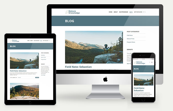
Your website is a huge piece of your marketing strategy. If it doesn’t function properly on a mobile phone, you’re missing out.
Forms
Sometimes, even when a nonprofit has a responsive website, they’ll send folks to a different website to complete forms or calls to action. And that third-party website is not mobile friendly. The best case scenario would be to keep all forms and calls to action on your website and optimized for mobile users.
But we realize that’s not possible for all nonprofits. If that’s your situation, ensure that the third-party service you use is at least mobile friendly. To check, test out the user experience for any service you’re considering on a smartphone. You can also test it out with Google’s Mobile-Friendly Test.
Loading Time
Load time should always be on the back of your mind as you think about creating new web pages for your nonprofit’s marketing. How long does it take your web page to load on a mobile device? Mobile users don’t have time or patience to wait for slow load times. To speed up page load times, you may need to do things like size down images or scale back functionality.
The Page Insights tool from Google Developers is great for testing load times and even offers specific recommendations to help speed things up.
Giving Options
Mobile users give a little differently than desktop users. But your donate form should still be mobile friendly! Mobile users like options that they can easily do on their phones. Has your nonprofit considered fundraising through avenues like Apple Pay or Google Pay? What about a text to give campaign? Or fundraising on social media platforms?
Search Engine Optimization (SEO) Considerations
We’d be remiss to refrain from mentioning SEO in a post about mobile-first marketing strategy. (How often do you Google something on your phone vs. your desktop?) In 2018, Google announced that all of the indexing for their search engine will be mobile first:
Mobile-first indexing means that we’ll use the mobile version of the page for indexing and ranking, to better help our – primarily mobile – users find what they’re looking for.
Adopting a mobile first marketing strategy will not only give your mobile visitors a better experience, it will also improve your chances of ranking higher in Google search results and capturing more visitors from organic search.
Writing Mobile Friendly Content
Writing mobile friendly content is similar to creating regular content for the web, but not the same. The distinction, again, is simplified content.
There are special considerations that you can make when writing content for mobile users:
- Absolutely no long paragraphs
- Use short sentences
- Break up content with headings
- Use lists and bullet points wherever possible
- Consider accessibility
- Add visuals
- Optimize video and images
Action Against Hunger and Direct Relief are both excellent examples of mobile friendly content. They use bite-sized paragraphs, lists and engaging visuals to reach their mobile audience.
Ready to build a mobile first marketing strategy for your nonprofit? Even if a new mobile first website design isn’t in the cards for your organization, there are improvements that you can make to your strategy today to improve the experience that mobile users have with your marketing materials and outreach. For example, you might start by formatting content with headings and lists or by reviewing the forms on your website to find ways to simplify.
Has your organization already adopted a mobile first marketing strategy? Any strategy components you’d add to the list? Or maybe you have questions about shifting your focus from desktop users to mobile? Reach out to us in the comments below.
Comments