
Website structure is a central piece of any highly effective nonprofit website. You could have the best content in the world, but if that content is tough for your visitors to find, they won’t hunt for it. They’ll leave.
That’s where having a logical and straightforward structure to your website comes in. When we say “website structure,” we’re essentially talking about how you organize the pages and subpages of your website.
But making a great website structure isn’t easy. Sure, you know what you want to say. But how do you put your structure together in a way that makes sense to first-time visitors unfamiliar with your organization? What about repeat visitors looking for a specific piece of info? How do you make your page names concise but strip out all of the jargon? And how do you compel visitors to want to learn more about you and ultimately get involved?
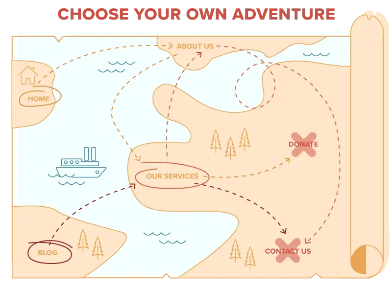
Your site structure needs to be like a choose your own adventure book without a set starting point. No matter what page your visitors enter on, and no matter what content they’re after, your structure needs to ensure they’re able to get where they want to go.
And that’s exactly why we created this guide.
Using This Guide
When using this guide, it’s important to remember that no two nonprofits are exactly alike. We definitely want this guide to help you with your website structure, but it shouldn’t be a straight copy and paste for your website.
Remember to consider the following when creating your nonprofit’s website structure:
- Adjust the page names throughout to make sense for your visitors
- Read through all of the sitemaps before picking one
- Mix and match pieces of each structure that work well for your visitors and their goals
- Start with essential pages and add more as necessary over time
Download the Website Structure Spreadsheet
Get a spreadsheet you can use to plan your nonprofit’s website structure. We recommend downloading the spreadsheet before you dive into the guide so you can take notes of structures you like as you go. But that’s just us. Follow your heart.
"*" indicates required fields
Common Nonprofit Website Structures
We’ve worked with a lot of nonprofits over the years, and while each is unique, we’ve seen some themes emerge when it comes to creating a strong website structure. Generally, website structure is largely dictated by the type work you’re doing in your community.
The following eight website structures can work really well for a wide variety of nonprofits.
For nonprofits that don’t need a lot of complexity to talk about key programs and services, use our sample sitemap and tips to build a website structure. View the Simple and Classic structure.
Is your nonprofit driven by 2-3 program areas? Use our sample sitemap and website tips to create a structure that appeals to supporters and participants. View the Driven by Programs structure.
If your nonprofit organizes program by the age of your constituents, this sample website structure can help, including the option to add or remove a blog. View the Programs by Life Stage structure.
Many nonprofits offer one core offering, like a school, summer camp or food bank. Use this website structure to share your program, stories and impact. View the One Main Program structure.
For nonprofits that offer direct services to clients in the community, this website structure offers a way for visitors to reach out and take next steps. View the Direct Service Provider structure.
If your nonprofit focuses on conducting or funding research and wants to educate the public to build support for your cause, use this website structure. View the Driven By Research structure.
Learn how to build a website structure that works best for groups that do programming and policy, such as educational, environmental or medical nonprofits. View the Programs and Policy structure.
Does your nonprofit focus on policy without programs? Or maybe you publish research? Use this template sitemap and helpful tips to build your website. View the No Programs, Just Policy structure.
If you want to dive straight into the structures above you certainly can, but we’d recommend reading through the rest of this page first.
Terms and Definitions
Before getting into best practices, we want to define some of the key terms that come up when talking about website structure.
Video Explaining Structure Terminology
If you’d prefer a video walkthrough of all of this terminology related to website structures, here you go. We’ll be using a real life example from one of our custom web design clients, Core Knowledge.
If you’re more into reading, check out the terminology written out below.
Website Sitemap
Often just referred to as a “sitemap,” a website sitemap is another term used to describe the organization of pages on your website. The term “sitemap” can also refer to a document that lists out all of the pages that exist on a site. Many people use the terms “website sitemap” and “website structure” interchangeably.
Primary Navigation
Your primary navigation is made up of the pages that show along the top (or “header”) of your website.
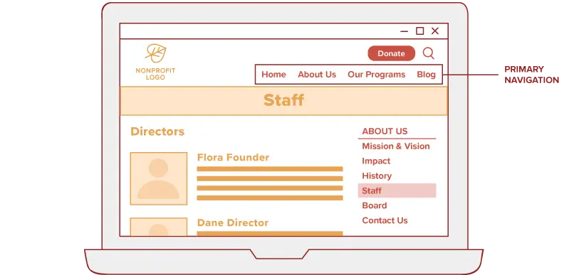
The pages in your primary navigation will serve as the foundation for your website structure. Sometimes folks use the term “main navigation” to refer to the same thing.
Secondary Navigation
Secondary navigation often displays in the upper right of your website’s header.
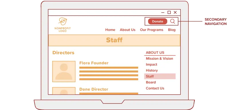
Secondary navigations can be used in a variety of ways including sharing additional buckets of content and housing prominent calls to action (such as a “Donate” button). It serves as a complement to your primary navigation. Many smaller sites don’t need a secondary navigation.
Sidebar Navigation
Sidebar navigation allows visitors to easily navigate to related content within the section of the site they’re currently viewing.
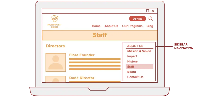
A sidebar navigation can make it more likely your visitors will browse multiple pages related to their interests.
Mobile Navigation
For most websites, you’ll want your navigation to collapse into a more compact display to work well on a smaller mobile screen.
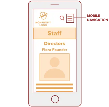
We generally recommend allowing visitors to expand the portion of the navigation they’re most interested in to provide a strong browsing experience when screen space is limited.
Top-Level Pages
These are the pages in both your primary and secondary navigations. Top-level pages often give a summary of the subpages within their section of the site and link visitors to related content.
Parent Page
Pages within a website structure are often described as if they’re part of a family tree. A parent page is the page that falls above the current page in the website structure.
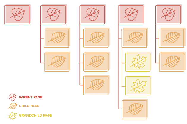
In the example above, a red page is the parent page of an orange page.
Child Page
A child page is a subpage of a parent page. In the example above, an orange page is the child page of a red page.
Grandchild Page
Sometimes you’ll have grandchild pages as well. This is typically more necessary as sites grow. Grandchild pages are two levels below a parent page. In the example above, the yellow page is a grandchild page of a red page.
Orphan Page
A page on the site that isn’t linked to from any other page on the site. This is sometimes done intentionally, like when you want to create a page that’s hidden or has restricted access. This is also sometimes done accidentally, which is something you’ll want to avoid since it makes your page very difficult for visitors to find.
Keys to a Strong Website Structure
While there isn’t a one-size-fits-all website sitemap that’s perfect for every nonprofit, there are some general best practices to keep in mind.
Think Big Buckets, Not Most Important Content
The point of your website structure is to make content easy to find. This means the main navigation should provide the big buckets that all other content will fit into. These won’t necessarily be the most important pages on your site. Instead, they’ll allow visitors to easily find whatever it is they’re looking for.
Think of the pages in your main navigation like drawers in a filing cabinet. Their primary job is to make it easy for visitors to clearly know where to find the information they’re after.
Avoid Jargon in Page Names
Whenever possible, strip the jargon out of your page names. Doing so will provide a much stronger user experience for visitors less familiar with who you are and what you do. For instance, an educational nonprofit would likely want to use something like “teaching practice” instead of “pedagogy.”
If your audience is solely made up of members of a certain industry with a vast knowledge of the lingo, you may be able to get away with some jargon if it makes your page names more precise. But whenever a more common word will work, go with it. Always use the language of your visitor, not your staff.
Focus on Your Primary Audiences
We often caution nonprofits to avoid trying to be “all things to all people.” Sure, you want to reach a broad audience, but you don’t want to sacrifice the user experience for those visitors most likely to get engaged with your cause.
Figure out who your primary audiences are and focus your decisions on their needs. Trying to make the sitemap a perfect fit for every distinct audience will result in a structure that’s confusing and difficult to navigate. (For more on getting to know your audience, check out Target Audience Personas: The Benefits of Persona Development for tips.)
Avoid Organizing the Site by Audience
We try to avoid organizing website sitemaps by audience (i.e. for donors, for volunteers, for program participants) for a few reasons:
- There’s typically a lot of overlap in the information your audiences are looking for. So in order to meet their needs, content would need to exist in multiple places. To make this happen, you’ll be forced to do one of two things. Either you’ll need to create multiple pages with largely the same content (which is confusing and tough to maintain). Or you’ll need to link visitors from multiple places in the navigation to the same pages which, in addition being more technically complicated, can make visitors feel unsure of where they are in the site.
- It can be unclear whether the content is intended to be for, or about, each audience. Something like “Volunteers” could be a place for your volunteers to view open opportunities and sign up. Or it could be a showcase of all the good work your volunteers are doing in the community.
- It doesn’t necessarily scale well since you may have new audiences accessing the site in the future. It isn’t sustainable to create a new main navigation item every time your audiences change.
- It sends a message to visitors that don’t necessarily fit neatly into one of the audiences that the site isn’t intended for them. The last thing you want is to make a visitor feel unwelcome when they land on your nonprofit’s site.
In rare occasions, organizing your site (or a portion of it) by audience may make sense. But for the vast majority of organizations, we recommend against it.
Let Logic Outweigh Internal Structure
It’s tempting to organize your sitemap in a way that mirrors your structure as an organization. But that often makes more sense to your employees than your visitors. Remember, most of your visitors don’t care what departments your nonprofit is organized into or how lines are drawn in your organizational chart.
Instead, let logic drive the placement and naming of pages. Think like your visitor. Go with a sitemap that’ll make the most sense to them.