Update on 7/7/20: Note that The Charity+ theme is now known as Chroma.
We’re constantly making updates to our Wired Impact platform themes to improve the experiences for both the nonprofit marketers making updates to their websites and the nonprofit supporters navigating those websites. For our next round of updates, we’re excited to announce an improved homepage for all of our clients using the Charity+ theme.
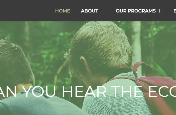
We’ll be updating the theme on Friday, August 31, 2018. Check out what’s changing on the homepage!
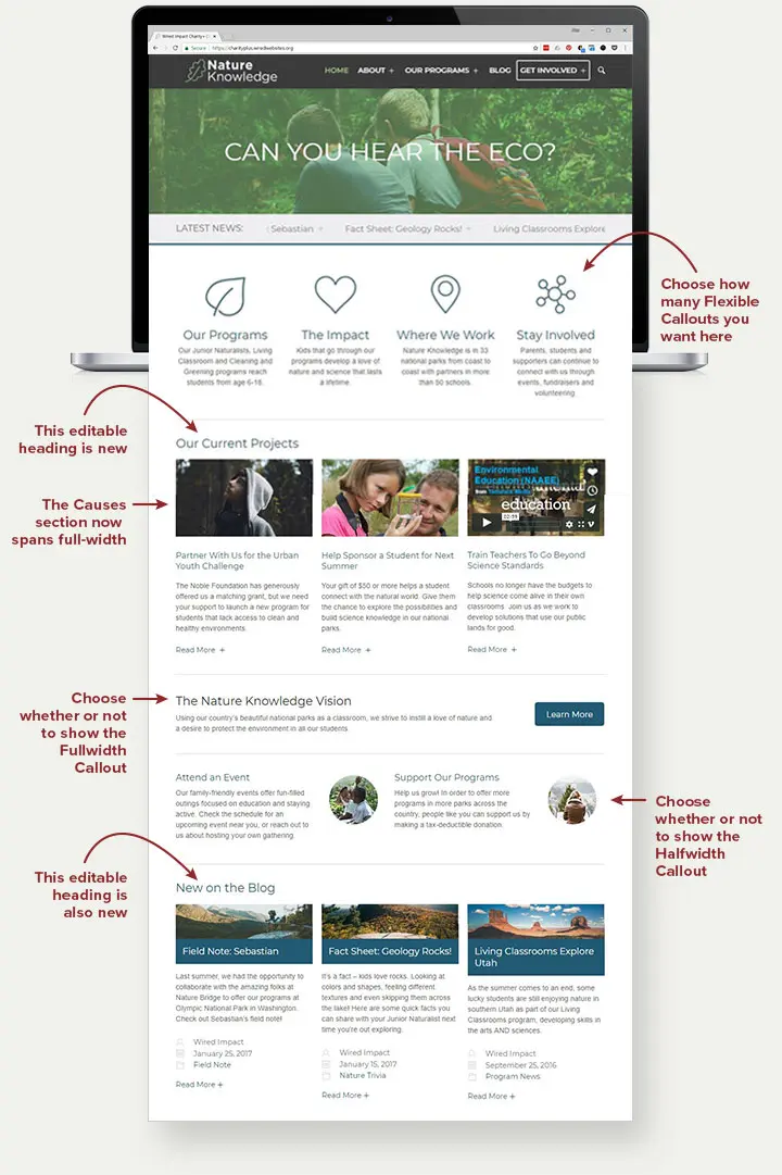
New Flexibility
When it comes to homepage design, flexibility is key. Since not all nonprofits need the same number of calls to action, we decided to make certain sections of the Charity+ homepage optional. It will now be up to you whether you’d like to include the following sections on your nonprofit’s homepage, or not:
- Flexible Callouts (previously called Quarterwidth Callouts, up to four short callouts)
- Fullwidth Callout (one callout that stretches across the page)
- Halfwidth Callouts (set of two callouts)
The Flexible Callouts have some additional—you guessed it—flexibility. You’ll now be able to include anywhere from one to four callouts in this section, and the spacing will automatically adjust depending on the number you choose. You’ll also be able to decide whether or not you’d like to include an icon or image with each of the flexible callouts, or leave the images off altogether.
If you decide you’d rather not include content for one or more of these sections, you can turn them off in the backend, and they won’t appear on the homepage.
Full-Width Causes
The Causes system within the Charity+ theme allows an organization to highlight fundraising campaigns, display how much they’ve already raised and easily link to a donation form. We wanted to give folks the ability to more boldly feature their Causes on the homepage, expanding this section to be full-width across the page and adding a custom heading.
However, if your nonprofit is not using the Causes system within the Charity+ theme, this section will not appear on your homepage.
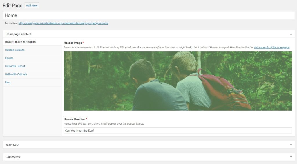
Improved Editing Experience
We also made some adjustments to the editing system in the backend of the homepage. Rather than asking administrators to scroll through each section in a long list, they can now use a tabbing system to quickly navigate through the page.
Adjusting Your Homepage
In light of the additional flexibility, it’s a great time to revisit your Charity+ homepage and decide whether you’d like to make any adjustments based on your nonprofit’s goals and the theme’s new options. For example, perhaps one of the four flexible callouts at the top of your homepage is no longer a high priority. You could adjust your homepage to delete that call to action and only include three callouts in that section.
If you have any questions about your organization’s current homepage or what you might adjust using the added flexibility, feel free to reach out to us through the Marketing Advice program using the form in your website’s dashboard. We’d be more than happy to take a look and provide you with our feedback.
To learn more about Charity+, as well as our other nonprofit website themes, check out our platform’s design options.
Comments