For many nonprofits building a website with us, seeing the design pieces come together is an exciting moment. With your logo in place, colors that match your branding and photos to help tell your story, it starts to really look like your nonprofit’s new website.
Fonts can help bring all these elements together. But until recently, our platform didn’t support that level of customization. Providing more flexibility with font choices was consistently one of the most requested features we heard from users.
So this spring, we introduced font styles on all of our website themes, and we’d love to share some background about the process of bringing this feature to life!
The Font Challenge
We know at first glance, it may seem simple – just browse through a list, pick a font you like and you’re good to go. But there’s much more to it behind the scenes.
In the vast world of typography, the number of font options seems to be unlimited. You could easily get lost in a sea of typefaces, each with its own charm and personality. The tricky part? Not every font works well in every context, and fonts for the web have a very specific set of requirements. Here are some of the things that a good font for the web needs to have:
- Good legibility on screens. The font you choose should be easy to read across all types of screens. This depends on many technical factors, like how distinctive some letters are from each other, how much space is used between characters, how long the font’s ascenders and descenders are, and the list goes on.
- Enough weights and styles. A good font family will offer different weights (like regular and bold) and styles (like italics). This is crucial to provide you with enough flexibility when using the font on your website, and a surprising number of fonts out there don’t have italics.
- Special characters/glyphs. Your font should include basic punctuation marks, numbers and common symbols. If your content includes a character that your font doesn’t support, you’ll see the following missing character glyph: “□”.
- Enough multi-language support. The best fonts support a wide range of languages, including accented characters and non-Latin alphabets.
On top of that, there are other considerations unique to our nonprofit website platform that we need to keep in mind. For example:
- The fonts should match your branding while maintaining usability. We know that your website will exist under the larger umbrella of your brand, interacting with all your other communications. It’s always better to keep the style cohesive — as long as it doesn’t sacrifice usability. A font that is optimized for screens and looks similar to your brand font can get the job done.
- Some fonts require a license to use. Commercial fonts require a paid license and have specific usage rules. They can be a good option depending on your requirements since there are tons of high-quality options tailored to every need. On the other hand, open-source fonts are shared for everyone to use for free, making them a budget-friendly option.
- If your site uses multiple fonts, they need to look good together. You need to find the right balance between the fonts not being too similar to the point they’re indistinguishable, but also not so different that they compete too much with each other. This is not an easy task!
- The fonts need to work well on your existing theme. Our themes were originally created using a default set of fonts that couldn’t be changed. Adding the ability to pick fonts means that we need to make sure each font looks and works perfectly across every page, block feature and theme, in terms of overall style, size and alignment.
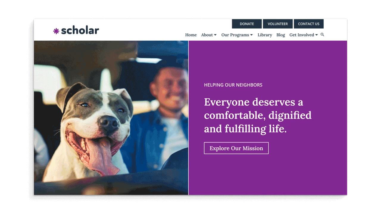
We know very well this is a lot to consider, and our main goal was to take all of this off your plate. This is why we decided to offer a curated selection of font pairings.
The Curated Approach
To decide which and how many style options to provide, we started by analyzing the logos of nonprofits that signed up for a free trial on our platform over the last year.
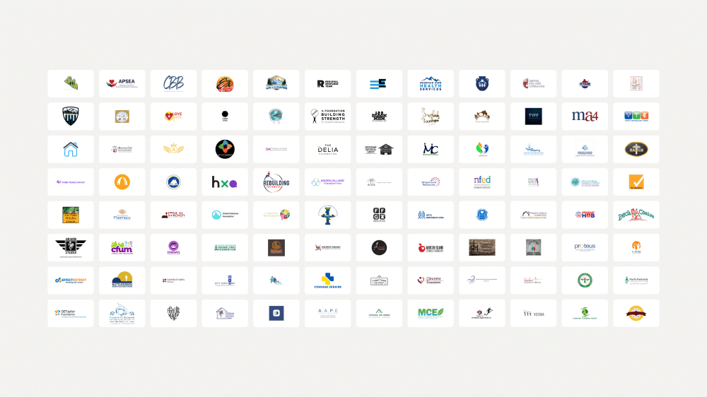
We then categorized those logos into groups based on their overall style and saw four clear patterns emerge: Minimal, Classic, Strong and Friendly. These patterns then became our initial batch of styles.
Through this approach, we wanted to help the greatest number of nonprofits find a close-enough option that would match well with their branding.
The next challenge was to find the right fonts for each style. With those overall styles selected, our team combed through hundreds of typefaces to find fonts that would fit within each option.
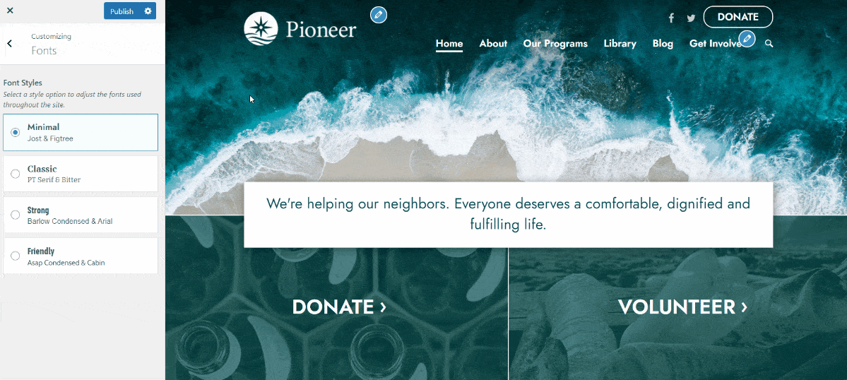
We carefully tested them across multiple website themes and features, on different browsers and devices and in countless scenarios to make sure they looked great and worked seamlessly in every situation. When fonts we shortlisted failed to meet these standards, we discarded them and continued the search for a better fit.
The result is a range of font options that span distinct branding styles, meet the requirements of good web fonts and work well with the various nonprofit features baked into our website platform. You can now easily select a style that complements your branding without having to review hundreds of fonts yourself or sacrificing the usability of your site.
As I mentioned earlier, this feature came to life thanks to your feedback. Whether you send us an email, respond to a survey or chat directly with us, we take every piece of feedback very seriously. You really help us shape our platform, and we can’t thank you enough.
What You Should Do Now
01. Come to Nonprofit Website Office Hours
We cover a new topic every few weeks. Plus get a live answer to any website-related question you're wrestling with.
02. Book a Website Call
Find a time to discuss your nonprofit's website needs. Discover what's worked for other nonprofits like you and see how easy building your new site can be.
03. Start a Free Website Trial
Try our nonprofit website platform for yourself. Instantly get access to every feature to see if it's the right fit for your needs. No credit card required.
Comments