You know your website inside and out. You manage the content and use the site often, and you probably know where to find what you’re looking for.
But your visitors often don’t.
Without that same insider knowledge, even small issues with your website structure can quickly confuse and frustrate visitors.
And when that happens, they’re a whole lot more likely to leave without engaging.
The good news is a few small changes can make a big difference. Discover four practical steps you can take to improve your website structure and make it easy for visitors to find what they’re looking for.
Video Transcript
This webinar was originally part of our Nonprofit Website Office Hours series. The transcript has been lightly edited for clarity.
Website structure is obviously one of the most important aspects of any nonprofit’s website. But it is also notoriously difficult to get right. But before we start peeling back the layers of that onion, we want to start out with something a little bit different here today.
Imagine this. You can close your eyes or you can keep your eyes open. Totally up to you. But just imagine that you are describing a dream vacation to a travel agent of the future.
They say they’ve got the spot for you. And because it’s the future, you’re just instantly teleported to the middle of a new place that you’ve never been.
It’s beautiful. But when you look around, you realize you can’t make sense of anything.
The signs are all in a language that you don’t understand. And you’re really hungry. But all you see are museums and parks. There’s no restaurants anywhere in sight. And as you look around, you start to notice everyone else seems just as confused as you are.
Everyone’s just kind of wandering around, knocking on doors, trying to find what they’re looking for. And generally, everyone looks pretty grumpy. You think to yourself, “If only I had a map in a language that I understand.”
If you stick around long enough, you could probably wander around and find what you need. But you’re hungry. You’re getting tired. So instead of wandering around aimlessly, you decide to leave and teleport back and try somewhere else.
When your website structure isn’t clear to visitors, this is exactly what they experience.
Visitors expect to find what they’re looking for quickly and easily, and when they can’t, most folks will not wander around aimlessly knocking on doors. They’ll just teleport back. They’ll leave your website.
And we see it all the time. It’s really normal for websites to evolve over time. New pages are created here, and things change slowly over time.
But those changes start to pile up. And what used to be a really well-organized site starts to feel really confusing and really overwhelming for visitors.
And as updates are tacked on and additions are made, it leaves the website as what we call a “Frankensite” where things are just kind of bolted together and don’t end up feeling super streamlined anymore.
So today, we’re gonna break down the four easiest, most impactful ways for you to improve your website structure so your site stays easy to navigate and as effective as possible.

Website Structure Basics
As we dive in, we’re going to take a minute to get clear on the language and the terminology that we’ll be using. That’s going to allow us to make this whole process more precise as we go through it.
Your website is made up of pages. And your structure is the way that those pages are named and organized. You might also hear this called a site map or even information architecture is a really fancy name for it.
But basically, they’re all referring to the same general thing. And I will say we have a resource on our website that talks about website terminology, and we’ll be sure to share that so that you have it handy.
But one of the most important things we’re going to cover here is the primary navigation.

This is essentially the main menu that helps visitors find their way around your website. And these pages in the primary navigation serve as the foundation of your website structure.
Now, the secondary navigation is this additional menu that complements the primary navigation.
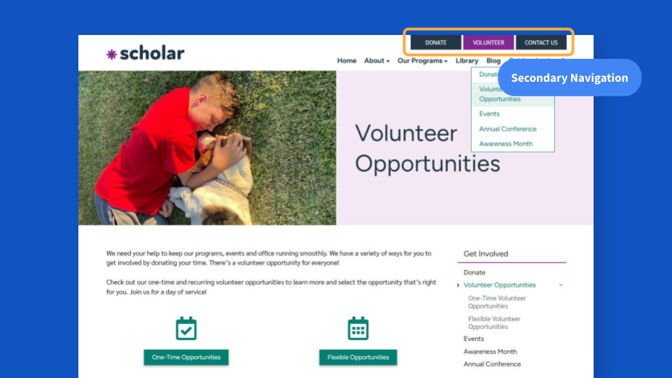
It might be made up of buttons, or it might be made up of links, depending on your website design.
Oftentimes, these are key action items, like Donate or Contact Us, that you want to make sure are really easy for visitors to find on most every page of your website.
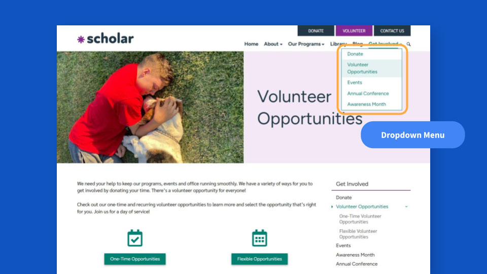
This one’s pretty self-explanatory: a dropdown menu refers to the additional pages that drop down or expand when you hover over an item in the primary navigation. So these are the pages within that section of the website.

And then your website might have a sidebar that appears on internal pages, again, depending on the design.
Oftentimes, you’ll see a sidebar navigation here, and this just allows visitors to easily navigate to related content within that section of the site they’re currently viewing.
The next few all kind of fit together here. You might hear pages referred to as parent, child and grandchild pages. It’s a way to describe their relationship to one another using family tree terminology.
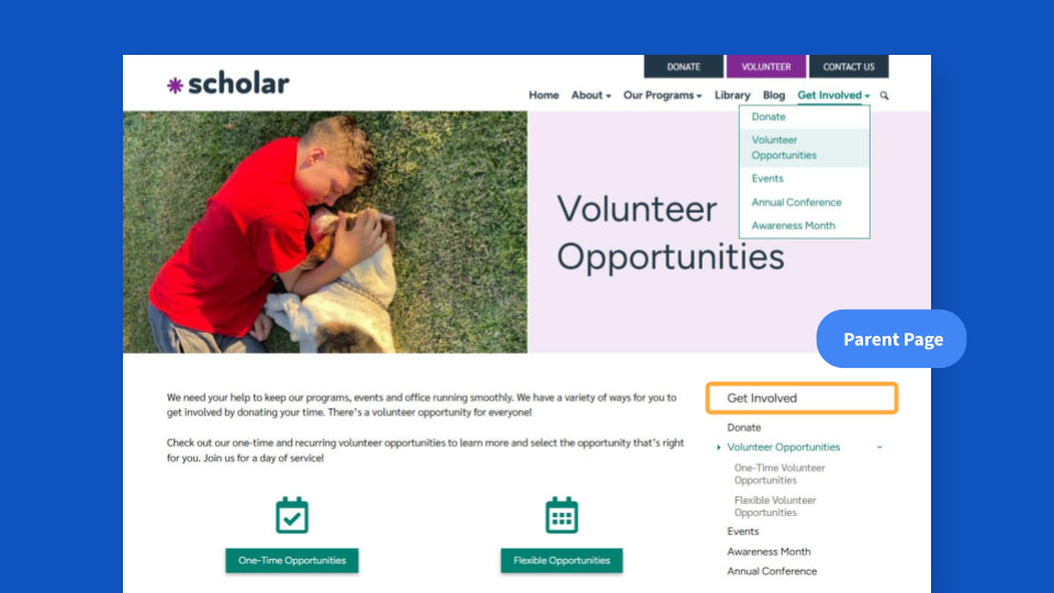
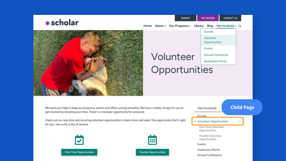
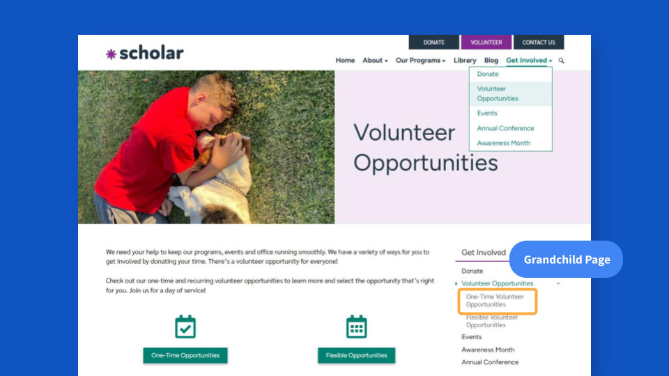
For example, here our parent page is Get Involved, which you can see highlighted there. And Volunteer Opportunities is a child page of Get Involved. And then the other child pages under Get Involved are Donate, Events, Annual Conference and Awareness Month.
You can see it there in the dropdown menu. You can see it in the sidebar navigation. And then One-Time Volunteer Opportunities is a grandchild page of Get Involved, and it’s a child page of Volunteer Opportunities.
Again, you can think of it like a family tree, and then each subpage is essentially a new generation in that tree. And then use the corresponding language to describe how pages are related to one another. It’s just a quick, easy way to describe the relationships of pages to one another.
I know that’s a lot of terminology. But those are all the terms we’ll need today to make sure that we’re able to nail our website structure.
What Your Structure Needs to Do
Now that we have a shared foundation, what does your website structure actually have to do? It’s pretty straightforward.
A good website structure makes it easy for your visitors to find what they’re looking for.
That’s really it. That’s its whole job. We want to make your content as easy for visitors to find as we possibly can.

A good structure will make it easy for folks to find what they’re looking for, regardless of things like where on your website they originally land, what problem that they’re trying to solve, or how much context and background knowledge they’re bringing with them to your website.
No matter what, your visitors should be able to quickly understand generally where they are within your website and how to get where they want to be.
The way that your pages are named and how they’re organized are all going to play a major role in making your content as easy to find as we possibly can. And together, they act as sort of that map that we talked about for visitors who have teleported in.
When it’s done well, it should help folks navigate through your site to find the information they need without getting frustrated or confused, hitting a dead end and ultimately leaving.
Common Signs Your Structure Needs Work
But how do you know if your structure is actually hitting the mark?
Especially when you’re in the weeds of your work, it can be really hard to know if your structure is as strong as it needs to be.
But there are clues you’ll start to pick up on, indicators that suggest your website structure could use some dialing in.
Questions About Info That’s Available on Your Site
One of the most common ones that we see is you’re getting questions from your visitors about information that is readily available on your website.
If you or your team are getting phone calls or emails from folks in your community asking for information that you know is published on the website, it’s a pretty strong clue that your structure could use some dialing in.
And this is a really common issue we hear from nonprofits we work with. It’s a pretty clear sign that information is there, but folks are not finding it.
It’s usually the first clue, but it’s not the only one.
High Exit Rates
Another is if we’re seeing high exit rates on the website. That’s a strong signal that the site might not be structured as well as it could be.
Now, exit rate is basically your website’s way of telling you that you’re losing people from a particular page.
The more technical definition is that it’s the percentage of visitors who left your site from a particular page. And a page’s exit rate tells you essentially the percentage of visitors where that particular page was the last one that they viewed before they left.
So if you have 100 visitors to a page and 30 of them leave from that page instead of viewing another one, the exit rate of that page is 30 percent, or 30 out of 100.
The thing to keep in mind is that it doesn’t necessarily tell you why they left. So it’s not this secret, objective answer.
Some pages you would expect to have a higher exit rate, like Thank You pages generally have a high exit rate because someone has completed an action at that point. Or pages that completely answer someone’s question or solve their problem might have a high exit rate.
So it’s not universally a terrible thing! But high exit rates can help you figure out where people might be giving up on their journey, especially if it’s higher than you would expect it to be.
With that information, we can start to see patterns emerging where maybe visitors’ expectations for a page are not being met by what’s actually on that page.
And if they can’t figure out where else to go, or they feel like they’re not getting closer to solving their problem, that’s when they’re more likely to leave. So it can help you root out some dead ends in your visitors’ journey.
Low Conversion Rates
And finally, the last thing we’re going to look for is lower conversion rates than we would like to see. This is the percentage of visitors who take the key actions that you’ve identified on your website.
And if you joined us a few months ago when we talked about conversion rate killers, then you know there are lots of reasons you might see low conversion rates. But one of those reasons can be tied to your structure and how well visitors are able to find what they need in order to take action.
Again, folks just want to feel like they’re getting closer to solving their problem or answering their question.
So if any of these sound familiar — fielding lots of questions, high exit rates, low conversion rates — first of all, know that you’re not alone. You’re in good company. A lot of amazing nonprofits face these challenges.
And then secondly, take it as your sign to review your website’s structure for possible improvements.

Easy Ways to Improve Your Website Structure
So with that, let’s dive into those easy ways that you can improve your website structure.
Think of these as where you should consider starting when you’re trying to level up your structure.
Use Clear Page Names
First, it sounds obvious but use clear page names. This is one of the easiest ways to make your structure more effective and helpful for your visitors.
Your navigation should make it obvious what visitors will find if they click on a page. But when page names start to reflect your own internal way of speaking about certain programs, or lots of jargon or acronyms that they’re not familiar with, it becomes a lot harder for visitors to know where they should go and what to expect when they click.
And if visitors can’t quickly understand your pages just based on their names in your structure, they’re more likely either to choose the wrong path, which can be really frustrating, or just kind of give up, chalk it up as too difficult, and ultimately leave your website instead of trying to guess and figure out where they should go.
That’s why it’s so important to use clear page names that even total strangers who are unfamiliar with your work would be able to understand.
But how do you actually do that? We all know we should do this, but how do we actually make that happen? We have some recommendations.
Use plain language your visitors would use
First, use plain language your visitors would use in your page titles. Not necessarily what you call things, but what your visitor might think to call it.
And to help you do this, ask a couple of questions. I start with these two. First: If your visitor was describing to someone what they’re looking for on your website, how would they describe it? What language would they actually use?
And then also, how would they ask the questions that your page addresses? If they were talking to you on the phone, what questions would they be asking?
And then use that language in the content of your page, certainly, but also in your page title directly. Because that’s going to give your visitors the best clues as to what they should expect to find on that page.
Here’s an example. We made this one up. We’re not going to roast any websites publicly here. But this is honestly not that far off from some examples that we’ve seen in real life.

The names might be very accurate and true to what we call things. But it’s what our team calls them internally, not what visitors would be looking for.
A new visitor is just not going to get a whole lot of value out of what these are called. And they clutter up the dropdown. It just makes it look much more visually overwhelming. And we can streamline them in a big way.
So you can see here we have: Nickie Bartels Award for Senior Merit and Excellence, David Hartstein Activities After School, Wired Impact Center for Achievement in Computer Science. A lot of room to streamline things.
Here’s what that looks like when we’ve streamlined it.

You see this becomes: Senior Scholarships, After-School Programs, Computer Lab, Apply Now.
They’re much more streamlined names, and even if they are a little less technically precise, they’re much clearer for folks who are new and much easier for them to find what they need.
And we can always use the longer, more precise names on the pages themselves. But in your navigation, it’s going to benefit you and your visitors to streamline, simplify things and use language that they’re likely to use.
Give each page one, single name
Next, give each page one, single name. You want to avoid situations where you’re including a slash or plus sign to combine two names into one.
Some common examples we see are things like Donate/Support Us, Financials/Reports, Reports/Publications.
It might feel like you’re being more all-encompassing or all-inclusive and more thorough. But it actually muddies the waters for visitors.
It just requires more mental energy to figure out what they can expect to find on that page and makes it less clear what they’ll find on the other side of a click, which is generally the exact opposite of what we want to do.
Avoid acronyms
Next, avoid acronyms in page titles. This is often another form of internal jargon that less familiar visitors won’t understand.
Now, we’re not saying don’t use acronyms at all. On the page itself? Absolutely, use acronyms. Especially if you define them first and then use the acronym, I think that can absolutely make a lot of sense. But in the page title, without any additional context, generally acronyms can be a little tricky.
There is one major exception to that, and it comes down to knowing your audience really well. If you’re speaking to a very specific audience and those visitors will know the acronyms — they use the acronyms themselves and understand the acronyms — then in some edge cases, it might actually be better to include them.
One example that often comes up for us is rare disease organizations or organizations that are doing a lot of research. A lot of times, there are acronyms that may actually be more common than the full scientific name for something.
That could be an example where an acronym actually is more helpful for visitors. But as a general rule, you want to avoid acronyms in page titles as sort of your default.
And it has the added benefit of oftentimes helping pages show up in search engines and AI answer engines, like ChatGPT or Gemini. Because that more closely reflects the language that visitors are typing into Google or ChatGPT, or whatever tool they might be using to search for the information that you want to be showing up for.
Ask an outsider
And when in doubt, ask an outsider. It’s tough sometimes to get out of our own way. And chatting with someone who is not part of your organization can be a game-changer here.
In general, I mean, we recommend talking to your audience anyway. And a great hack for using clear language that your audience is going to understand is to actually use their language.
So if you’re talking with them, if you’re interviewing donors or supporters or members of your community — if you can, record those conversations. Get them transcribed, and then key in on the language that folks are actually using to describe your work, your programs, your services. And then fold that language into your content and your page names.
Streamline Your Main Menu
All right. Next up, streamline your main menu.
Your main menu should help visitors quickly scan their options and determine where to go. This is a lot harder to do when it’s completely packed with pages.
When there are too many items placed in your main navigation, or your dropdowns are filled with tons of pages and subpages, visitors are likely to get pretty overwhelmed. And generally speaking, that overwhelm turns into exits.
The more options you present, the more crowded your site starts to look, and the more mental bandwidth it’s going to take visitors to make any sort of decision.
If you’ve been at Office Hours before, you’ve probably heard us say something to the effect of “Everything you add takes attention away from everything that’s already there.”
And that is absolutely true with navigation. Everything you add, people are going to spend a little bit of time looking at, thinking about, processing. And it’s going to take away attention from everything else that is already there.
The point of your navigation is not to get all your most important pages up there. I want to say that again, because that is actually a common misconception: It is not the job of your navigation to showcase all of your most important pages.
Its job is to help visitors find what they need, to bring this sense of overarching structure to your website. And streamlining and simplifying your main menu can help in a big way to that end.
So again, how do we actually do this?
Limit your menu to 5-8 items
First, try to limit your primary navigation to somewhere in the neighborhood of five to eight items.
We’re talking about those pages listed at the top in your primary navigation. You’re going to want to limit that, generally, to somewhere in the ballpark of five to eight items.
Unfortunately, there is not a strict rule that applies to all websites here. It depends on your website fonts and layout and the size of your text and the size of your logo and all kinds of styling. But generally, you want to stick somewhere around five to eight items in that primary navigation.
And we recommend including Home in there. Some folks want to pull it out because if you click on the logo on almost every website now, it takes you to the homepage.
Usability studies still suggest it’s a best practice to keep Home in the primary navigation. There are still visitors that don’t know to click it. And your website’s homepage is still really important in most visitor journeys.
So we always recommend keeping Home in there and counting that as one of the five to eight items you’re including in your primary navigation.
Tighten up long labels
Next, you’re going to want to tighten up long labels or page titles that take up a lot of space.
It’s not going matter how much you’ve limited your items in your primary navigation if those page titles are super long. It’s still going to feel really crowded.
So instead, look for opportunities to tighten up your page titles or labels in your menus. And some of the common opportunities that we see are right here.
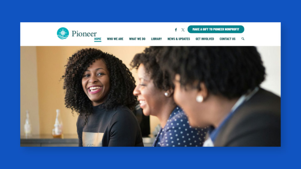
You can see it’s starting to look pretty crowded in our primary navigation here.
We actually have — what, one, two, three, four, five, six — seven items, if I counted that right? Yep, seven items.
So we’re under that eight threshold. But they’re just long. Right?
For example, our blog is called News and Updates. Contact Us is in here, and it’s taking up 10 characters in the primary navigation. You’ll also see that button in the secondary navigation, “Make a Gift to Pioneer Nonprofit”.
Sometimes organizations are tempted to include their full organizational name in the page title. But it clutters things up pretty quickly, adds a lot of length. Plus, folks are already on your website.
There’s no need to repeat it. There’s other brand clues. People can generally get a sense of where they are.
So, here’s a little before and after.
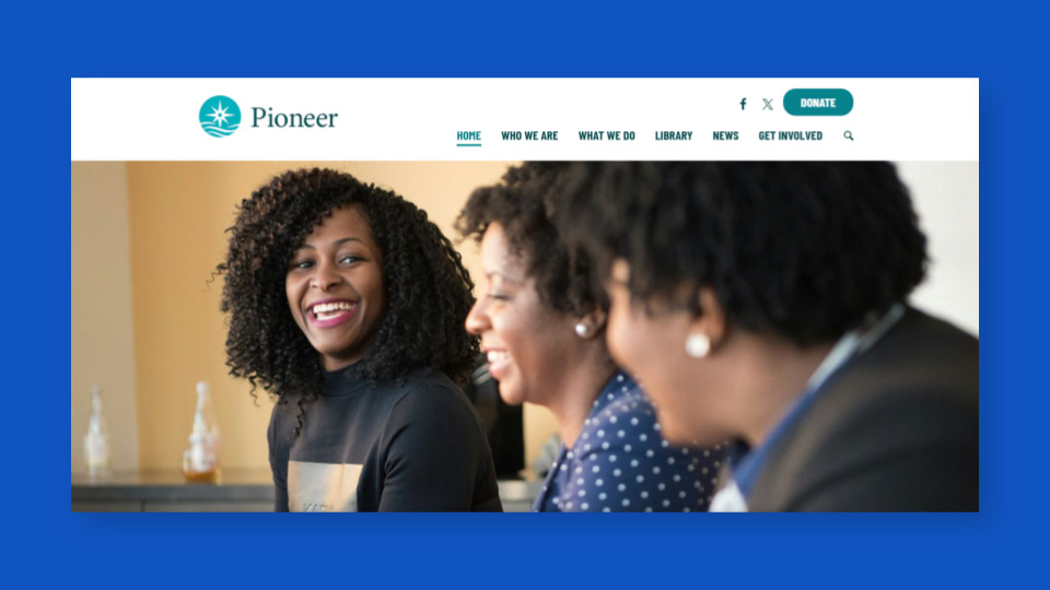
You can see we’ve tightened things up a lot here. News & Updates became News. Shortened that up pretty sub substantially. We moved Contact Us out of the primary navigation, placed it under the Who We Are section, and then Donate to Pioneer Nonprofit became Donate.
Everything is still accounted for. Visitors can still find what they need. It’s just a lot less crowded, a lot less visually overwhelming. And much more likely to engage visitors and help them find what they’re looking for.
Break up overloaded dropdowns
Alright, next up you’re going to want to break up or reorganize overloaded dropdowns.
Once you start to reach seven or eight pages in a particular dropdown list, it’s generally going to become a lot harder for visitors to review them and make a decision. It can also start to present usability challenges on smaller screens. Dropdowns can actually start to extend off of screens at times.
Here’s actually a really common example we see.
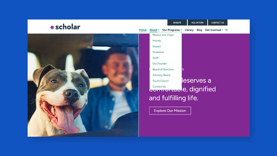
This is an About section. You’ll see this dropdown has 10 pages. And there are some clear opportunities to streamline things here.
The most common way to tighten up a dropdown that’s starting to get lengthy is to consider if any of the pages can be connected under some sort of new umbrella page.
In this example, five of the 10 pages are about people, right? We have Staff, Our Founder, Board of Directors, Advisory Board and Youth Council. So we could create a new page called something like Our Team or Our People and then move those pages to be children of that new page.
So here, again, we have a little before and after. And here’s our after.
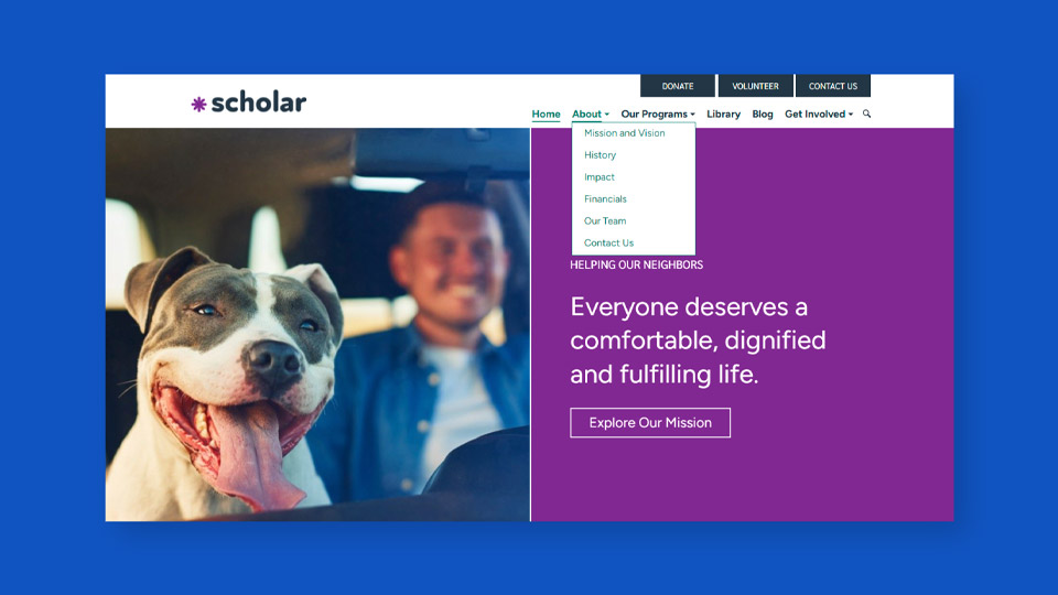
You can see that the move to create this Our Team page streamlines this dropdown in a big way. And if that’s the kind of information that folks are looking for, if our visitors are looking for any of those five pages, they’re still pretty easily able to find it under this Our Team page.
If we go to the next slide, here’s the Our Team page. We’ve used it as this sort of overview of all of the different groups of folks that make up our team.
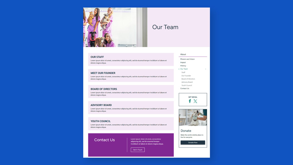
So folks can click through using those calls to action. And then you’ll see there’s also the sidebar navigation, where people can see the children pages under Our Team.
So we still have Staff, Our Founder, Board of Directors, Advisory Board, Youth Council. They can still easily get there. They can still easily navigate to what they were looking for.
Now, creating these new umbrella pages is not always the solution. But it is a really common one.
And generally it’s where I recommend folks start if these dropdowns are starting to feel overly crowded. Especially if you can find some logical ways to group some pages together in a particular dropdown.
Use your blog to share content when appropriate
Then finally, don’t overlook the power of a blog. If you have one, use your blog to share content whenever it’s appropriate.
A very common cause for clutter in menus is that folks feel like they have to add pages for short-term types of things.
We’re not talking about new programs or new initiatives here. We’re talking about things like reminders or alerts, maybe an emergency relief effort that’s only going to be for a short period of time, a single event, your latest report, your latest publication, etc.
These are all important pieces of information! But they don’t necessarily need to be in the main menu just because they’re important.
Again, the point is not to get the most important pages up there. It’s just to bring structure to our visitors’ journey in navigating to the most relevant parts of our website.
There’s this common misconception that important information can’t live on a blog, that it should have its own page. We’re here to dispel that myth. That is absolutely not true.
There are lots of ways you can effectively route folks to blog posts and still get a lot of traffic to those blog posts. So don’t let importance dictate where content lives on your website.
Find the most logical overall place that that information should live. And then if it is a matter of importance, we can think about other distribution channels, other ways to get eyes on that content.
It’s going to make it far easier for folks to find what they’re looking for and help you avoid that situation where you end up with that Frankensite we talked about earlier at some point down the road.
Organize Content by Topic
Speaking of which, our next tip is to organize content by topic. Honestly, this is probably one of the most helpful mindset shifts for making your website structure more effective. You’re going to want to organize content into logical buckets based on topic.
Visitors come to your website looking to solve a problem or answer a question. And when your website structure doesn’t group content together logically — or when it reflects the way your team thinks about content — it becomes really difficult for your visitors to find what they need. It adds a lot of friction and confusion to their journey and makes it a lot more likely they’re going to abandon your website before engaging.
You might think of it like going to a new grocery store. You walk in expecting to find things grouped by type, right? Produce, bakery, dairy, frozen food. We’re just used to certain types of products being grouped together.
And that’s what generally makes it easy to find. Even if you’ve never been to that grocery store before, you can still typically find what you’re looking for.
But instead, imagine if you walked into this new store you’ve never been to and things were organized by brand instead of by type.
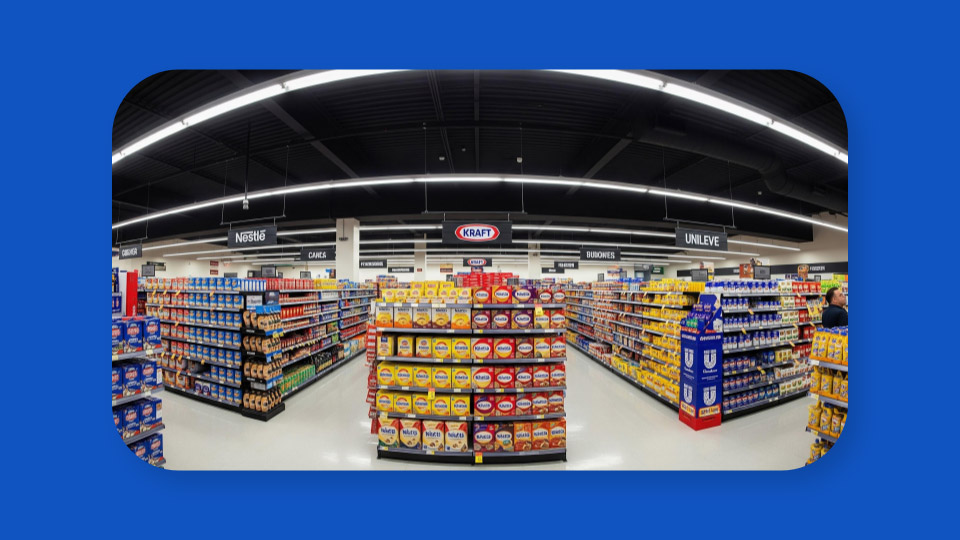
So, Nestle is over here, Kraft is over here. Everything is still there. Yeah, Dani, this is nightmare fuel here, right?! Like everything is still here. You just can’t find what it is you’re looking for.
You’re going to be searching around a lot. You’re probably going to be doubling back as you’re walking through. I mean, I do that a lot at the grocery store anyway, but in general, that’s not a best practice, right?
We don’t want people to have to go back to an aisle they were already in, searching for what they’re looking for. This is going to happen because it’s just not how your visitors are used to engaging. It’s not how we’re used to shopping in this store, right?
When we go to a grocery store, based on our past experiences, we have expectations. And this one is not particularly helpful unless you’re searching for a particular brand.
A lot of website structures honestly end up working pretty similarly to this. You have all the content, all the content is on your website somewhere. But if it’s not grouped in a way that your visitors would logically expect to find it, they’re going to have a hard time tracking it down.
Your structure should help folks who have never heard of you and never been to your website before, just as much as it’s helping returning visitors who have a lot more context.
So how do you actually pull this off? A few specific tips.
Group your content into buckets
First, you want to think about and group your content into buckets or folders. Not by what’s most important or what’s for this audience or that audience. As we’ve said, the whole point of your website structure is to make it easier for your visitors to find what they’re looking for.
And it means your main navigation should provide these big buckets or folders that all of the content fit into. That way, visitors can find what’s most important to them — not what you’ve sort of dictated is most important.
I sometimes find it helpful to think about pages in your primary navigation like drawers in a filing cabinet. Their main job is to make it easy for visitors to clearly know where to find the information they’re after. And then once they’re in the right drawer, they can find the right folder, they can open it up and look for a specific file.
But they’re going to feel that progress. They’re going to feel like they’re getting closer to the answer to their question or the solution to their problem.
And that’s really important to keeping people on your website: that they feel like they’re making progress in their journey.
Rethink any catch-all pages within those buckets
Next up, it’s a really good idea to rethink any catch-all pages within those buckets. So what do we mean here?
If you think of your navigation like a filing cabinet, a catch-all page is basically your junk drawer. It’s full of the stuff that you can’t bring yourself to get rid of, but you can’t find the right home for it in your filing system.
If you know what’s in the drawer, you might find what you need. But you sort of have to know, right? And these pages often are used to collect a bunch of loosely related points outside of their proper context. I think examples help here.
Some of the most common examples of these catch-all pages that we see are Frequently Asked Questions, or FAQ, pages and Gallery pages. Just like a collection of photos, videos, things of that nature.
They generally become dumping grounds for content that we don’t know where to put. And typically speaking, they’re not especially helpful for visitors. They generally don’t get all that much traffic. Because people don’t really know what to expect on those pages.
So instead of doing this, what we recommend is finding a logical and related home for the content that you’re considering putting on these catch-all pages.
Instead of one catch-all Frequently Asked Questions page, put those individual frequently asked questions on your program pages, your service pages — whatever the question relates to, put it right on that page.
Because then it’s going to speak directly to the visitor who is engaging with that part of your page instead of just someone who’s thinking, “I have general questions and might get it on an FAQ page.“
And then with images, do the same thing. Images, videos — put them directly on the page that they are illustrating. A lot of times, this would be, again, programs, services, things of that nature.
Instead of having a gallery, event recaps can be a really nice place to put individual galleries of images or videos, instead of just a general Gallery page that has all the images that you’ve ever collected.
Avoid organizing site by audience
Next, avoid organizing your website by audience. It’s a pretty common desire at some point in your website structure journey to at least consider organizing your site by audience.
I’ve been there myself on the surface. I totally see why most of us end up here at some point. But there are a few common issues that typically come up over time if you’ve tried to organize your site by audience.
So the first and, in my opinion, probably the most important is the interests of your audience are not typically distinct enough for this organizational structure to make sense.
If you think about it, your donors and your program participants are looking to do very different things on your website. But they’re probably both interested in information about your impact, for example. So if you’re organizing by audience, it often leads to a lot of duplicate content.
And then the second piece is that your audiences themselves, a lot of times, are not actually that distinct in practice. Someone may be a member of multiple audiences, right?
They might be a volunteer, they might be a donor, they might be a client of your services. And asking them to pick only one audience doesn’t generally provide them with the best experience.
It also doesn’t usually scale super well. There may be some shifting over time in your audiences or how they use your website. And it can be really difficult to adapt the way your site’s organized over time if you’ve organized it by audience.
So again, you want to organize by topic, not by audience — even though this temptation is likely to creep in at some point.
Rely on landing pages when needed
And finally, the last step here is to use landing pages when you need to for shorter-term campaigns or appeals.
Now, there may be times that you need to speak directly to a particular audience. Maybe you’re running a campaign, and you need to speak directly to donors. But the main audience for your website is program participants, for instance.
This is where a landing page can really come in handy. Rather than spinning up a new section of the site for donors or for this campaign, use landing pages instead.
Create a landing page that speaks directly to this audience. And then when you reach out to that audience through a distribution channel like email or social media or however you’re distributing that campaign, route them to this landing page as the start of their journey.
That way, you can speak to them and provide them with a really solid, compelling initial experience on your website. But you’re not sacrificing the rest of your website audience and your website’s organizational structure in general for this shorter-term appeal.
So when you’re thinking about the best home for new content, just don’t forget about landing pages as an option. Especially for these more time-bound, shorter campaigns. These are often going to exist outside of your main website structure, but can be a really effective engagement tool if you’re trying to speak to a specific audience.
Give Each Page One Home in Your Structure
And then last step, so we have time for Q&A. I promise we’ll get through this one quickly! The last step is to remember to give each page one home in your structure.
The whole goal here is to make it as easy as possible for visitors to find what they’re looking for. And if you include too many routes to the same information in your navigation, it makes things more confusing for visitors. Again, we always want to minimize confusion as much as we can as another way to boost website engagement.
Assign parent pages when appropriate
This one is pretty quick, pretty easy in practice. The simplest place to start is just making sure that you have assigned a parent page to your pages.
Assuming that it’s not going to be a free-floating landing page, this is a really small, behind-the-scenes step that can make a really big difference. It should be part of every page publishing checklist that you have before publishing a new page on your site.
Not only is this going to help your visitors find where they are within your website structure, but it also is going to boost page visibility in the sidebar navigation since a lot of sidebar navigation is tied to the way that pages — parents, child, grandchild pages — have been set up.
Here’s an example, using our website platform.
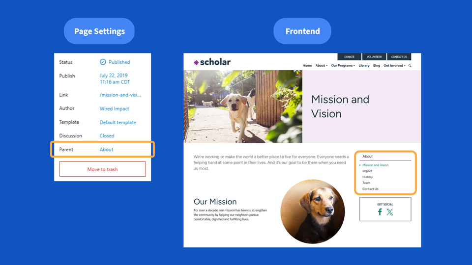
You’ll see on the left side, in Page Settings, we’ve chosen the About page as the parent page for our Mission and Vision page.
And then on the right, you can see the Mission and Vision page is safely nestled within the About section of our site. It’s showing up in the sidebar navigation. It’s reflected in the URL structure.
That way, visitors are going to easily be able to get to this page. They’re going to know where they are when they land on this page. They’re going to get to other sibling pages here in the sidebar navigation easily if they would like to.
Now, I know we just talked about landing pages a minute ago. Those actually often do make sense to be free-floating, especially if they’re part of a unique campaign.
You know, they have a specific audience, right? And if you’re going to be making a concerted effort to drive traffic to these landing pages through various distribution channels, it can make sense not to put them in your overarching website structure.
But generally speaking, you’re going to assign a parent page to most pages that you publish, assuming they should be in your website structure.
Avoid double-dipping in your menu
Next, you’re going to want to avoid double dipping in your menu. Sometimes we see organizations include the same page in multiple sections of their site or within multiple dropdowns in their navigation.
I totally see why this feels helpful. You want to give people more roads leading to a particular page. But it often has the opposite effect in practice. Generally, the reason this actually reduces engagement is visitors don’t know which path to trust, like which one is the right way to get there.
They might also be confused about whether these pages are the same or different. They might click on one expecting it to be different from the one they were on earlier, and seeing the same information makes things confusing.
So each page should only be in one dropdown in your primary navigation. If it overlaps, that’s totally fine. Just choose the most logical one that you think folks would think to look for it.
Build internal links for a clear path
And related to that, don’t forget about building internal links for a clear path. Thoughtfully building links between related pages can lead to huge lifts in website engagement.
And it also takes a lot of pressure off of your website navigation. We’re showing visitors a logical related page or resource, and we’re substantially increasing the chances that they’re going further engage with our website.
These links provide a very clear, easy-to-follow path for visitors. And they’re also really valuable and helpful for search engines to understand what your website is all about and how your content fits together.
Search engine optimization is a conversation for another day! But as we’ve just mentioned, there’s a lot of overlap between best practices that relate to your website navigation (your website structure) and optimizing your website for search engines, for answer engines like ChatGPT or Gemini, things like that.
So that’s it. Four easy ways to improve your nonprofit’s website navigation: Use clear page names; streamline your main menu; organize content by topic; and give each page one home in your structure.
If you do those four things, you’re going to be well on your way to improving your website structure and making it a whole lot easier for your visitors to ultimately find what they’re looking for.
What You Should Do Now
01. Come to Nonprofit Website Office Hours
We cover a new topic every few weeks. Plus get a live answer to any website-related question you're wrestling with.
02. Book a Website Call
Find a time to discuss your nonprofit's website needs. Discover what's worked for other nonprofits like you and see how easy building your new site can be.
03. Start a Free Website Trial
Try our nonprofit website platform for yourself. Instantly get access to every feature to see if it's the right fit for your needs. No credit card required.

Comments