People say that you eat with your eyes first, and that the best dishes are ones that look beautiful, too. The same can be said for website content.
When you consume content on a website, you are not only reading and evaluating the value of the content, but a large factor is how the content is laid out visually.
Think about the last time you read a blog post. All too often, that blog post lacked clear organization. You leave the page not because the information wouldn’t be helpful, but because it wasn’t presented in a way that enhanced your understanding.
This all may seem pretty intuitive, but we often see nonprofits struggle with the principles of formatting for usability and consistency. The best practices we outline below can be used for email newsletter campaigns, blog content or pages of your nonprofit’s website. Most of our examples are based around using WordPress, but are applicable across the board.
Create a Style Guide
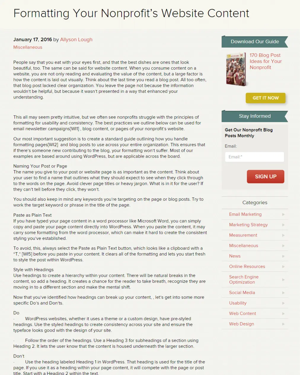
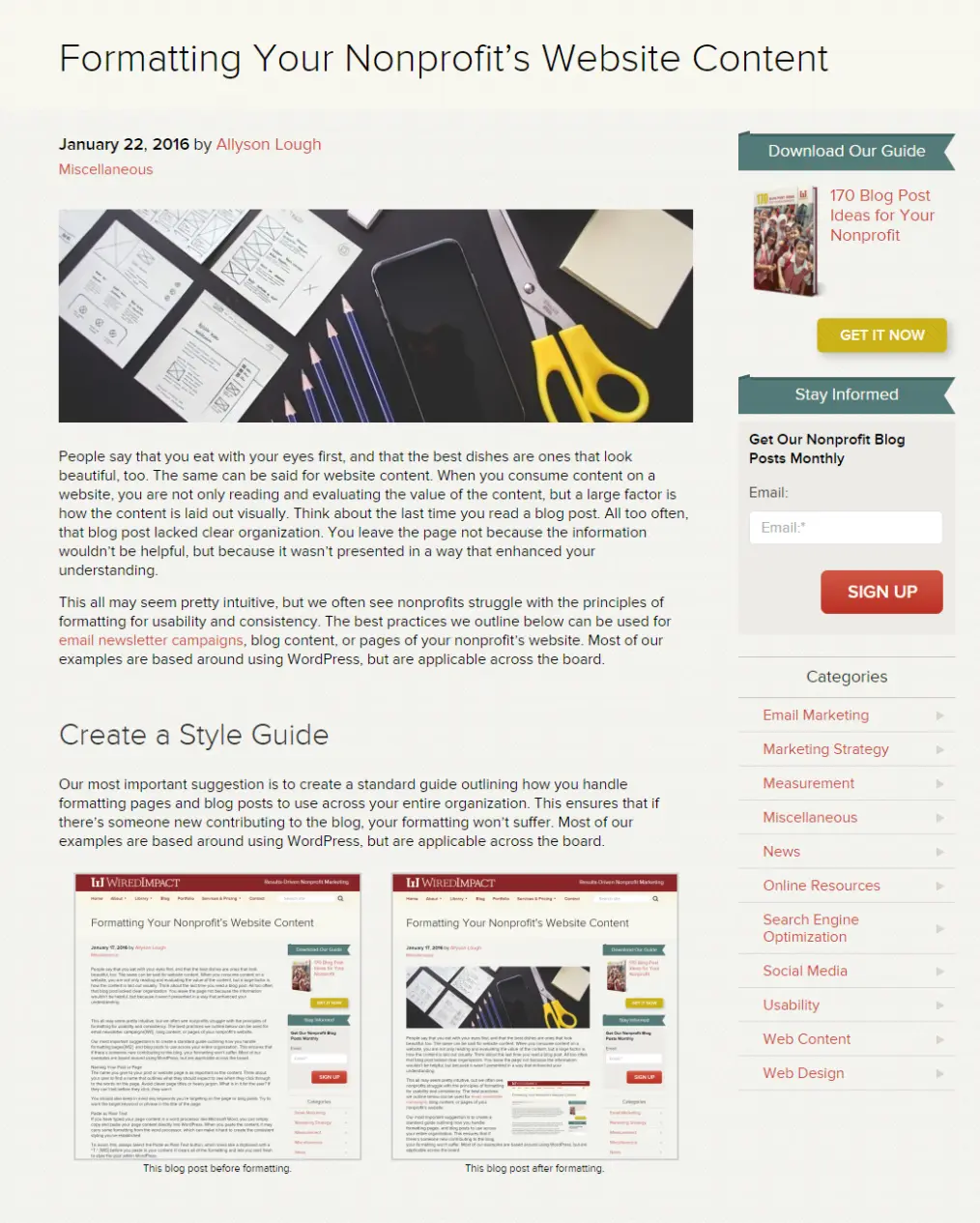
Our most important suggestion is to create a standard guide outlining how you handle formatting pages and blog posts to use across your entire organization. This ensures that if there’s someone new contributing to the blog, your formatting won’t suffer.


Naming Your Post or Page
The name you give to your post or page is as important as the content. Think about your user to find a name that outlines what they should expect to see when they click through to the words on the page. Avoid clever page titles or heavy jargon. What is in it for the user? If they can’t tell before they click, they won’t.
You should also keep in mind any keywords you’re targeting on the page or blog posts. Try to work the target keyword or phrase in the title of the page.
Paste as Plain Text
If you’ve typed your page content in a word processor like Microsoft Word, you can simply copy and paste your page content directly into WordPress. When you paste the content, it may carry some formatting from the word processor, which can make it hard to create the consistent styling you’ve established.

To avoid, this, always select the Paste as Plain Text button, which looks like a clipboard with a “T,” before you paste in your content. It clears all of the formatting and lets you start fresh to style the post within WordPress.
Style with Headings
Use headings to create a hierarchy within your content. There will be natural breaks in the content, so add a heading. It creates a chance for the reader to take a breath, recognize they are moving in to a different section and make the mental shift.
Now that you’ve identified how headings can break up your content, let’s get into some more specific Do’s and Don’ts.
Do
- WordPress websites, whether they use a theme or a custom design, have pre-styled headings. Use the styled headings to create consistency across your site and ensure the typeface looks good with the design of your site.
- Follow the order of the headings. Use a Heading 3 for subheadings of a section using Heading 2. It lets the user know that the content is housed underneath the larger section.
Don’t
- Use the heading labeled Heading 1 in WordPress. That heading is used for the title of the page. If you use it as a heading within your page content, it will compete with the page or post title. Start with a Heading 2 within the text.
- Use excessive bold and italic text or add in funky text colors. You may think it adds visual interest, but this will only make it harder to achieve consistency in your formatting and looks scattered to the user.
Create Lists
Whenever possible, add a list. This can be with numbers or bullets, but a list will help visitors easily scan through your content and pick out the key information. They don’t need blocks of content if it could be made into a list. Just remember, the simpler, the better.
Add Links
Always cross link to other posts or helpful resources within your page content or blog post. It’ll direct readers to potentially helpful content that you’ve written in the past, and keeps them on your site longer. As a general rule, we suggest avoiding Click Here links. Be more descriptive about what a reader will see when they click on the link.
Use Visuals
Visually representing the work your nonprofit does within your content is important, but you probably already know that. Selecting the best images is the first step to communicating your work on a website page. Formatting those images also requires several steps.
- Crop and name your image before uploading it to your website
- Upload the image and add in alt text
- Use the wrapping tools to make sure your image lays well within the page content
- Preview your images within the content before publishing your post or page
These basic formatting tips will elevate the perceived value of your nonprofit to users and create a more consistent look throughout your online content. Do you have any other formatting rules of thumb you use at your organization? We’d love to hear about them in the comment section below!
What You Should Do Now
01. Come to Nonprofit Website Office Hours
We cover a new topic every few weeks. Plus get a live answer to any website-related question you're wrestling with.
02. Book a Website Call
Find a time to discuss your nonprofit's website needs. Discover what's worked for other nonprofits like you and see how easy building your new site can be.
03. Start a Free Website Trial
Try our nonprofit website platform for yourself. Instantly get access to every feature to see if it's the right fit for your needs. No credit card required.

These tips are really useful and it guide us to formatting the blog in a right way and in a useful manner.
Thanks so much for your comment! Glad to hear that the formatting tips were helpful.