Photos can make a website pop. Icons and infographics are other ways to visually punch up your website, but there’s no better way to convey your nonprofit’s story than through photos.
There’s a lot to say in terms of the technical composition of a photos, such as color, sizing, contrast and depth of field. But this post will specifically address how to evaluate photos that can help communicate a story and compel action. Whether you’re going through a massive amount of stock photos or your own images taken by a photographer, here are some questions to ask yourself in order to quickly weed out the bad and keep an eye on the good.
Do I really need this photo or will it just be filler?
A big misconception about using photos on a website is that more is better. Not true; quality trumps quantity every time. Photos shouldn’t be filler or purely decorative. And the last thing you want to do is bombard your website visitors with too many photos; it’s visually overwhelming and distracting. Images should be carefully selected and placed throughout the site in a deliberate, discerning manner. Be thoughtful (and picky) about the images you choose and make sure that your photos have a purpose. Choose photos that contextualize, enhance and visualize the story you’re trying to tell.
Does the photo tell a story?
When you’re thinking about how to evaluate photos, start by looking for a narrative in a photo by examining the details and considering the focal point. One important thing to consider is that the story behind photos should be clear from the outset. Photos should convey a message or story that isn’t really up for interpretation; the last thing you want to do is confuse people or select a photo that can obscure the message you’re trying to communicate. Think about what the photo communicates, its underlying message, and how you can bridge that to your nonprofit’s story.
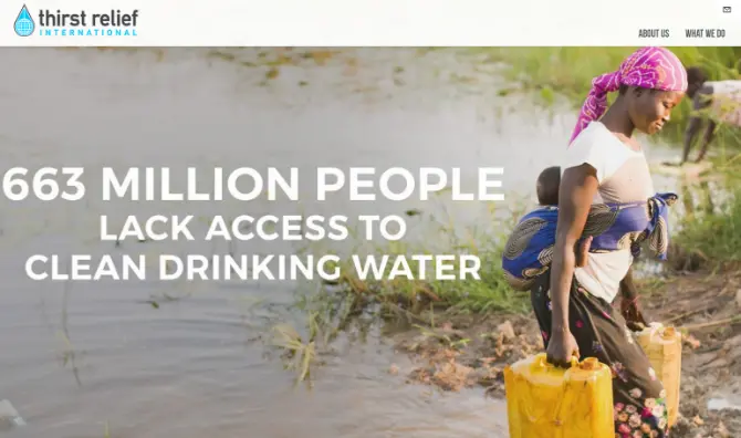
The large banner image (also known as a hero image) on Thirst Relief International powerfully tells its story by marrying content and visuals. While the content and the photo could stand alone, the impact is more powerful together in this context. This image is the first thing you see on the website and it immediately pulls you in.

Are there people in the photo?
People connect with people. Photos featuring people can communicate that your nonprofit is genuine and authentic, which helps build credibility with audiences. Wherever possible (and respecting confidentiality issues), use photos of real people connected to your nonprofit like your staff, volunteers and people who have benefited from your services. For example, photos of kids engrossed in a science project are much more effective than just an image of a textbooks. Another tip is to select photos that reflect realness by choosing candid shots (rather than perfectly posed photos) that represent the diversity and personality of your organization.
What emotion does the photo evoke?
Leverage the emotional potential of photos and select photos that make people feel happy, inspired, or moved enough to support your nonprofit. It’s definitely not a hard and fast rule, but photos with bright colors tend to convey a happy or upbeat outlook. While black and white photos can be associated with a more somber emotion, they also tend to be more dramatic and powerful.
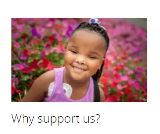
St. Jude’s website features photos that capitalize on its great people and mission. Their photos strike an emotional chord that aligns with the organization’s branding; it’s joyful, bright, optimistic and hopeful.
Does the photo compel action?
The power to persuade is closely related to emotion. There tends to be an emotional reason or connection behind most of the purchasing decisions people make online. Use that same principle for your nonprofit as you try to convert people to donate, sign-up or volunteer. Your photos should complement and reinforce all major Calls to Action on your website. Select photos that capture the right people, actions, and context to motivate people to support you.
Does the photo reinforce our brand?
Make sure the photos are consistent with your overall look and across all of your platforms. There should be visual cohesion in your photos that unify your branding in print collateral. This can be achieved through consistent photo styling – cropping, coloring, and filters.
As you sort and sift through photos, make sure the ones you select will be impactful and appealing. Have any other tips on how to evaluate photos to tell your nonprofit’s message? Let us know in the comments below.
What You Should Do Now
01. Come to Nonprofit Website Office Hours
We cover a new topic every few weeks. Plus get a live answer to any website-related question you're wrestling with.
02. Book a Website Call
Find a time to discuss your nonprofit's website needs. Discover what's worked for other nonprofits like you and see how easy building your new site can be.
03. Start a Free Website Trial
Try our nonprofit website platform for yourself. Instantly get access to every feature to see if it's the right fit for your needs. No credit card required.


Comments