Writing content is one thing, but being able to logically organize it is another. Knowing how to structure your website is an essential part of the process.
Sure, the website structure isn’t as flashy as design, or as exciting as functionality, but it’s the logic behind all of the content on your site. Without a thoughtfully developed sitemap, visitors to your nonprofit’s website could get stuck in a jumbled mess of pages and leave in frustration.
Why It’s Important
You want visitors to your website to be able to find what they’re looking for, and easily. Never (ever) underestimate the comforting feeling of finding something exactly where you’d expect it to be. It’s a simple and effective way to build trust and lead your new website visitor from whichever page they land on all the way to your nonprofit’s donate page.
The sitemap affects search engine rankings, as well as usability. To index pages and return them in search results, the pages need to be easily accessible for each search engine’s site crawl. Google has said that it uses things like click-through and bounce rates in its algorithm.
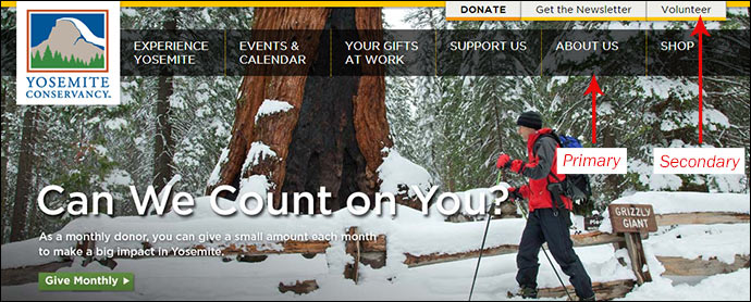
Let’s start with the primary navigation, which is that horizontal bar at the top of each page and the starting point for traversing a website.
Primary Navigation
Focus on logic and simplicity. For the primary navigation, we’ve found that 5 – 7 big buckets (including Home) are a great starting point. These are buckets that all of your content should logically fall into, not necessarily a list of the most important pages, and definitely not a list of your audiences. You’ll probably want pages like About Us, Our Impact and Get Involved in here. If you can, try to keep these page names on the shorter side for design purposes.
Secondary Navigation
If your primary navigation is getting too cluttered, consider utilizing a secondary navigation. This is generally found in the top right-hand corner of a page and is great for more actionable items. You can include pages like donate, volunteer or a phone number, depending on your nonprofit’s website goals.
Pages Not in the Navigation
Not every available page should be included in the navigation. These are your thank you pages, your privacy policy, and maybe a registration form not available to the average user. These types of pages are pretty easy to overlook, but you’ll want to be sure you include all of the pages that’ll be on your website. While we’re on the subject, it’s a good idea to include thank you pages for any forms that you plan on including on your site. If a visitor goes to the trouble of giving you their information, whether it’s for volunteering, donating or registering for an event, create a page to thank them once they’ve submitted the form.
Fill Your Buckets
This is the easy part! Now that you have your big buckets, it’s time to fill them with the rest of your pages. Place pages in the most logical bucket so that users will be able to easily find each one. As you go, think of your average website visitor. Would they think to look here for this content?
Start planning your website structure with our free guide and template.
If you find you have pages with too much content on them, it’s definitely okay to create subpages, or even save some of the content for future blog posts. But try not to make your overall site structure too deep. As a general rule, you don’t want visitors to have to click more than three times to reach each page. If you have more than three clicks, and you may be unintentionally hiding pages.
Test Your Work
At this point, you should have a pretty good idea about how to structure your website. As with any massive undertaking such as this one, it’s nice to have a team member take a look at the structure. They could have some great ideas on how to structure your website. You could even give them a quick test. Give them a list of pages to look for and see if they can easily find them on the sitemap. If it they can’t easily find them, you may need to re-think your organization.
Do you know how to structure your website? What’s been your experience with creating sitemaps? What did your process look like? We’d love to hear from you in the comments!
What You Should Do Now
01. Come to Nonprofit Website Office Hours
We cover a new topic every few weeks. Plus get a live answer to any website-related question you're wrestling with.
02. Book a Website Call
Find a time to discuss your nonprofit's website needs. Discover what's worked for other nonprofits like you and see how easy building your new site can be.
03. Start a Free Website Trial
Try our nonprofit website platform for yourself. Instantly get access to every feature to see if it's the right fit for your needs. No credit card required.


great navigation bar article
Thanks for commenting, Mayson. I’m happy you found the post helpful!