Visual content is compelling, and it can have a significant impact on how we perceive the world and the people in it. We see and consume images of people all the time—on social media, on websites, on television, in advertisements, in print, and in our everyday surroundings.
The images that we see in the media and advertising, in particular, can shape our culture by defining the standards of who and what is deemed normal or beautiful. At its worst, advertising can help to reinforce biases, prejudices, and stereotypes, and as a result, the images we consume do not always accurately reflect reality.
Based on our expertise at Envato Elements, learn five practical strategies for any organization looking to create engaging and inclusive visual content that will represent and appeal to a diverse audience.
The Problem with Non-inclusive Imagery
Images that are not representative of broader society, and instead help to maintain the status quo, are problematic because they perpetuate social and cultural inequalities. If we don’t fit into the narrow optimum demographic created for us, they can harm how we see ourselves and our perceived worth.
What is Diverse and Inclusive Imagery?
Just because an image includes a diverse group of people does not mean they will all be represented equally or in an inclusive manner. The biases of photographers–as well as photo editors, stock photo curators, and designers–can often be revealed in subtle yet potentially discriminatory ways.
Here are some of the terms to consider when it comes to inclusive and non-inclusive imagery:
- Diversity: The illustration of marked differences, lived experiences, and visible and invisible identities that distinguish one group from another.
- Inclusion: A culture that values and welcomes different points of view. Individuals and groups can feel safe and respected for who they are and what they bring to the table.
- Unconscious bias: These are the stereotypes that we have about certain individuals or groups that we develop outside of our own conscious awareness. These biases tend to stem from our desire to speed up the thinking process and organize groups into categories.
- Tokenism: The practice of making only a symbolic effort to be inclusive of underrepresented people, especially by recruiting or including a small number of underrepresented people in order to give the appearance of equality.
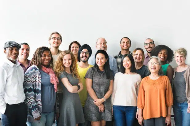
While most mainstream visual content does not accurately or inclusively represent people of different backgrounds, this issue can be addressed. If we choose to share and create imagery that includes a diverse range of people and portrays them as equals it can have a positive impact on our culture.
Why Does Diverse and Inclusive Visual Content Matter for Nonprofits?
Nonprofits rely on building, nurturing, and growing a vibrant, active community. This is difficult to achieve without effectively representing the people from the communities you’re trying to reach or support, including various backgrounds, orientations, and perspectives. Examining the way you’re currently engaging with your community is the first step toward improving your approach to diversity and inclusion.
- Are your visual assets–photography, illustrations, icons–accessible to and representative of your community and their backgrounds and experiences?
- Is your messaging accessible and appealing to people that make up your community, including catering to different demographics, languages, and cultures?
If you’re not sure, get feedback from your team. Most likely, you already have access to a variety of viewpoints and perspectives, and if you don’t, consider asking why.
As a nonprofit, you can deliver more effective support and services by being inclusive in your messaging and visual content and seeking to understand your audiences:
- To build a strong, diverse community, and cultivate genuine, authentic relationships.
- To gain a better understanding of different viewpoints and avoid using tone-deaf or exclusive language.
- To make a stronger connection with the people and communities you’re trying to reach.
If you get it right, you’ll be more inclusive to both those on the receiving end of your support and services, as well as those that donate money to your not-for-profit organization.
5 Tips for Choosing Inclusive and Diverse Imagery
Your audience wants to see themselves in your content, and more importantly, they want to know that you see and understand them, too. Choosing better images requires extra care. There are a lot of poor quality and unrepresentative images out there, so here are some guidelines to consider when choosing inclusive imagery.
1. Make a demographic checklist
Before you start your search for the perfect photo or illustration, take a quick inventory of what kinds of images typically appear first in the list of results for your search terms. Consider some of the terms you could use to ensure you’re featuring a diversity of imagery across the following:
- Gender: Gender diversity is used to mean including images of strong, independent women, but gender is a broad concept that includes attitudes, feelings, roles, and behaviors. Gender can be thought of in two ways: gender identity, or how you see yourself, and gender expression, or how you express your gender identity outwardly.
- Abilities: Visual content featuring people with disabilities can help shift the focus away from stereotypes and good intentions and toward the richness and complexity of their real lives. The emphasis on the individual, rather than their physical or cognitive impairment, reflects the reality that millions of consumers live active, dynamic lives despite visible or invisible disabilities—and they, and the people in their lives, deserve to be recognized.
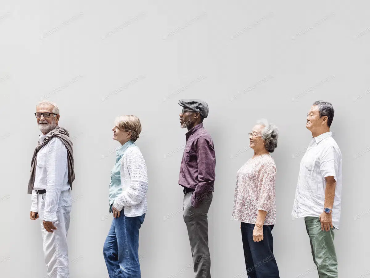
- Age: Marketers frequently overlook a universal truth: we all get older. Older consumers are a powerful and growing demographic, but according to research, 79% of people over the age of 50 do not believe they are accurately portrayed in advertising. Including older people older than 50 in your campaigns helps your marketing reflect reality and gives you a better chance of tapping into this growing market.
- Body type: Displaying realistic and diverse bodies is a daring and inclusive step that can help your campaign stand out and even improve brand perception. Marketing and advertising have traditionally promoted unrealistic body types from predominantly young, white models. Using imagery that depicts people in all shapes, sizes, and complexions can connect with audiences in a very authentic way—which is every nonprofit’s goal.
2. Keep your bias in check
In addition to following a demographic checklist, ask yourself a few simple questions to recognize your own biases, and identify groups of people you may be overlooking.
- Are any stereotypes being perpetuated in the image I’m using?
- Would I want to be portrayed this way?
- Who is missing or excluded?
- Can everyone who might view the image see someone like themselves represented?
The imagery we see frequently excludes underrepresented and marginalized groups of people, and when they do appear, they are commonly portrayed in stereotypical ways. To avoid preserving existing stereotypes, choose visual content that purposefully puts different types of people in the spotlight, particularly in roles or circumstances that they might not typically be associated with.
3. Use specific search terms and filters
When you’re looking for an image, it can be tempting to grab the first decent one you find at the top of the search results.
However, images at the top of your search results can be the least diverse, representing only the “default” of young, attractive, straight, and usually white people. Using filters to support your search terms can eventuate in you selecting from a more diverse and inclusive choice of imagery.
- Understand how stock photo sites work: It can have genuinely harmful repercussions when stock photography isn’t done well. There have been multiple instances where stock photography has unintentionally perpetuated racist, ableist, and overall damaging stereotypes.
- Develop an inclusive keyword library (for getting diverse results): It’s critical to spend time digging deep in addition to using filters and keywords. Don’t limit yourself to the first page of results. Rather than picking one of the first few you see, commit to spending a few extra minutes finding one that both addresses your brief and is inclusive.
4. Pay attention to photo composition
Choosing images that appear to be “diverse and inclusive” on the surface may be doing more harm than good. When selecting or shooting photos, pay close attention to how people are positioned in the frame. What is the point of focus? Is the image cropped in a way that it appears to favor one group over another, and is therefore reinforcing biases?
These questions may seem insignificant, but small choices like these have the power to shift your nonprofit’s visuals to be more inclusive.
5. Learn from other companies
Don’t give up if you’re having trouble creating inclusive visual content for your nonprofit. Instead, get some inspiration from brands doing it right.
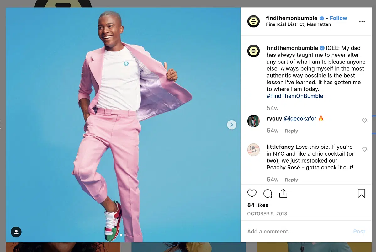
- Make it human: To create inclusive visual content, you don’t need to run a campaign solely focused on diversity or equality. You can create inclusive content by highlighting your actual customers in your visual assets, like the dating ad Bumble did in its #FindThemOnBumble campaign. The brand invited inspiring creatives, artists, and change-makers from around New York City to appear in the campaign, and in the process represented the diversity of its audience in a creative and authentic way.
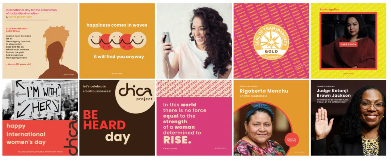
- Make it real: Chica Project is a non-profit organization whose mission is to close the opportunity divide for Latina and other Women of Color. To enforce this brand message, they showcase real women of all ages, shapes, and sizes, rather than touched-up, high-fashion models.
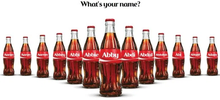
- Celebrate variety: To connect with your audience from different parts of the world, you must create campaigns representing diverse communities and cultures. Coca-Cola has been running its “Share a Coke” campaign since 2013, with labels on bottles that include names from all over the world. When people see their name or the name of someone they know, they frequently post images of the bottles on social media, making it highly shareable and visual content that people can identify with.
Build an Inclusive Visual Content Strategy for 2022
Understanding and embracing what makes your audience unique is what inclusive visual content is all about. By emphasizing what’s interesting, inspiring, individual, or different about your not-for-profit community and how you support them, you may attract new donors and advocates who see your marketing campaigns, begin to identify more with your mission, and realize that your nonprofit aligns with their own values.
This is a guest post written by Lily López. Lily is a Content Writer and Marketer at Envato by day and a Spatial Design student by night. She has worked with several global clients for the past 7 years developing projects involving Content Operations, Data Analytics, Copywriting, Outreach, and Voice-over productions. When not working, Lily can be found hanging out at the nearest flea market.
What You Should Do Now
01. Come to Nonprofit Website Office Hours
We cover a new topic every few weeks. Plus get a live answer to any website-related question you're wrestling with.
02. Book a Website Call
Find a time to discuss your nonprofit's website needs. Discover what's worked for other nonprofits like you and see how easy building your new site can be.
03. Start a Free Website Trial
Try our nonprofit website platform for yourself. Instantly get access to every feature to see if it's the right fit for your needs. No credit card required.
Good article. Another thing to be more inclusive with images is to add image descriptions or alt-text so people who are blind or low-vision can have access to the information.
We completely agree! For anyone wanting to learn more about accessiblity, check out another recent post, 11 Achievable Ways to Improve Your Nonprofit Website’s Accessibility.