You’ve probably heard about the benefits of showing your nonprofit’s impact for several years now. But where and how do you put these things on your website? Go beyond the blog and create an interactive map that shows your mission, stories and impact on a whole new scale.
Why Make an Interactive Map?
It’s not uncommon to see websites with static maps that show general locations or service areas. More and more, you’ll also find sites that provide more user-friendly Google maps, which offer the ability to get driving directions or zoom around impacted areas.
But online maps can do more than show people where your next event is or the counties you serve! Even the most popular mapping software out there is already focused on storytelling with maps. What about you?
As a self-described map nerd, it doesn’t take much to convince me that an interactive map is worth the effort. I think any type of nonprofit can put an map to good use. But if you’re wondering how it can help you reach your marketing and outreach goals, here are just a few reasons to use a web map:
- Share stories based on location, like different volunteer sites or where your donors live.
- Publish user-generated content like photos or video testimonials that are site-specific.
- Offer an engagement tool for people to enjoy, click and share, boosting their web experience while educating them about your mission.
- Consolidate and visualize information about your nonprofit’s impact in different places and over time, showing what has been, what is now, and can be with continued support.
- Promote programs and opportunities that might be of interest to participants, volunteers and donors who want to make a difference where they live, work or play.
Nonprofit Web Map Examples
It’s natural for environmental and recreation-focused nonprofits to use web maps to talk about their impact and missions, so I’ve rounded up groups working in education, religion, human rights, hunger, disaster response and impact investing to show you the possibilities. You’ll also see a range of technologies and design work involved, from custom programming to Google’s free map resources.
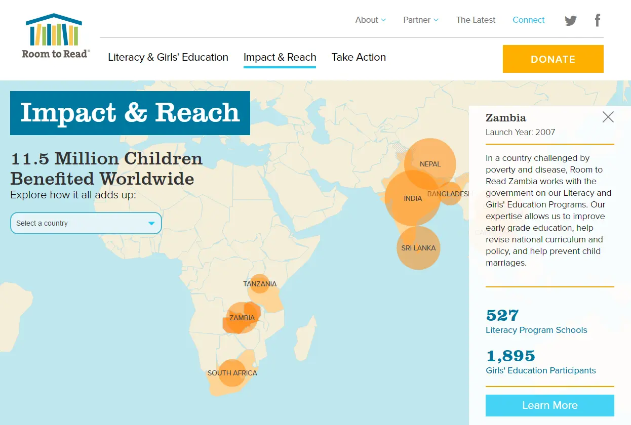
Room to Read
A huge, full-width map is a major feature of the Impact & Reach section on the Room to Read website. Users can get quick stats by rolling over each location or clicking to see more about a specific country and go to a related profile page with background information, stats, stories and a donation form.
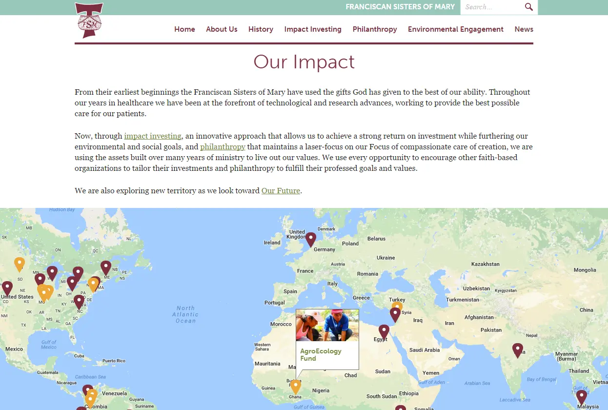
Franciscan Sisters of Mary
Here’s one from our portfolio! Because of the global nature of their impact investing, the Franciscan Sisters of Mary requested that we create a pinpoint-based map that helps users to see the diversity of projects with a clickable title and thumbnail image. Each project has it’s own subpage with photos, videos and partner information. Featured on the homepage, the map also lives on the Our Impact page.
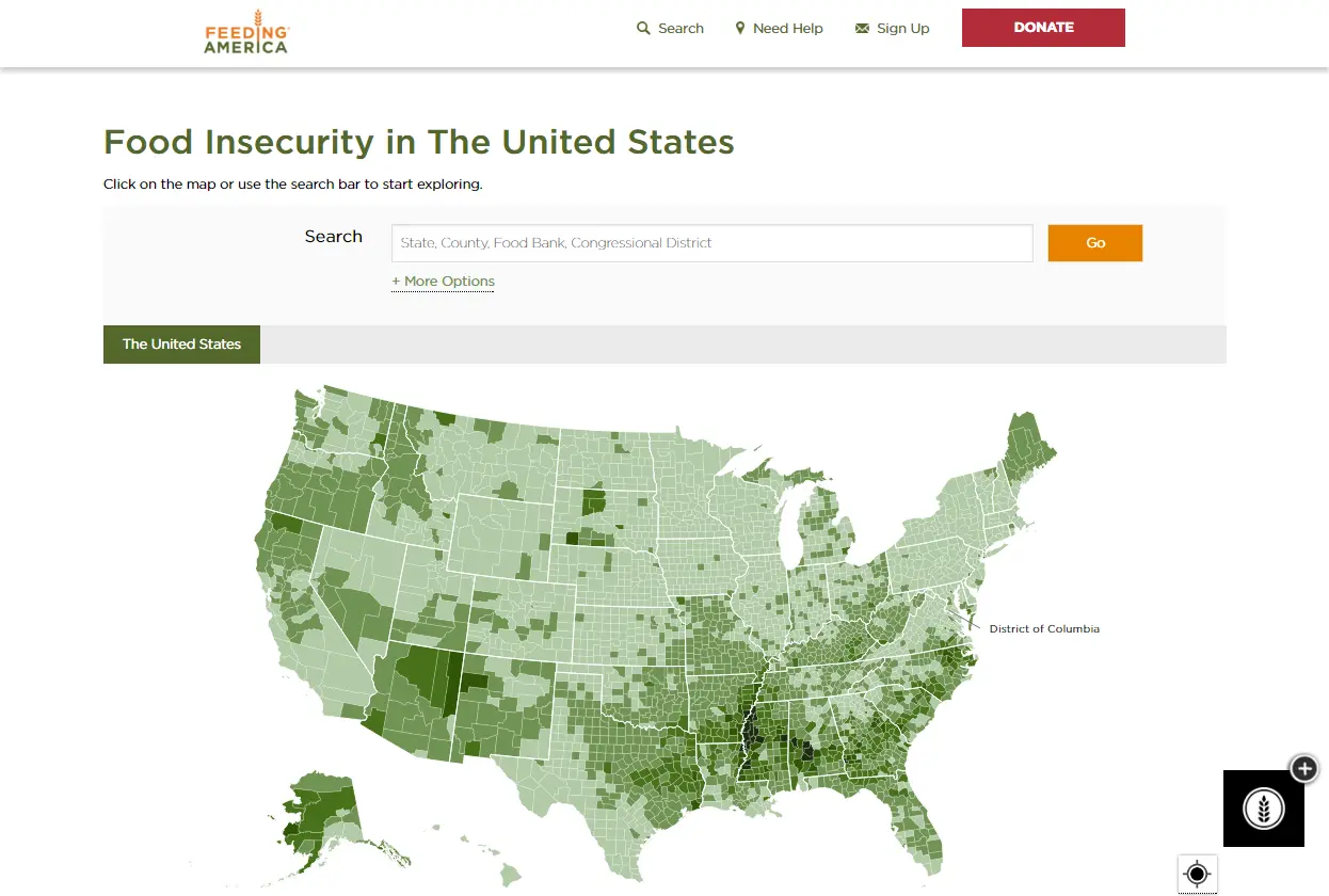
Feeding America
The Map the Meal Gap project does an incredible job presenting an abundance of data in map form and giving users control to explore their interests. It lives in the educational Hunger in America part of their site, serving an important role in communicating the need for action no matter where someone lives.
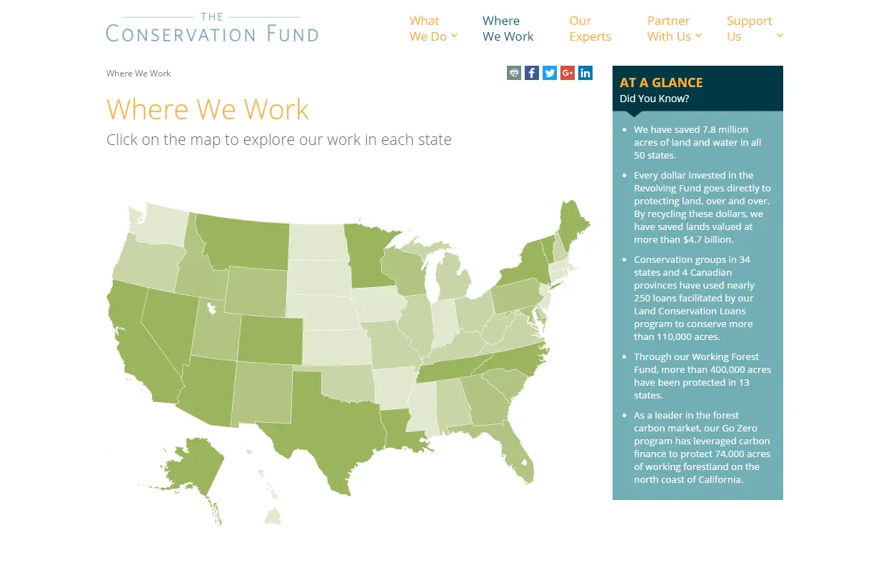
The Conservation Fund
There’s a strategic simplicity to this Where We Work map from The Conservation Fund. Rather than just sending people to individual state pages, the map does the extra job of showing acres saved in each place. By clicking on a state, visitors go to a profile page that spells out the impact of their work with stats and related content pulled in from other parts of the site.
UPDATE: For anyone wondering, this map was created using Mapbox combined with Leaflet.
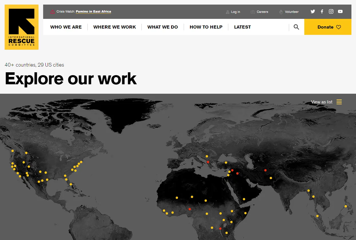
International Rescue Committee
Like the previous example, this Where We Work map for the International Rescue Committee offers site-specific information with an extra level of detail in the legend. I also appreciate that there’s a menu in the top right for users that want to view information as a list. By clicking on a location, you’re taken to a country-specific page with quick facts, related news, videos and press releases. The huge images at the top of each country page tell their own stories, too.
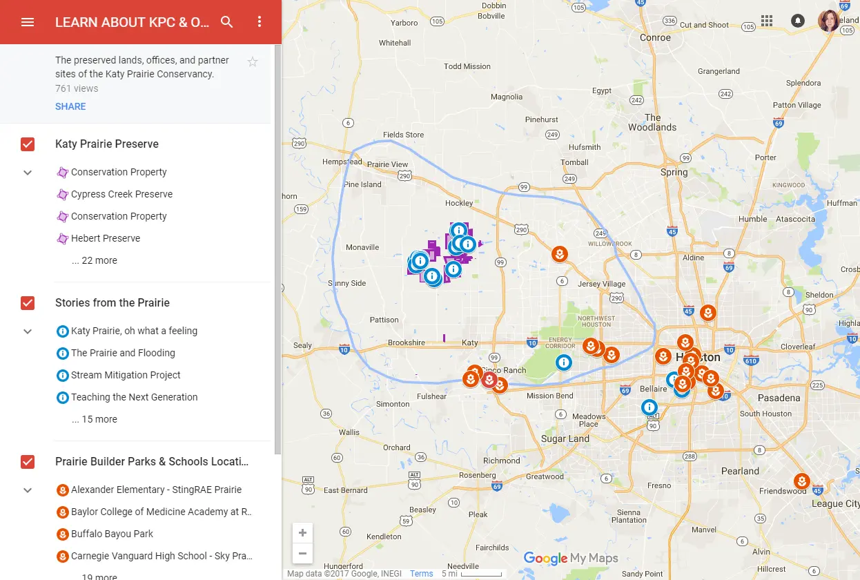
Katy Prairie Conservancy
Although it’s not integrated within their website, this multi-layer web map from the Katy Prairie Conservancy is a great example of what’s possible using free (and relatively painless) tools like Google Maps. Users can filter information based on what they want to learn and see, such as where conserved properties are located and where programs take place. But my favorite part is how they’ve added in and repurposed their video stories in a way that brings the map to life.
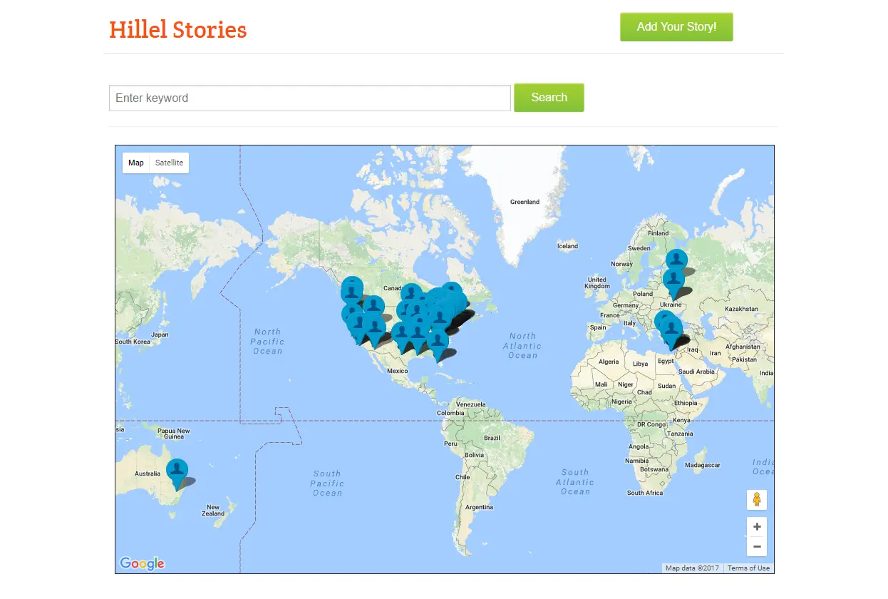
Hillel International
Here’s another nice use of Google maps. Hillel International has consolidated posts from the Hillel Stories section of their site into an interactive map that allows users to zoom and pan to locations of their choice. The map is promoted throughout the Stories section, and Hillel makes good use of the map page by including a CTA button to “Add Your Story!” For visitors that would rather browse stories outside of the map, there’s a search bar as well as a list of stories.
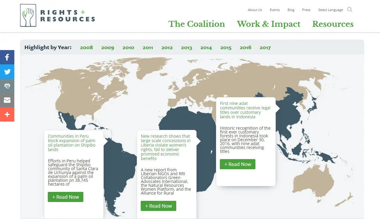
Rights and Resources Initiative
On their Impact Stories page, the Rights and Resources Initiative shows their collective impact over time by using a map-based timeline. Users can select the year to see stories of accomplishment from that year and around the world, clicking each to read more and find related content. Be sure to check out how the page scales for different screen sizes — transforming to a list of stories by year once you get too small. Great touch!
Next Steps
Getting started with basic maps is within reach for the DIY marketer using tools like ESRI’s Nonprofit Organization Program, online classes (here’s one from Lynda.com) or by reaching out to a local college or university about working with a student or class studying geographic information system (GIS) science. For more involved map systems, it’s probably best to work with a partner or vendor that has mapping, programming and design skills.
Adding an interactive map to your nonprofit’s website offers a different way to communicate what you do, where you do it, and the very real impact. Feeling inspired? Start talking to supporters and constituents about what they would use and find interesting — but make sure your map is also easy for you to update with new information. Like any piece of content on your website, you’ll want to keep it fresh and engaging over time.
Have you seen online interactive maps that do a great job? What’s keeping you from using a map to show your nonprofit’s impact and share stories? I’d love to hear your thoughts in the comments and see examples you’ve found, too.
What You Should Do Now
01. Come to Nonprofit Website Office Hours
We cover a new topic every few weeks. Plus get a live answer to any website-related question you're wrestling with.
02. Book a Website Call
Find a time to discuss your nonprofit's website needs. Discover what's worked for other nonprofits like you and see how easy building your new site can be.
03. Start a Free Website Trial
Try our nonprofit website platform for yourself. Instantly get access to every feature to see if it's the right fit for your needs. No credit card required.
Comments