
 Alex McQueary
 Just because the footer of a website is at the bottom of a web page certainly doesn’t mean that it should be neglected. A footer is an organization’s last opportunity to get users to where they need to go and to serve them important information. We’ve rounded up 10 nonprofits with great website footers to spark some inspiration for your own website.
Footer Design Basics
You may notice that great website footers are designed in wildly different ways. Some are short and to the point. Some are pretty large, packed with important information. While there are no hard and fast rules for what should go into great website footers, a footer absolutely should direct site visitors to places your organization deems important. Whether this means repeating your primary navigation, adding in calls to action or dishing up some information about your parent organization, it’s important to make the most out of this valuable last bit of space living on each page of your website, both on desktop and on mobile devices.
Examples of Great Website Footers
Looking for great website footers for inspiration? Check out these 10 nonprofits that are knocking footers out of the park.
Case Foundation
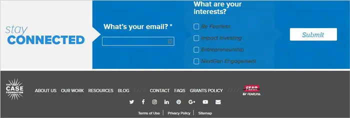
The Case Foundation includes relatively minimal information in their footer. Featured prominently is a uniquely-designed, easy-to-fill-out form to receive ongoing information about several topics. The footer also features the organization’s primary navigation and a few other helpful links, as well as social icons and fine print links, such as terms of use and privacy policy.
On mobile, the information is re-prioritized. The newsletter sign-up form remains prominent and the navigation links disappear while social media links and fine print links stay put. On the mobile version of this website, the header moves down the page with the user, so it’s still very easy for a user to get where they want to go no matter where they are on the page. This makes it unnecessary to include the navigation in the footer on mobile screen sizes.
Girls Who Code
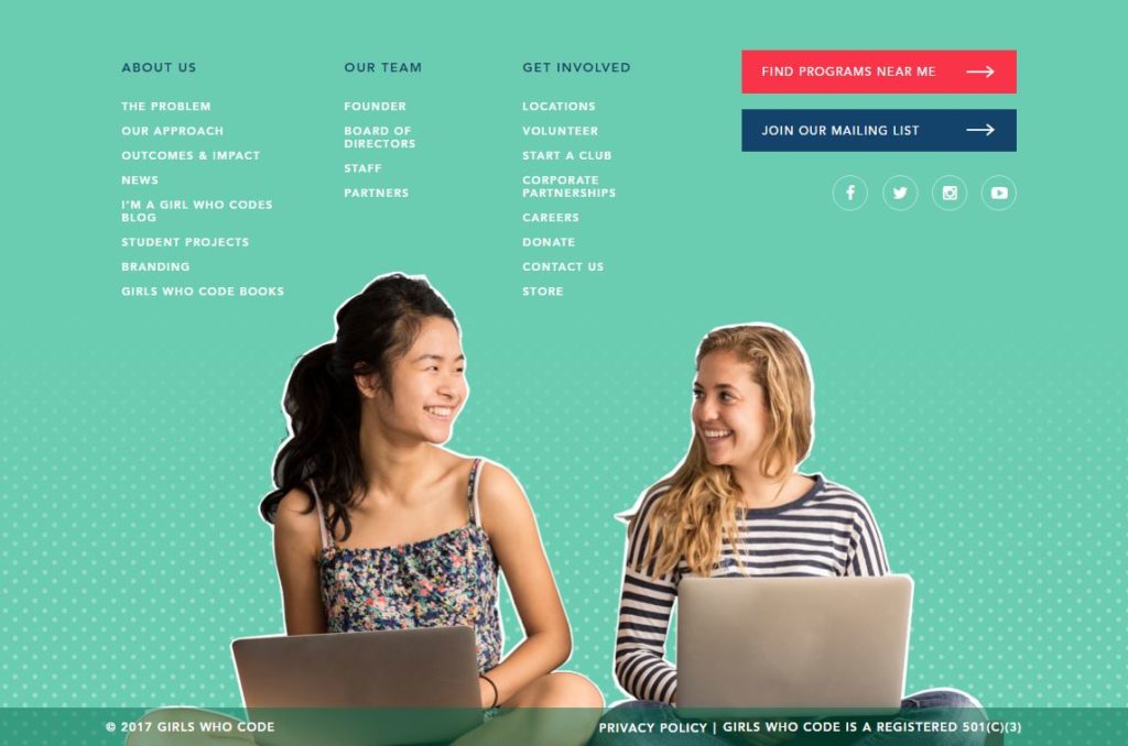
While most of the time great website footers are designed relatively minimally, Girls Who Code proves that sprucing up a footer with images and fun colors can still provide a clean and clear footer experience. First, a menu of links is provided for visitors who have made it to the bottom of the page, featuring some priority pages. Calls to action coupled with social media icons follow the page links to entice visitors to engage even further. Finally, at the very bottom of the footer, they’ve added copyright information, a link to their privacy policy and a readily available statement that they have 501(c)3 status, which can promote credibility.
On mobile, Girls Who Code shrinks their navigation up into an expandable menu, which allows users to still access all of the links that are out in the open on the desktop version of the site. The calls to action fall underneath the nav, while the social icons disappear and all of the copyright, fine print and nonprofit information remains at the very bottom. On mobile, it seems they are prioritizing their internal links over pushing visitors to external social media sites.
Fight Colorectal Cancer
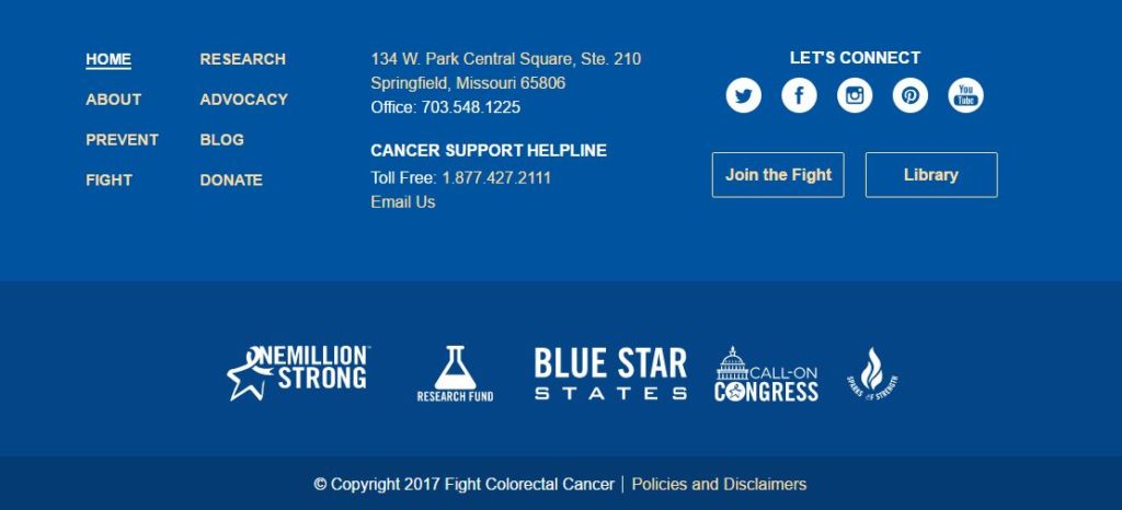
The Fight CRC footer is divided into three main sections. The top section begins with their navigation from the header to make it easy for users to jump to other areas of the site. They then provide contact information, as well as easy access to a cancer support helpline, and finally social media icons with two calls to action to get involved and to explore their library.
The middle section of the footer showcases prominent icons of their largest campaigns, making it easy for users to browse advocacy and research campaigns in depth. And the third section of the footer houses the copyright and fine print links at the bottom.
On mobile, the order of the footer information remains largely intact with some minor tweaks. The navigation is pulled out to save vertical space, and a “back to top” button makes it easy to shoot up to the top of the page. The contact information, social media icons and call to action buttons make up the top section of the footer, while campaign icons follow in the middle section and the fine print brings up the rear, as on desktop screens.
HeForShe
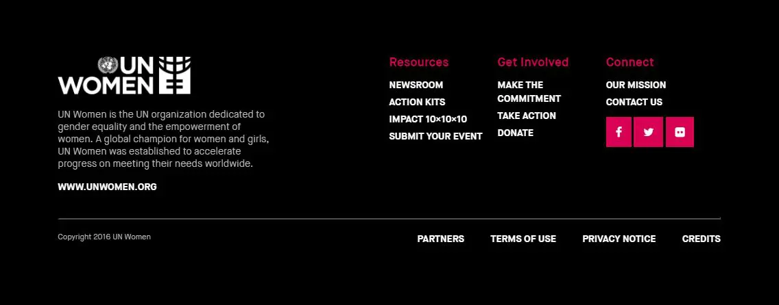
HeForShe has a high contrast footer, using a mostly black and white color scheme with their bright brand-magenta peppered throughout to make certain items really stand out. In contrast to some of the organizations we’ve looked at so far, HeForShe highlights a bit of information about their parent organization at the forefront of the footer. They also provide a variety of important links, social media, copyright information and other fine print links.
On mobile, all of the original information is kept intact and stacks up vertically so all of their important information can be seen.
The Kennedy Forum
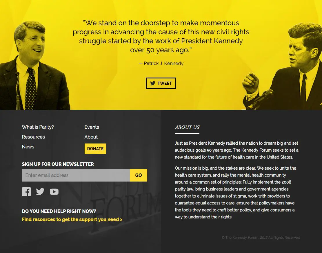
The Kennedy Forum’s footer is unique in that it’s quite tall and includes an extremely visual, tweetable quote from Patrick Kennedy at the top. On desktop screens, the footer houses a bright yellow section with this inspirational quote along with photos of Patrick himself and President John Kennedy. Following is a large button calling users to tweet this quote.
Below the quote section is the more traditional part of the footer, divided into two sections. The left half starts with a few important links, followed by a button to donate, a newsletter sign-up form and social media links. Finally, a heading with the powerful question “Do you need help right now?” with a link to find support resources brings this section to a close. The right half of the footer contains two short paragraphs about the organization with copyright information at the bottom.
On mobile screens, none of this information is taken away. The photos are omitted from the quote section to save some vertical space (but keep the emotional impact), and the rest of the information stacks up in the order it’s found on the desktop version of the footer.
Malala Fund
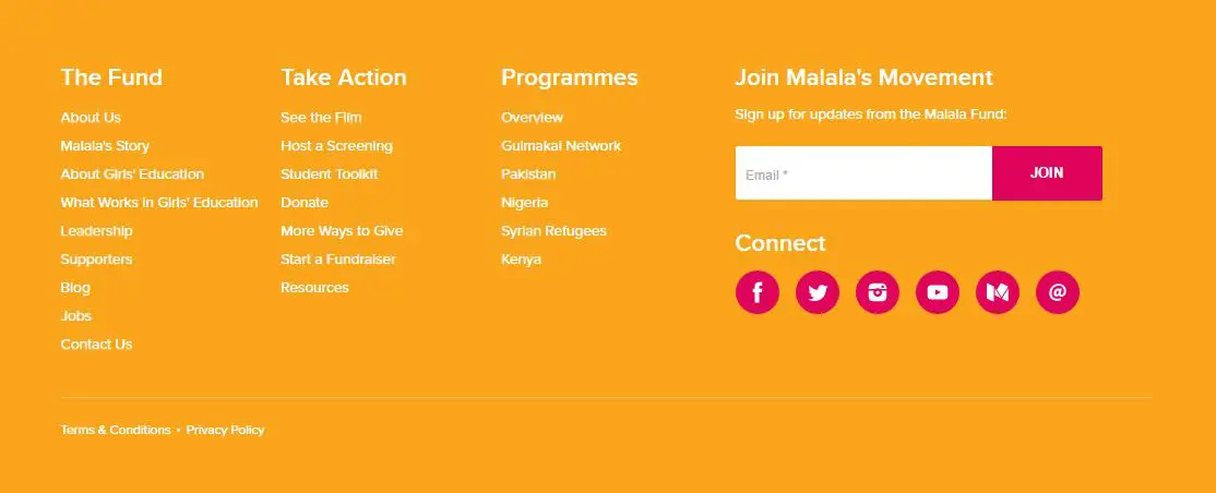
The Malala Fund’s footer is pretty straightforward and well-organized. Several of the pages within their website are linked in the footer under three main buckets of information: The Fund, Take Action and Programmes. To the right of the page links, you’ll find the newsletter sign-up form and social media icons, with fine print links at the very bottom.
On mobile, all of the page link sections stack one on top of the other, with the newsletter and social media calls to action following and the fine print bringing up the rear. This goes to show that even a no-frills footer can be incredibly helpful for a user.
Natural Resources Defense Council
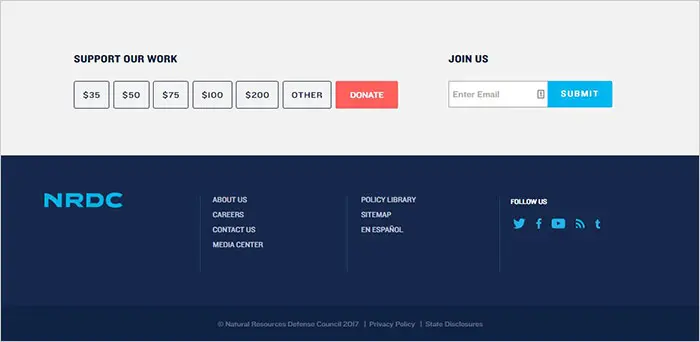
The NRDC takes the approach of including both a pre-footer and footer on each page of their site. The pre-footer is a light gray color and almost appears to be part of the content, rather than part of the footer. The pre-footer houses the ability for users to select a donation amount, to then be taken to the donation page to complete the donation transaction. The pre-footer also includes a prominent form to sign up for the newsletter right then and there.
The NRDC footer is on the minimal side of the spectrum yet is very direct and effective. Instead of including a lot of information, they’ve chosen to include 7 important links, as well as social media icons and fine print links at the very bottom.
On mobile screens, the footer remains largely the same. It includes all of the same information as the desktop version, resized and stacked to fit on thinner screens.
One Drop
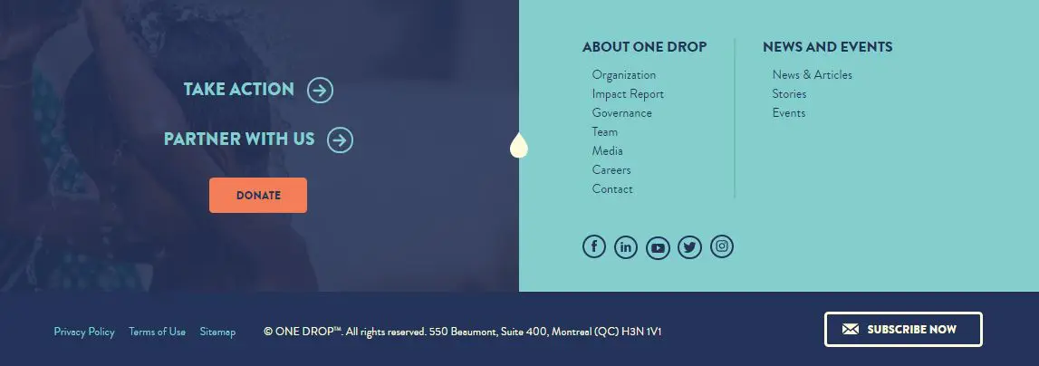
One Drop is another organization that’s using imagery in their footer and using it well. The photo is not overpowering or distracting. It’s a nice subtle way to bring some visual interest into the footer as they’re making a final call to their site visitors to get involved at the bottom of each page.
Most prominently, One Drop features three calls to action to get involved in some way with the organization. The second half of the footer features a set of links to learn more about the organization and a set of links to see current news and events. Finally, the user is presented with social media links, fine print links, copyright info and a button to subscribe to their newsletter. All of these design elements are paired with a very pleasing color palette and incredibly balanced layout.
One Drop’s footer simplifies quite a bit as the screen size shrinks. On mobile, the calls to action remain at the forefront as the sets of links to various internal pages and social media icons disappear. This puts a heavy priority on getting involved with the organization. The newsletter sign-up button makes the cut and the fine print links also remain on mobile.
(RED)
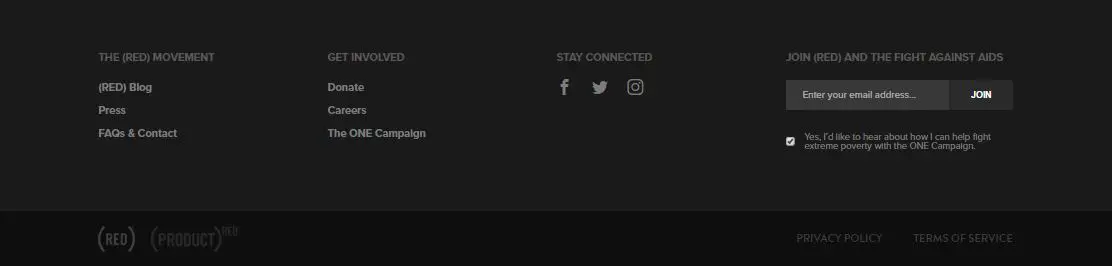
On the (RED) website, we’re going back to footer basics. They’ve created a monochromatic footer featuring three sets of links to learn more about the organization, to get involved and to explore their social media pages. The user is also met with a form field to sign up to join the fight against AIDs, and finally, we have the fine print links.
On mobile, the sign-up to join the fight moves on top of everything else, giving it more prominence. The three sets of links are accessible by an expandable menu, and the fine print links remain at the bottom of the page.
Wyman Center
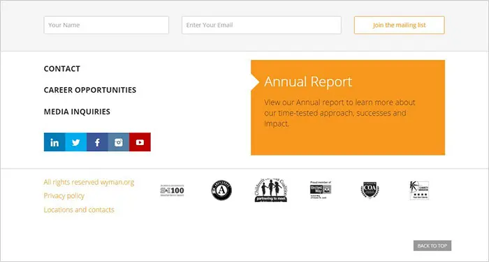
The Wyman Center adds a component to their footer that we haven’t seen yet on this list — a large call to action to download their annual report. A big part of gaining trust from supporters is making financial information easy to find, and they have certainly done that. Their footer also includes some of the recurring items we’ve seen in many of the other well-designed footers in this list, such as a newsletter sign-up form, pertinent links, social media icons and fine print links. The Wyman Center also features some credibility and partnership icons toward the bottom of their footer.
On mobile screens, the content in the footer does not change. All information remains in the same order, stacking vertically to better serve a mobile screen. The annual report callout remains the center of attention, which is a unique approach to gaining trust and, ultimately, new or continuing support from your website visitors.
Based on these examples of great website footers, you can see that there isn’t necessarily a hard and fast list of what needs to be included in your nonprofit website’s footer to make it effective. Each of these nonprofits with great website footers has thoughtfully curated their footer content to best serve both their organization and site visitors.
Know of any other nonprofits with great website footers? What content have you found to be most effective in your footer? Let us know in the comments!
What You Should Do Now
01. Come to Nonprofit Website Office Hours
We cover a new topic every few weeks. Plus get a live answer to any website-related question you're wrestling with.
02. Book a Website Call
Find a time to discuss your nonprofit's website needs. Discover what's worked for other nonprofits like you and see how easy building your new site can be.
03. Start a Free Website Trial
Try our nonprofit website platform for yourself. Instantly get access to every feature to see if it's the right fit for your needs. No credit card required.
Great post
Thanks, Nehitha! I’m glad you found it helpful.