You want visitors to read your website content and be inspired to take action because of it: donating, signing up to volunteer, registering for an event, joining your email list, becoming a member, advocating for change. The list goes on. But what happens when a nonprofit call to action is lackluster or, even worse, not present? Visitors don’t do anything.
Through this post, let’s take a necessary moment to review these asks on your website and make a few strategic tweaks. Your supporters, teammates and organizational goals will thank you.
What do we mean by nonprofit calls to action?
Through nonprofit calls to action (or CTAs), you’re asking someone to do something for your nonprofit. They’re invitations to your readers to get involved related to the content (page, email, blog post, etc.) that they are reading at the time. The best website calls to action are specific and actionable, meaning visitors can do something in that moment and through your site.
For example, on their Youth Movements page, Teen Health Mississippi highlights a new tool that they created to help teens select a birth control method. Through the call to act, they reinforce the name of the tool and its purpose as they encourage their youth supporters to check it out.

5 Ways to Uplevel Your Calls to Action
Improving your calls to action can increase the overall number and rate of conversions or actions taken on your website. And it could be as simple as a shift in the language you’re using or the placement on the page to inspire visitors to act.
Choose an action that can be done now.
Simplicity is key for calls to action. If a visitor can just click a link on your website to get started, they’re much more likely to take that action. Extra steps like copying and pasting an email address only to then write out a full email request from scratch adds complications and lowers the likelihood that more people will complete all the steps.
While a special design element certainly helps to draw attention to your call to action, you can still have a successful CTA with a simple heading, text and link. In this example from Mississippi Instructional Materials Matter, they make their case for high-quality instructional materials in Mississippi schools on the Why Now page before encouraging visitors to read the related research.

Create urgency.
The best calls to action inspire immediate action. Let supporters know that they’re needed now and give them a reason to take action in the moment. Clarify that the impact will be bigger if they act now rather than wait (and potentially forget).
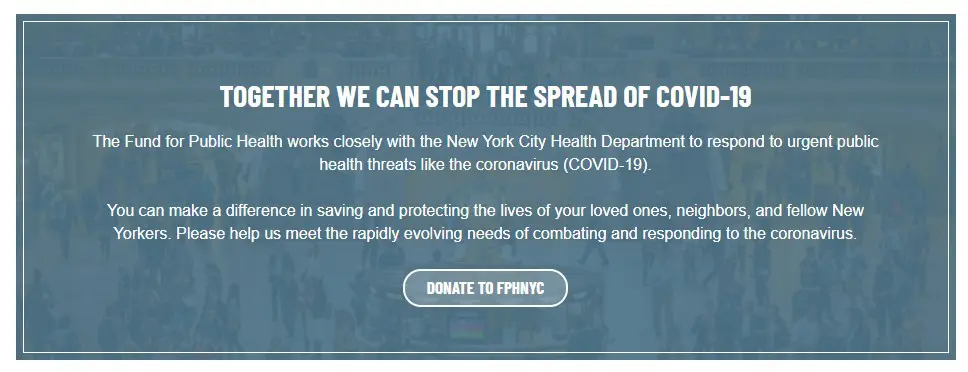
The Fund for Public Health in New York lets supporters know that they need help to combat “urgent public health threats” with “rapidly evolving needs”. The urgency they created through this call to action, along with a sense of togetherness and reinforcement that every donation can make a difference, drives home their message in a big way.

Place your call to action strategically.
Pro tip: The call to action doesn’t always belong at the bottom of the page. Make your case and position your ask contextually, but before people lose interest. You can always cover additional details or situations that aren’t as pertinent to your goal action lower on the page.
On their Attorney Mentorship Program page, VECINA outlines how the program works and then immediately calls attorneys to “Sign Up Now”. They cover the FAQs for the program below for those who have lingering questions before signing up.

Use strong and inspirational language.
Instead of saying “Donate Now” or “Learn More” bring visitors into your cause with language that inspires and makes them the heroes for taking action. “Help Change History” or “Support Second Chances” or “Keep the Memory Alive”. Bring some of that emotion to your call to act.
To call attention to their Oral Histories Project, The St. Louis Kaplan Feldman Holocaust Museum conveys the impact and importance of survivor stories, along with a powerful quote to encourage visitors to listen.

Get creative without losing clarity.
We’ve all been guilty of sinking too far into a metaphor. But convoluted language has no place in a call to action. Aim for clarity, making sure that your ask is clear even for those who just skimmed the page. Clear language doesn’t mean your CTA has to be boring though. Instead, use emotion and personality to encourage visitors.
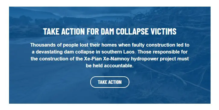
International Rivers stays focused on the goal through all of their advocacy calls to action. This CTA on their Human Rights page gives a quick, but emotion-evoking, two-sentence overview of the problem and solution before calling visitors to “Take Action”.

Weaving well-crafted nonprofit calls to action into your website content is a strategic way to boost the actions taken on your website. You created thoughtful content to provide details on who you are and what you do. Why not take that content a step further and ask your website visitors to move to the next step? Without website CTAs, you may be missing opportunities to motivate supporters to move through your marketing funnel.
How does your organization approach nonprofit calls to action? Do you have additional language or design tips that you’ve had success with? Let us know in the comments below.
What You Should Do Now
01. Come to Nonprofit Website Office Hours
We cover a new topic every few weeks. Plus get a live answer to any website-related question you're wrestling with.
02. Book a Website Call
Find a time to discuss your nonprofit's website needs. Discover what's worked for other nonprofits like you and see how easy building your new site can be.
03. Start a Free Website Trial
Try our nonprofit website platform for yourself. Instantly get access to every feature to see if it's the right fit for your needs. No credit card required.

Comments