
Navigation is one of the most import building blocks to your nonprofit’s website. It’s one of the first items users see on your site, and it is the system that leads to all of your content. So, it stands to reason that your navigation needs to be as functional as possible.
Now for the tricky part; there are about a million ways to tackle your site’s navigation. Do you have a lot of content, or only a little bit? Should your navigation be on the top or over to the side? What’s right for your site?
First and foremost, you need to organize and categorize your site content. This will help your navigation be clean, clear, and free from clutter. A navigation system is the road map through your site. If confusing, users can get lost, frustrated with their experience, and ultimately leave before engaging with any of the important information you have to offer. If you need help with your website structure, we have the guide for you!
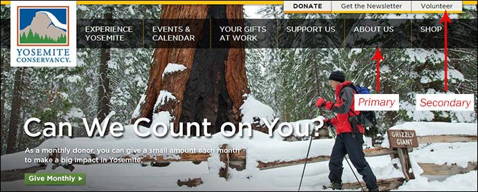
Primary v. Secondary Navigation
The contents of primary and secondary navigation differ from site to site. What might be considered primary on one site, could be secondary on another. This varies depending on what information each organization deems most important, and can be a daunting task for larger, more complex sites. How do you decide what information goes where?
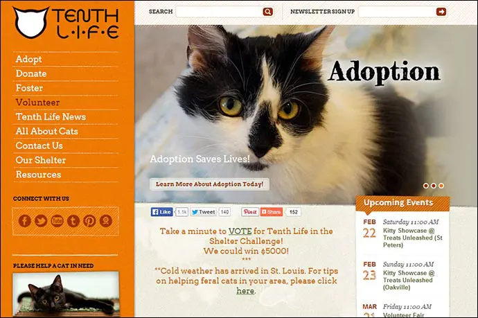
Primary Navigation refers to the content that users are most interested in, and usually holds the most prominent real estate. For your nonprofit, primary navigation could be links like About Us, Mission, Services, Blog, Volunteer Opportunities, or Donate.
Secondary Navigation then refers to the content of secondary interest to users. Secondary navigation also usually holds a prominent spot on the site. Items like log-in or register links, and social media icons are found in the secondary navigation. Even links to a shop, various resources, or a call to request more information about your organization can be found in the secondary navigation.
Best Practices
- Put the information users will be most interested in within your primary navigation
- Make sure primary navigation is more prominent than your secondary
- Highlight your most significant call to action within your navigation. Most of the time this is going to be Donate or Volunteer. Changing this to a unique color, or adding a background draws more attention to that specific link
Organizing Your Navigation
You have established the importance of primary v. secondary navigation. Now you need to consider how to organize your broad range of information that could fall under these two sections.
Remember, your navigation is the roadmap that’ll guide your visitors throughout your site. Not every important page needs to be in the top-level navigation, but it all needs to be organized in a way that makes it easy to find.
A thoughtful approach to organizing your navigation will help reduce a lot of potential frustration on the part of your visitors.
Best Practices
- Make navigation titles as concise as possible.
- Approach the information in terms of how a new user would navigate through it, rather than a seasoned vet (you). Each title should be clear to a visitor unfamiliar with your organization’s jargon and should tell a visitor what to expect when they click it.
- Consider grouping your content by subject, in order of a process, alphabetically or geographically. Do whatever makes the most sense given your circumstances and the goals of your website.
- Try card sorting. Write each piece of navigation content onto cards, and physically sort them into the groups that make the most sense. Allow others to do the same to find similarities in organizational patterns.
But wait, there’s more! Do users have the opportunity to log in to your site? Do you have site admins or clients that need to be able to log in? If so, consider how the navigation would change based on which users are logged in. Do you need to add content to your navigation, or take some away? Does the navigation change altogether based on who is logged in? It is important to plan for each user level individually.
Now that you’ve organized your navigation, things are moving right along! We have content categorized, but now where do we put that content?
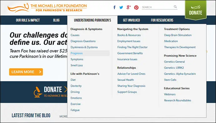
Horizontal v. Vertical Navigation
Horizontal Navigation often runs across the top of a website, and is one of the very first things users see upon landing on a site. Elevating navigation to the top of the page makes it clear that important information lives in that spot, and that users should look there for guidance.
Horizontal Navigation should be considered if:
- You have 2 – 8 main navigation items
- You plan to use drop down menus or mega-menus
- Main navigation titles are relatively short and predictable
- The number of main navigation items is not likely to change over time
- The width of the main content area is of high importance from a design standpoint, and vertical side navigation would cut into this space (for instance you may have a graphic that needs to be as large and wide as possible)

Vertical Navigation is best served on the left side of the page (when it’s serving as the main navigation for your website). Since most users view a site from left to right, placement on the left side ensures the navigation content will be prominent upon landing on the site. Navigation on the right side of a page could be confused for secondary content, and be ignored.
Vertical Navigation should be considered if:
- You have more than 8 main navigation items
- Main navigation items will likely be long
- Navigation may translate into different languages (often Spanish, French, etc. translations are longer than English)
- The width of the main content area can be flexible, and does not need to be full-width
Horizontal and Vertical navigation do not need to be mutually exclusive. Plenty of sites use both.
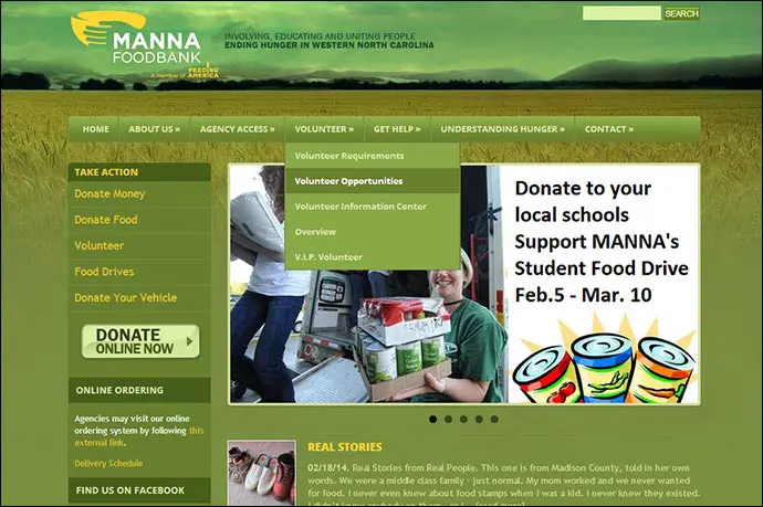
Dropdown Menus
Another important consideration when creating your navigation is a dropdown menu. These menus organize complex sub-levels of content and save valuable real estate on a page. They can range widely from short and sweet, to extremely elaborate and long. Dropdown menus are most commonly used to organize pages within a particular section.
Best Practices
Above all: Keep it clean
- Allow for breathing room in line-spacing
- Make sure the text is not too small
- Avoid drop-downs with more than 2 levels. This clutters design and makes it easy for users to lose focus
- Use hover effects to tell where exactly you’re at within the navigation
Phew! That’s a lot to think about, but now you’re well on your way to an incredible navigation structure for your nonprofit’s site.
The process may not be over for you, however. Are you creating a mobile version of your site? Then don’t get too comfortable! Take a breather, and stay tuned for Part 2 where we’ll discuss making your navigation responsive for tablet and mobile variations of your website.
Fantastic post Alex, couldn’t agree more with your point about keeping it all clean. Simplicity is definitely the key in web design although it appears that there are still quite a few web designers who aren’t exactly aware of this! – Maria
Thank you so much, Maria! The cleaner the better, in my opinion.
[…] Nonprofit Website Navigation: Tips and Best Practices by Alex McLain at WiredImpact […]
Its a well organized post. I like the information provided.