Whether it’s your first or your fifth year taking part in Giving Tuesday, there’s a lot you can do to make sure that your campaign succeeds.
We understand that your fundraisers are probably focused on more traditional year-end appeals: drafting and writing letters, scheduling one-on-one meetings with donors, and making phone calls to prospects. But with all the hustle and bustle heading into the holiday season, there’s one tool that you don’t want to forget: your website.
A nonprofit’s website is a crucial anchor for all sorts of fundraising and marketing activities, whether you’re reaching out to people in print, through email, on social media or even texting. Based on the typical annual giving cycle, you’re probably not surprised to hear that 29% of all online giving happens in December. But are you paying enough attention to how donors experience your mission and impact when giving to you online? How many people reach your site only to leave without making a gift?
To help you take advantage of online giving this holiday season, we came up with five ways to make the most of your website for Giving Tuesday and year-end fundraising. While some website projects can seem like insurmountable undertakings, these tips should get you to a better place for end-of-the-year appeals without too much time or trouble.
1. Craft Donor-Centric Messaging Within the Donation Experience.
Of course you want to keep donors on your form long enough to complete it, but the way you make them feel during the process has the potential to shape future interactions, including giving again. The donation experience goes beyond an immediate thank you on your website, an email and then dropping a receipt in the mail. Make online donors see that giving to your organization helps them meet their own philanthropic goals and values.
On Your Website
Once you’ve made sure that you have an effective donation form (including testing!), think about the messaging you use to describe what donors are “buying” by using examples that are as specific as you can get. For example, you might be able to show that a $10 donation means a shelter animal has meals for the month. You can then leverage this in your Giving Tuesday campaign by asking people to add one more thing to their holiday shopping list.
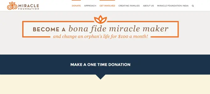
If that level of detail isn’t possible, communicate what the donor achieves through giving to you at a more conceptual level, maybe even giving them a special designation like hero, caregiver or “bona fide miracle maker” like the example below.
Who’s Doing It Well
Check out the donate page for the Miracle Foundation, which makes potential donors feel like a part of the solution, provides specific giving options tied to impact that they’ll make, and celebrates the donor before they’ve even submitted payment. Did you notice that the URL for the main donation form is /YouRock? That about sums it up!
2. Develop a Campaign-Specific Landing Page.
Are you making a special appeal that ties to a compelling story, specific giving program or urgent need? You might want more than an updated donate page to motivate potential donors. A landing page offers you the chance to highlight a special opportunity (such as monthly giving, gifting a membership or a matching gift) with its own donation form or related call-to-action.
On Your Website
Create a new page that matches the message and visuals of your year-end giving campaign but is easily read online. Don’t just copy and paste the text from the print letter – people reading web pages actually comprehend more of what you’re saying when you use shorter sentences, break up text with subheadings, and use quick read sections like bulleted lists. Embed a donation form or include a prominent donate button that directs to the donate page. And make sure to create a simple and catchy URL that you can use when promoting the appeal on other channels (like Facebook or your email newsletter).
Who’s Doing It Well
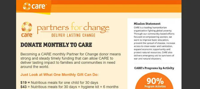
Care’s landing page for their monthly giving program is an all-star when it comes to spelling out what’s being asked from the donor and why. There’s also bonus information about their mission and how they spend money (see #5 below) so that a visitor doesn’t have to navigate away to find it. This all-in-one landing page approach might make a difference for you on Giving Tuesday, when new people are arriving on your site and quickly considering donating for the first time.
3. Feature Your Fundraising Goal on Your Homepage.
Despite your best efforts to get people to a specific page on your website, there’s probably a large percentage of your visitors that get to your site by typing in your homepage or doing a search. This also holds true when putting a specific web address in print materials. Highlight your Giving Tuesday campaign or special year-end appeal on your homepage to make sure people head in the right direction.
On Your Website
Depending on your homepage design, you might have several options, including changing the main header image to a photo that includes your call-to-action message and a link to your landing page. You could also publish a blog post about the campaign for a featured news section, make a special donate button or consider adding a pop-up like the one you’ll encounter on the homepage for the American Cancer Society. Their pop-up also matches the header image – nice touch!
Who’s Doing It Well
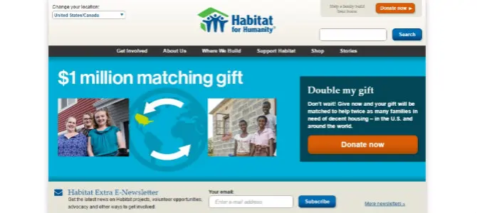
Habitat for Humanity does a good job directing people to their $1 million matching gift by transforming their homepage header into a simple graphic with photos and an obvious donate button.
4. Tell Solution-Driven, Emotion-Filled Stories.
Sharing stories about the impact and importance of your nonprofit’s work shouldn’t leave readers feeling helpless or negative. In addition to describing the challenges you or your community faces, talk about the solutions your mission offers and describe what success looks like. Donors want to feel like there’s room for them to contribute and know that there is a path to a better tomorrow. When they visit your website this holiday season, your stories should welcome and encourage them with warmth and optimism.
On Your Website
Your blog is a natural home for stories. From there, you can link to stories directly in email appeals and social media posts, which is nice if they are somewhat long or have great supporting content like a photo gallery that you don’t want people to miss. Consider how you might feature stories on your program pages, on your homepage or where you post financials and other measures of success. This can be as easy as posting a related photo and using the caption to link to the story on your blog. The goal is to effectively tie facts with emotion. Try to add at least one blog post displaying your impact on a personal level before you launch your campaign.
Who’s Doing It Well
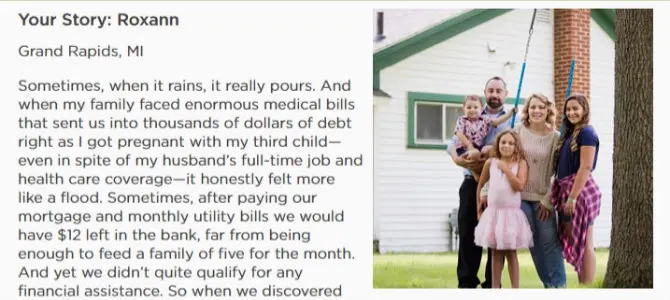
The Real Stories of Hunger section of Feeding America’s website is a well-organized storytelling machine. By asking volunteers, staff, and program recipients to talk about their motivations, fears, hopes and each other in their own words, this single page of stories draws people into the mission, goals and faces of the organization.
5. Share Financial Information.
When your financial information is easy to find and understand, it shows new and returning donors that you are professional, responsible and stable. You also send a message that you expect people to make smart investments with their money. In return, your organization demonstrates similar values when it comes to smart spending. What a great exchange!
On Your Website
It’s an industry best practice for nonprofits to have a Financials page where they share audits, 990s and annual reports. But will your visitors actually find it? If you already have a page that’s up to date, take it a step further and share some of that compelling data on your program or donation pages as an extra confidence booster. Another (more subtle) option could be linking to your information on Charity Navigator or GuideStar in the footer. And if you have great finance data but lack design talents, turn to Piktochart to make a visual that’s also social media worthy.
Who’s Doing It Well
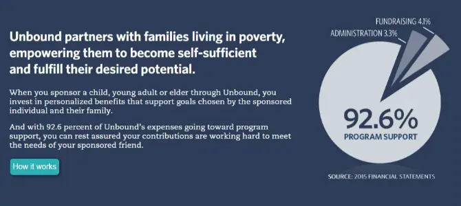
Kudos to Unbound for being bold and upfront with financial data. Not only are they efficient when it comes to program spending, but donors aren’t wasting any time getting this information because it’s highlighted on the homepage with a link to read more – without any accounting jargon! Also check out the Sexy Financials from DoSomething.org (their words, not mine).
P.S. Make your Giving Tuesday measurable.
Wouldn’t it be nice to evaluate which marketing activities helped reach your goals and which ones were a waste of time? One of the most valuable pieces of data that you can collect throughout your campaign is where donations and the people that make them really come from. Track this information (as well as top pages and the different paths to your donation forms) using Google Analytics so that you can easily see the types of content and online channels that are helping you reach your goals.
Even if it’s a small tweak, any work you do on your website for Giving Tuesday and year-end fundraising will benefit your organization throughout the year. Sometimes you just need a good, urgent reason to make an improvement or two, and there’s one coming up quickly on November 29th!
How else can nonprofits get their websites ready for Giving Tuesday and year-end appeals? What challenges do you have when it comes to using your website for online fundraising? We’d love to hear about your experiences in the comments.

I have a facebook page only, not a official website. Apparently, I’m not able to register my organization without one. Is there anything I can do to register?
Hi Henry! I’m sorry to hear that you’re having trouble registering as an official partner for Giving Tuesday. Are you planning to use your Facebook page to ask for or accept donations? Because this is a public movement, you aren’t required to register in order to promote your organization on Giving Tuesday. You won’t be listed on their website, but you still have access to the great resources there. I hope that you’ll continue to plan for the big day!
[…] Learn how to use your website to drive donations this year-end […]
[…] Is Your Website Ready for Giving Tuesday? […]