
Note: This blog post was written using Universal Analytics, which has been shut down. You can find newer posts covering Google Analytics 4 here.
Measurement is easy. Effective measurement that allows you to answer meaningful questions and make strategic decisions is a lot tougher. But luckily for us, there are these nifty tools called Google Analytics dashboards that make measuring what matters a whole lot easier.
It’s generally pretty straightforward to grab a count of the number of visitors coming to your website. But at the end of the day, knowing the number of visitors doesn’t help you adjust your marketing to increase engagement and drive action from those visitors once they’re on your site.
The key to effective measurement in Google Analytics is connecting the dots between different data points. And that’s where Google Analytics dashboards shine.
What are Google Analytics Dashboards?
Google Analytics dashboards allow nonprofits to pull data from multiple reports into one centralized place. Each piece of data is called a “widget.” Widgets can include counters, timelines, charts, tables and maps.
Remember when you used to do Connect the Dots puzzles as a kid? Think of each widget as a dot in one of those puzzles. No individual widget tells the full story, but as you connect these individual dots, the full marketing picture starts to come to life.
While dashboards may not single-handedly answer every data-related question you have, they should at least highlight areas or bring up questions that warrant further investigation. For more background on getting started with and using dashboards, check out About Dashboards from Google Analytics Help. If you’re interested in more general definitions for terms used throughout Google Analytics, check out this glossary of terms from Google.
What Happens When You Download a Nonprofit Dashboard
When you download one of these dashboards, it’s added to the Google Analytics view that you specify. They’re built to use your website’s actual data. We’ve just specified the widgets we think you should start with when reviewing that data.
Also, feel free to customize these dashboards once you’ve downloaded them. They’ll only be added to your individual Google account, so don’t worry about messing anything up. You can always come download them again. And to put any potential concerns to rest, no one else can access your data just because you add these dashboards. So it’ll all stay safe and sound.
How to Add Google Analytics Dashboard to Your Account
In order to use these dashboards with your own data, you first need to add them to your Google Analytics account.
To do so, follow the steps below:
- Log into the Google account associated with your Google Analytics profile
- We recommend logging out of all other Google accounts on your device if you’re logged into multiple ones to streamline this process
- Click any of the buttons below in this blog post to install our dashboards (which should open a new window in Google Analytics)
- You can choose between installing each individually or all of them at once
- Select the view you’d like to add these dashboards to in the dropdown menu
- Click the blue “Create” button
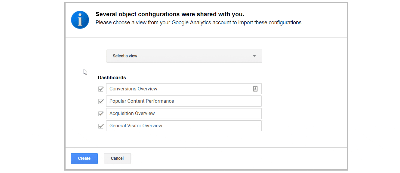
That’s it! These dashboards should now be added to your Google Analytics account.
Accessing Dashboards After They’ve Been Added to Google Analytics
Once you’ve added these nonprofit dashboards to your Google Analytics account, it’s easy to view them.
To do so, follow these steps:
- Click the “Customization” item in the left sidebar of your Google Analytics account
- Select “Dashboards” in the menu that opens
- Click on the dashboard that you’re interested in viewing
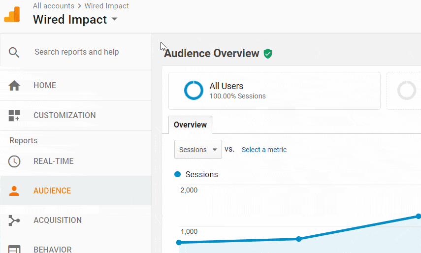
Told you it was easy. Now on to the fun stuff!
Google Analytics Dashboards Built Just for Nonprofits
We’ve built the following four dashboards just for nonprofits. Many of them will work just fine for other types of organizations, but we’ve tailored these with nonprofits in mind.
You can also download each nonprofit dashboard individually below if you’d prefer.

Dashboard #1 – General Visitor Overview
This dashboard shows a high-level overview of the visitors who are coming to your website. These are definitely not the most important metrics you should track when it comes to evaluating your marketing, but they can be a nice place to start.
Push yourself to look beyond these numbers though to see what’s really going on. For instance, the number of sessions doesn’t really matter in its own right, but if you’ve seen a major uptick or downturn in your daily sessions, that’s definitely worth investigating. Your overall pages per session don’t tell you a whole lot by itself, but if you notice your pages per session is far higher for a certain state or region, you may be able to identify some regional interest in your messaging.
Remember, these numbers aren’t the end of the story. They’re a jumping off point.
Key Questions Addressed in this Dashboard
- What do we know about the visitors that come to our website?
- Are we reaching any groups of people particularly well?
- Are there any groups we aren’t reaching as effectively as we’d like?
Data Shown in this Dashboard
- Total Number of Sessions
- Total Number of Users
- Sessions by Date
- Users by Date
- Overall Pages Per Session
- Overall Bounce Rate
- Sessions by Device Type
- Sessions by User Type (New vs. Returning)
- Engagement by Device Type
- Engagement by User Type
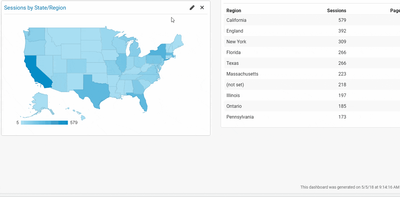
- Sessions by State/Region
- Engagement by State/Region
Using and Customizing this Dashboard
Using the “Region” Metric – Within the United States, the “region” metric will display the state a session came from. Outside of the United States, it’ll likely display a territory or some other form of geographic region.
Changing the Country on the Map – The map has to be limited to one country, but you can change that country. To do so, follow these steps:
- Hover over the map
- Click on the pencil icon that shows in the upper right of the widget to load the Widget Settings
- Click where it currently says “United States” in the “Select a region” dropdown and choose the country you’d like to focus on
- Click the “Save” button in the lower left of the window
Dashboard #2 – Acquisition Overview
This dashboard provides an overview of what traffic sources are driving visitors to your website. It shows not only total traffic numbers but more importantly engagement and conversion numbers as well.
Don’t fall into the trap of just reporting on the number of visitors from each traffic source. Remember, quality is more important than straight quantity when it comes to website traffic. Look at the sources that are driving your most engaged visitors and those most likely to convert (or complete one of your Google Analytics goals).
For traffic sources that are doing well, what are you doing that you may be able to apply to sources that are underperforming? And how can you drive even more traffic from your sources with the highest engagement?
Remember, the most helpful data will lead you to change your marketing efforts in some concrete way.
Key Questions Addressed in this Dashboard
- How are visitors finding our website?
- Which sources and pages are driving the most engaged visitors to our website?
- Which sources and pages are helping us meet our goals as an organization?
Data Shown in this Dashboard
- Traffic and Engagement by Source
- Sessions by Traffic Source
- Conversions by Traffic Source
- Traffic and Engagement from Social Media
- Traffic and Engagement from Referrals
- Top Landing Pages for All Visitors
- Entrances by Section of the Site
- Bounce Rate by Section of the Site
Using and Customizing this Dashboard
Using “Section of the Site” – The two widgets that use “section of the site” use your URL structure to add all subpages within a given portion of your site. For instance, if you have your About page and a subpage under it called Mission, these widgets will add the entrances to both pages and display the total under “/about/” since Mission is a subpage of About.
Consider the Purpose of Each Page – Not all pages are cut from the same cloth. Consider the content and purpose of each page when looking at engagement metrics like pages per session or bounce rate. For instance, maybe you have a Donate page that sends donors to a Thank You page after they make a contribution. If everyone that lands on the Donate page makes a donation and then exits from the Thank You page, you would see your Donate page only averages 2.00 pages per session and conclude that page isn’t doing a great job of engaging visitors. But the conversion rate for the Donate page would be 100% and you’d be raising a bunch of money!
So remember context matters.
Dashboard #3 – Popular Content Performance
This dashboard is built to show you what website content is resonating most with your visitors. You can see content consumption sliced in a variety of ways including aggregated across the whole site, by a section of the website and by individual page as well. You can also see information on what days and times your content gets the most activity.
As mentioned above, it can also be really illuminating to keep an eye on all of this data over time. For instance, maybe you notice a major surge in pageviews to a particular section of your site. Does this align with any of your marketing initiatives? If not, it would be great to dive in deeper to see what could be causing it.
Key Questions Addressed in this Dashboard
- What types of content are resonating the most with our visitors?
- What sections of our website are getting the most attention?
- When are visitors engaging with our content?
Data Shown in this Dashboard
- Total Pageviews
- Overall Pages Per Session
- Overall Bounce Rate
- Pageviews by Date
- Pageviews by Section of the Site
- Top Pages Overall
- Top Landing Pages
- Pageviews by Day of the Week
- Pageviews by Hour (24-Hour Clock)
Using and Customizing this Dashboard
Using “Section of the Site” – We’re using “section of the site” data again in this dashboard. As mentioned above, this data uses your URL structure to add together all subpages within a given section of your site. This will show you what section of your site is driving the most pageviews from your visitors (as opposed to entrances, which we were tracking in the previous dashboard).
A Caveat on Day and Time Data – When looking at something like “Pageviews by Day of the Week” or “Pageviews by Hour,” it’s important to consider all of your other marketing efforts before drawing broad conclusions. For instance, if you send a weekly email with links to your website every Wednesday, we’d expect to see pageviews spike on Wednesdays. But that doesn’t necessarily mean your target audience is most active online on Wednesdays in general.
Dashboard #4 – Conversions Overview
The Conversions Overview dashboard is arguably the most important of the four nonprofit dashboards in this post. Traffic and engagement are great, but they’re just means to an end. Conversions, on the other hand, are directly tied to the goals you’ve set up in Google Analytics. These should be intimately tied to your goals as an organization as well.
This dashboard can help you start measuring the value of various types of visitors. For instance, maybe you notice that returning visitors are three times more likely to complete a goal on your website. It’s worth starting to think strategically about how to re-engage visitors and drive them back to the site using something like an email newsletter or social media.
If you only install one of these Google Analytics dashboards, make it this one. (Although, honestly, just install them all. It’ll be much more helpful in the long run.)
Key Questions Addressed in this Dashboard
- What key website actions are visitors taking that’ll help us meet our goals as an organization?
- What do we know about visitors who complete a goal on our website?
- Are there any particular types of visitors we should target to increase goal completions?
Data Shown in this Dashboard
- Total Goal Completions
- Overall Conversion Rate
- Goal Completions by Date
- Goal Completions by User Type (New vs. Returning)
- Goal Completions by Device
- Goal Completions by State/Region
- Goal Completions and Conversion Rate by Traffic Source
- Landing Pages Driving the Most Goal Completions
Using and Customizing this Dashboard
Viewing Completions for Each Individual Goal – It makes total sense you’d want to know how many times each of your goals was completed. Unfortunately, as of the writing of this post, there isn’t an easy way to summarize this concisely into a single dashboard widget. The best we can do (which should work for most) is to make the heading for the “Total Goal Completions” widget link to a report in your Google Analytics where you can see individual counts. Hopefully that’ll do the trick!
Avoid Just Counting Goal Completions – It’s easy to get drawn into the trap of simply counting goal completions and drawing false conclusions as a result. Let’s say 60% of your goal completions come from organic search. It could be tempting to assume you should pour all of your free time into driving more organic search traffic. But before doing so, look at conversion rates. Maybe something like email drives a lot less traffic (and thus, fewer conversions) but actually has a much higher conversion rate (meaning it’s more efficient at driving visitors to act). In this case, it may make more sense to spend your time increasing traffic from your email newsletter and figuring out ways to get more visitors to sign up in the first place. Spending your time on email could ultimately lead to a bigger bump in overall goal completions.
Getting the Most Out of Google Analytics Dashboards
Phew. I know that’s a lot in one post. But the most important thing at this point is to just get in there and start playing around. Hopefully these Google Analytics dashboards help your nonprofit get started with measuring your marketing efforts more effectively.
Remember, don’t just measure what’s easy. Measure what matters. These nonprofit dashboards should serve as a helpful starting point when it comes to asking the right questions and diving deeper into your data.
Do you have any questions about using these Google Analytics dashboards? Or is there any data you don’t see in these dashboards that you’d like to check out? Please let us know in the comments below. And who knows? If this blog post piques enough interest, we just may do a second round with some additional nonprofit dashboards sometime down the road.
What You Should Do Now
01. Come to Nonprofit Website Office Hours
We cover a new topic every few weeks. Plus get a live answer to any website-related question you're wrestling with.
02. Book a Website Call
Find a time to discuss your nonprofit's website needs. Discover what's worked for other nonprofits like you and see how easy building your new site can be.
03. Start a Free Website Trial
Try our nonprofit website platform for yourself. Instantly get access to every feature to see if it's the right fit for your needs. No credit card required.
This article is fantastic and we would love to share it with our nonprofits on our website. We would gladly give you all credit and link back to this website. Would you give your permission for us to share it?
Thanks a lot for the kind words Rebekah. I’m glad to hear you found the post helpful. We’d love for you to share it on your site. Thanks a lot for checking!