Your nonprofit’s logo is the visual centerpiece of your brand. It’s a stamp that labels the work you do, the content you produce, and the impact you have. It’s also often your first statement to website visitors about who you are (since it’s right there at the top of your website).
Therefore, it is very important that your logo conveys the right message about your organization and that it conveys that message clearly. Here are a few ways to do both of those things and a couple of nonprofits that are doing them well.
Keeping it Simple – The American Red Cross

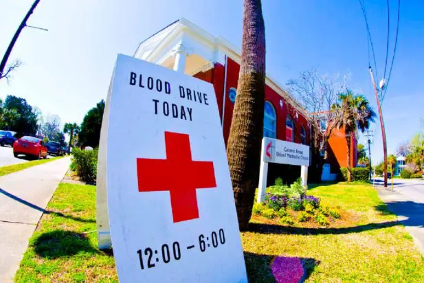
The logo of the American Red Cross has become the symbol of their 132 years of domestic and international aid, relief and health services. Their logo is now one of the most recognizable in the world. The American Red Cross is a perfect illustration of how simplicity and directness can pay off. A “red cross” represents the Red Cross. You can’t get much more direct than that.
Here are some other nonprofits that keep it simple:

Save the Children’s logo shows a child in red, a color that commonly signifies danger or eminent threat in Western cultures. This very basic logo says just what it needs to – that there are children who need to be saved.
Rather than developing a complex graphic, the YMCA sticks to a text-only logo that connects the brand with their popular and friendly nickname “the Y.”
Using a Metaphor – The Mentoring Project

Admittedly, not all nonprofit organizations have missions that are easily explained with a graphic. The Mentoring Project does a great job of conveying the very basics of their mission, to provide adults to help guide kids, with their logo.
Using elephant illustrations to demonstrate their point, we are able to understand what they’re talking about: an adult (big elephant) helping a child (small elephant) learn how to wade though life’s waters — mentoring. Your designer may want to build a more creative solution to explain your mission.
The following are some other organizations using illustrations or metaphors in their logos:
Amnesty International works to end grave abuses of human rights. Their logo uses an image of barbed wire to reference painful and immoral barriers to human rights. The encircled candle represents the hope and liberation that is at the core of their mission.

Not for Sale campaigns to end human trafficking and slavery. Their aim is to ensure that no human being is for sale. Their logo demonstrates this by showing a commonly used currency sign (the US dollar) tilted on its side and cut and half.
Choosing Appropriate Colors – Feeding America
The colors of your logo should be one of its most recognizable and thought out features. Carefully chosen colors can say a lot about your organization’s purpose and personality. Feeding America, the nation’s leading domestic hunger-relief charity, uses orange and green in their logo to associate their organization with the idea of agriculture and wholesome food.
In case you didn’t get all that with the colors alone, they incorporated an illustration of a head of wheat for good measure. The muted colors give the logo a nurturing and serious tone. The Feeding America logo is an example of a great pairing of color and shape with an organizational cause.
Here are some other nonprofits using color in a powerful way:
Girls Inc. ensures that girls will recognize the organization as their own by using girlhood’s most commonly associated color – pink. They use a bright bold shade of this color to express the organizations goal to “inspire all girls to be strong, smart, and bold.”
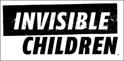
Invisible Children campaigns to end the abduction, killing and displacing of civilians in East and Central Africa. The stark black and white logo gives due seriousness and gravity to their cause. Having the word “invisible” in white also adds a helpful emphasis to the word.
Building your Nonprofit’s Logo
Because your nonprofit is different from any other organization, your logo should also be unique. Before creating your logo (or redesigning an old one) remember to keep it simple, consider using a metaphor, and chose appropriate colors. You can use these logo examples or find ones of your own for inspiration.
If you have any logos that you love, or if you want to share your organization’s logo, leave them in the comments.
Image courtesy of Charleston’s The Digitel
What You Should Do Now
01. Come to Nonprofit Website Office Hours
We cover a new topic every few weeks. Plus get a live answer to any website-related question you're wrestling with.
02. Book a Website Call
Find a time to discuss your nonprofit's website needs. Discover what's worked for other nonprofits like you and see how easy building your new site can be.
03. Start a Free Website Trial
Try our nonprofit website platform for yourself. Instantly get access to every feature to see if it's the right fit for your needs. No credit card required.
Comments