
Your nonprofit’s website header will be seen on every page. It contains your site’s most important information, brands your organization and shows your user where to go and how to get there. With all these moving parts, it’s hard to know where to put what.
But have no fear. We’re here to discuss how to juggle these elements to create a streamlined, easy-to-use header.
Playing Into User Expectations
Web conventions are practices that have been adopted over time to form what users “expect” when visiting a site. Considering your website visitors’ expectations will help you better serve their needs and provide them with a better experience on your site.
Optimizing your site’s header to align with user’s expectations will dramatically improve its ease of use. And since the navigation in the header will be the way the vast majority of your visitors find content on your website, ensuring ease of use is pretty important.
A Website Header Template
Here is a template sketch of a conventional layout for a header containing a horizontal navigation. This template should not be taken as a set of hard rules, but rather as guidelines to those web conventions I mentioned above.
As you will see in many of our examples, it’s possible to deviate from convention and still serve your user. But you must first know the conventions before you can get away with breaking them.
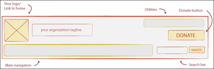
Now that we have a template to work off of, let’s talk about some of these elements individually.
Logo
A longstanding web convention is to place your logo in the top left corner and to link it to your home page. This practice has become such an expected convention that according to one report up to 63% of the top 500 sites no longer use a home page link in their navigation.
I hesitate to fully stand by the practice of stripping out your home link in your navigation since some users may still want to see it there. But clearly you should be making your logo a link to your home page.
Main Navigation
Your main navigation is where you provide easily accessible links to your top-level pages. A site’s main navigation is traditionally organized in one of two ways: as a horizontal bar in the header at the top of the page or as a stacked vertical bar along the side of the page.
If using a horizontal layout, the navigation should be placed at the bottom of your header. This placement within the header has become expected from web users. By placing it as the closest element in the header to the page content, you visually group the navigation with the pages to which it links.
If you’re really interested in this stuff, we wrote up a whole post on website navigation best practices.
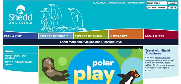
Shedd Aquarium Example
The Shedd Aquarium’s header features a nice illustration and uses a unique shape and creative colors for the main navigation. This header has a very original look but it is built upon a very conventional structure. The logo is in the top left corner and the main navigation runs across the bottom of the header.
Search Bar
A search bar is a must for any larger site. The placement of the search bar is one of the most flexible elements of your header design. The important thing to consider here is giving it enough space to hold its own in your star-studded header.
While I could write a whole post on search bars (and perhaps will in the near future), suffice it to say the most important thing is to make it easy to find and use. Making it easy to find and use will provide the best experience to your visitors. And that’s really what it’s all about.
World Food Programme
The World Food Programme placed its search bar at the very top of its header. It is a good distance away from the utilities on the left as well as the donate button on the right.

Utilities
Utilities links allow your users to quickly travel to different functionalities’ pages throughout your website. Examples of these include “my account” “sign in” or “view my cart” links. These should be placed above the main navigation.
Take care to make this navigation less visually prominent than your main navigation. Utility links are for those who need them, but your main navigation is for everyone. You want to avoid a situation where your utilities are competing with your main navigation for visitor attention.
Making your utilities less prominent insures that the viewer feels comfortable exploring your site without having to log into an account or perform some other action.
Feeding America Example
The Feeding America site, for example, tucks away its utility page, “sign into my account” into the top right of the header next to the email sign up. The text for this link is smaller than that used in the main navigation.

Donate Button
Designing and positioning a donate button is an art of its own. What is most important is that it stands out and that it is consistently placed. The top right side of the header has become a go-to spot for donate buttons because of its visibility. For a detailed account on things to consider, I recommend reading our post on donate button best practices.
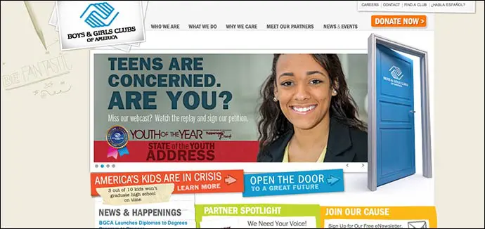
Boys and Girls Clubs of America Example
The Boys and Girls Clubs of America places their donate button in an optimal location that’s easy to find with only a quick scan. In case you somehow miss it, they’ve also made the button bright orange.
Your Nonprofit’s Header
Hopefully this has left you with guidelines for your header design. Remember, when designing your header, user expectation is key.
If you’ve seen any other user-friendly headers on nonprofit sites or have noticed any other conventions please leave links in the comments below.
What You Should Do Now
01. Come to Nonprofit Website Office Hours
We cover a new topic every few weeks. Plus get a live answer to any website-related question you're wrestling with.
02. Book a Website Call
Find a time to discuss your nonprofit's website needs. Discover what's worked for other nonprofits like you and see how easy building your new site can be.
03. Start a Free Website Trial
Try our nonprofit website platform for yourself. Instantly get access to every feature to see if it's the right fit for your needs. No credit card required.
Comments