
Your nonprofit website homepage is arguably the most fun to put together—but also the most challenging to get right. There’s a lot of competition for valuable space, things can change frequently, and it’s hard to capture everything that you are in one go. What’s the best homepage content strategy?
We’ve seen a lot of nonprofit homepages and can tell you that the unsuccessful ones usually lack focus rather than have a poor design (though the combination of both those things is definitely a recipe for disaster). A recipe for homepage success, on the other hand, looks something like this:
20% Inspiration
30% Explanation
10% Credibility
40% Action
Your page content doesn’t have to follow this order, but use the percentages as your guide for how much room you give each category. Each piece of information should be working to answer one core question for website visitors: “Do I care?”
Let’s break down what each of these components means and how they’ll inform what to put on the homepage of your website.
20% Inspiration Homepage Content
As one of the main entry points to your website, especially for first-time visitors, your homepage should serve up a dose of inspiration that gets someone’s attention and encourages them to learn more. But don’t let inspiration content gobble up all of your valuable space. Focus on one or two strong pieces of content, and try to lead off with one of them, such as:
- Compelling hero or featured image that represents why your mission is needed or what your vision of success looks like.
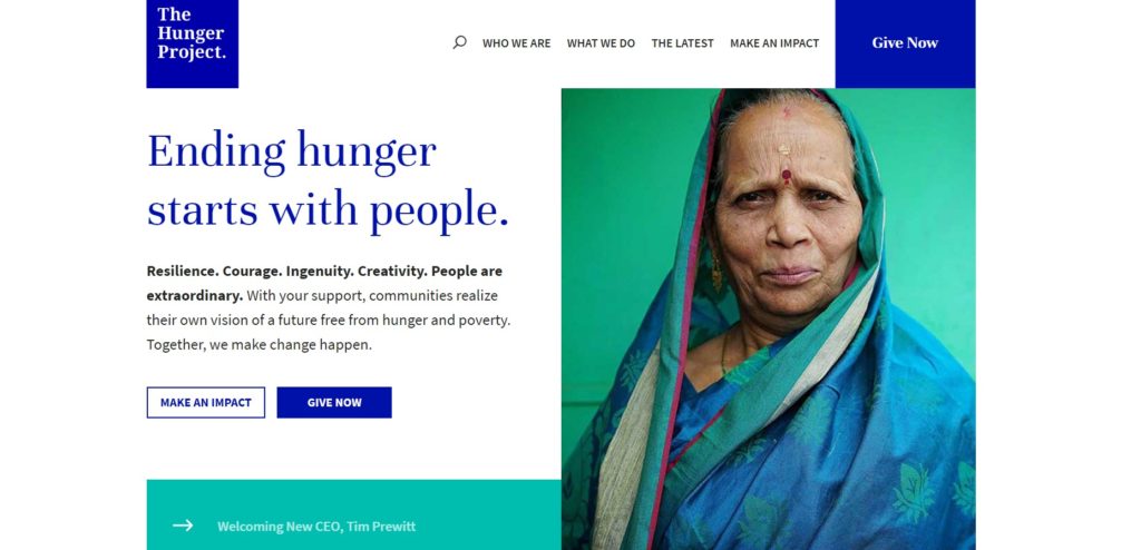
- Tagline that quickly communicates what you’re all about in one sentence or phrase. In the example from The Hunger project below, they use “Ending hunger starts with people.”
- Short video teaser that introduces people to the voices, scenes or issues of your work. (This is not the place for a 10-minute news story.)
30% Explanation Homepage Content
Once you’ve buttered up your visitors with inspiration content, turn to explanation content to educate website visitors about the specifics of your organization. Being vague about your programs and services, or even where you work, can lead to frustrated visitors who will choose to leave your site rather than hunt around for details. Here are some content types to consider:
- Introductory statement of 2-3 brief sentences that offer an overview of what you do, who you serve and where you do it. (This could be a mission statement, but only if yours is specific and jargon-free.)
- Service snapshot, where you highlight and link to a handful of the key ways that you’re addressing the need or challenge of your mission, such as core programs or advocacy initiatives
- Latest news to demonstrate how you’re putting your mission into action to serve the community, like your most recent blog post or annual report.
10% Credibility Homepage Content
It’s only a small part of your homepage, but finding a way to communicate credibility or trustworthiness can help visitors feel comfortable that you are who you say you are. A nice-looking, user-friendly website certainly adds to a sense of legitimacy, but so does content like:
- Testimonial from a community member, partner or program participant that can attest to the great work you’re doing
- Impact stats or featured story that quickly summarizes a top accomplishment and show how you’re putting donations to good use
- List of partners or sponsors, typically with a list or grid of logos
For a bonus, consider placing certification or “seal of approval” logos in your website’s footer.
40% Action Homepage Content
An effective homepage content strategy focuses on action more than anything else, which is why this content should dominate your page. Inspiration, explanation and credibility content should all offer value to visitors, but action content encourages them to take an off-ramp to something that piques their interest and gets them to take the next step. Consider calls to action related to:
- Ways to get involved, from as simple as subscribing to your newsletter to participating in a program, attending an event or volunteering
- Downloadable resources like a fact sheet, report or advocacy tool, which can be accessed in exchange for an email address
- Service or support locator that helps people find a program or service you offer based on their specific needs, interests or location
- How to give, like making an instant donation online or giving to a specific campaign
- Advocacy alerts or other urgent action that you want visitors to take to address in the moment, like contacting their legislator or signing a pledge
Homepage Examples We Love
A list of homepage content ideas is great, but we know examples are appreciated. As you plan and write your homepage content, use these sites as inspiration. You’ll notice that none of these homepages rely on auto-rotating content or sliders as part of their content strategy—and we strongly suggest you take their lead.
The Hunger Project
Starting with a bold image and call to get involved, the homepage content for The Hunger Project is a fantastic collection of background information on the problem they are solving, how they go about their work, and the results that should make donors proud.
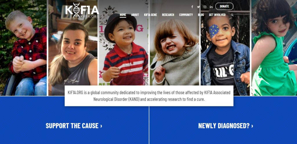
KIF1A.ORG
As an organization working in the rare disease space, KIF1A.ORG leverages its homepage as a way to funnel visitors to a wide range of content and calls to action, including community stories, events, resources for new families, and a credibility-boosting video clip.
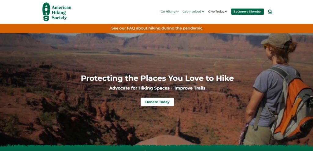
American Hiking Society
Inspiring multimedia is abundant on the American Hiking Society homepage, but it doesn’t distract from all that they are trying to say. There are lots of jumping-off points that route visitors to take action, dive into issues, and become a supporter in different ways.
While no homepage is the same, following a basic recipe for your homepage content ensures that you’re using this space with the big picture in mind: getting people to care. Work toward a homepage that addresses the highest needs of your visitors and the most important goals of your organization. And, most of all, remember that it’s a tool to route people to the next page in their journey.
Do you have any questions about your nonprofit’s homepage content? What’s your biggest challenge when it comes to managing your site’s homepage? See you in the comments.
What You Should Do Now
01. Come to Nonprofit Website Office Hours
We cover a new topic every few weeks. Plus get a live answer to any website-related question you're wrestling with.
02. Book a Website Call
Find a time to discuss your nonprofit's website needs. Discover what's worked for other nonprofits like you and see how easy building your new site can be.
03. Start a Free Website Trial
Try our nonprofit website platform for yourself. Instantly get access to every feature to see if it's the right fit for your needs. No credit card required.
Comments