
Remember that popular kid in high school with the most stylish clothes, piercing eyes and perfectly coiffed hair? We all knew that person. Beyond their entrancing looks, they got away with everything and distracted you from all of your school work, because let’s face it, they were dreamy. An image rotator (a.k.a. image carousel, image slider) on your nonprofit’s homepage is a lot like that; it looks pretty slick, but in the end it’s incredibly distracting and bad for conversions.
Loss of Focus
When planning your organization’s website, you likely have some goals in mind. Maybe you want to increase donations or collect more volunteer sign-ups. These are both great goals!
By putting all of your calls to action in an image rotator that’s constantly changing, you make it hard for users to decide what they want to do, and distract from other critical content on your homepage. It’s important to lead your users purposefully through your site and explicitly show them what you’d like for them to do.
Banner Blindness
On top of causing general confusion, a rotating image can also trigger banner blindness. We’re so used to being bombarded with ads online, on TV, and out and about in the real world, that we’ve become experts at ignoring them.
To quote Nielsen Norman Group, “Users almost never look at anything that looks like an advertisement, whether or not it’s actually an ad.” In one of the Nielsen studies, banner blindness caused a consumer to skip right over a big bold offer they were searching for, located in an image slider. This particular image used gigantic 98-point font, which would be seemingly difficult to overlook.
Kiss Conversions Goodbye
In one study, out of almost 4 million visitors, barely 1% of users clicked on the rotating image. Furthermore, of that 1% who clicked the rotator, 89% clicked the very first image. We’re talking a miniscule amount of people clicking on the additional images. Stats like these create an incredibly compelling case to feature one message at the forefront of your site at any given time, rather than several rotating messages.
Not-So Mobile-Friendly
Many times, sliders are not mobile friendly. In an on-the-go world where mobile usage is sky rocketing, your best bet is to create a site that is easily digestible on all devices. Your organization could lose out on so many donations, applications, volunteer sign-ups, and other conversions by using an image carousel catering to desktop users only.
Accessibility Issues
Many image sliders advance automatically. This is harmful on the accessibility front for two main reasons.
First off, screen readers have trouble reading sliders. This makes it incredibly difficult for people with visual impairments to gather the information and interact with the slider.
Secondly, users consume content at very different rates. Some people with slower motor skills may struggle to click the calls to action on an automatic slider. Some people may read slower than others, or may not be native English speakers, resulting in difficulty keeping up with the content.
Alienating users is a surefire way for your visitors to lose interest and click that dreaded “X” in the right-hand corner.
Bad for SEO
Ultimately, carousels add extra weight to your site with large images, code, and extra content, all of which slow your site down. With several rotating pieces of content competing for attention at the top of your homepage, search engines struggle to discern what your page is about. Each of these factors take a toll on your search rankings. The lower your search rankings, the more difficulty people may have finding your site.
Still not convinced? Check out this article by SEO expert, Yoast. It includes many anti-slider testimonials.
Solution
I know what you’re thinking. “But sliders are gorgeous, flashy, and oh-so-good to look at!” I know. So was that person you were ogling in high school, and they didn’t help you pay attention in class or get your homework done any faster. There are other ways to tell your nonprofit’s story in an incredibly attractive and beneficial way.
- Choose one key photo that tells your story, with a concise statement about who you are as a nonprofit.
- Design (or have someone design) a graphic to illustrate what your organization does.
- Create some hierarchy. Just because you shouldn’t use a rotating slider doesn’t mean you can’t tell more than one part of your story!
- Content management systems, like WordPress, allow you change the image when you like. The image may be static, but it doesn’t have to be the same all the time.
- Figure out what your most important call to action is, and place it toward the top of your homepage.
Here are a few examples of organizations that have beautiful (and more importantly, functional) websites that don’t involve a rotator.
HandUp
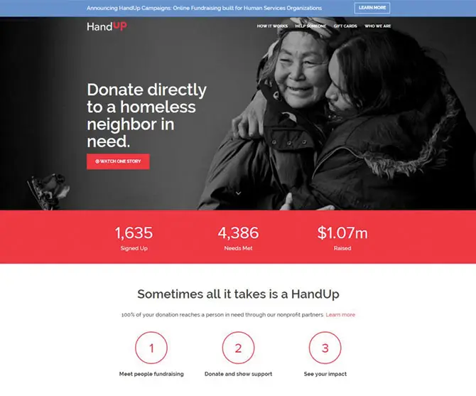
HandUp works with community partners to get homeless people on their feet. They use one strong image on the forefront of their site to really tug at a visitor’s heart strings, with messaging that tells us exactly what they do as an organization. The site then calls on the user to learn a bit more before donating. The prime real estate of this site is clean, clear and makes it easy to take the designated next steps.
Manna FoodBank
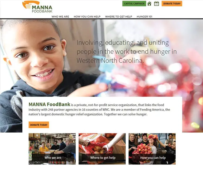
Manna FoodBank displays a heartwarming photo of a child, with the organization’s mission overlaying the image. Right away we know exactly what Manna FoodBank is all about. They then include their most important call to action right below the mission. As users, we get an immediate sense of what this organization does, and exactly what they want us to accomplish during our time on the site.
Heifer International
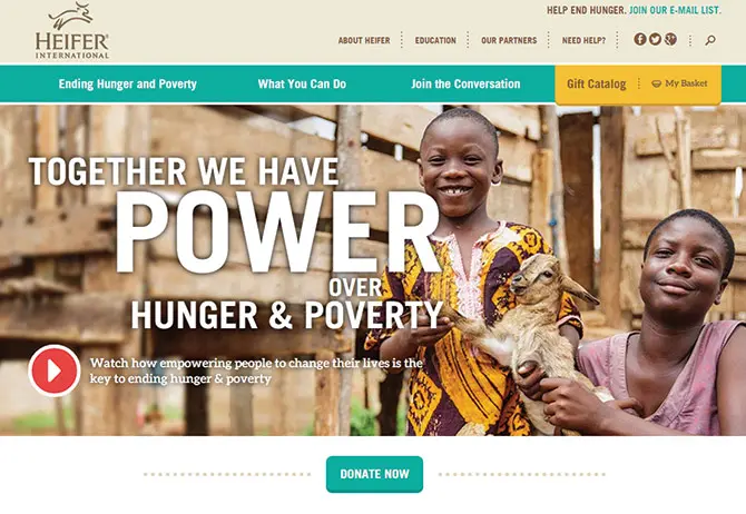
Heifer International is another great example of an organization using a static image and text to directly convey their big picture, as well as immediately call the users to an action (give a donation). As you scroll down the site, we learn how they’re making a difference and really get a sense for the people they are helping every day.
Ditch the Rotator
It’s possible to get the best of both worlds. You can have a beautiful site full of photos that’s usable and informative as well.
We know it can be tough to avoid the temptation of using a rotator. That image carousel knows just what to say as it winks in your direction with that lovely coiffed hair to keep you thinking it’s the right functionality for your site. But, once you get rid of the rotator and hone in on your messaging, we think you’ll find that your users and your organization will benefit immensely.
How have you conveyed your nonprofit’s calls to action in an attractive and functional way? I’d love to hear from you in the comments below.
What You Should Do Now
01. Come to Nonprofit Website Office Hours
We cover a new topic every few weeks. Plus get a live answer to any website-related question you're wrestling with.
02. Book a Website Call
Find a time to discuss your nonprofit's website needs. Discover what's worked for other nonprofits like you and see how easy building your new site can be.
03. Start a Free Website Trial
Try our nonprofit website platform for yourself. Instantly get access to every feature to see if it's the right fit for your needs. No credit card required.
I’ve noticed that many developers are starting to transition from rotating banners to video backgrounds. What’s your take on having a video background in place of a rotating banner?
#nycmixing
Hi Ravi,
That’s a great question. On one hand, it poses similar problems to rotators. For instance, video file sizes can be large, it would probably not be great for accessibility, and you’d more than likely need to come up with a static solution for mobile, as it wouldn’t be ideal to automatically stream video on 4G. On the other hand, if the messaging or call to action didn’t change, at least you’d avoid some of the confusion and banner blindness associated with rotating banners. It would also depend on what the organization was trying to achieve with the video. It might make more sense for some than others. Airbnb is an example of a company pulling video off well.
Thanks for the comment! I hope this helps.
Alex
Great article there! I never know that people are less to click the sliders. I thought it’s a must in every website I design.
Looks like I need to clear back my design then.
Thanks so much for the compliment and comment. I’m glad the article was helpful for you!