
While compelling case stories make for powerful persuasion tools, it’s the data points and patterns that augment your story and motivate action. Enter: nonprofit data visualization.
By offering supporting data, organizations are able to replicate an individual story on a broader level for their target audience. But the thing about data is that it can get overwhelming.
This is why it’s important to use data visualization to communicate data clearly and effectively. Not only does this make it engaging and easily digestible, but it allows you to tell a story and give meaning to the data.
Let’s take a look at how you can leverage nonprofit data visualization to tell compelling stories.
Identify the Objective
There are two questions you need to address before you create a data visualization:
- Who is your target audience?
- What do you want to achieve from the visualization?
For instance, creating an infographic for an email newsletter to build awareness about a cause is very different from demonstrating impact numbers through charts for an annual report.
Establishing the objective and audience will help you collect the right kind of data and choose the type of visualization that best reflects the information.
Here are some ways nonprofits can use data visualization to improve their communication:
- Illustrate a problem
- Create awareness about a cause
- Highlight trends and patterns
- Demonstrate nonprofit impact
- Provide fundraising campaign or event updates
- Show a breakdown of donation spending
- Communicate a campaign strategy
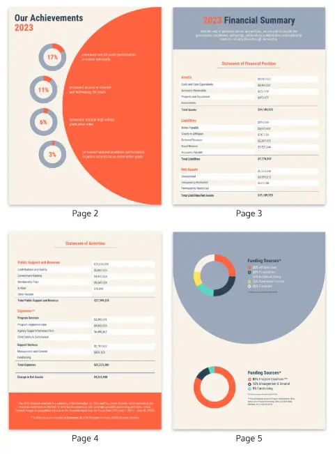
In this example of an annual report design, take a close look at their use of charts and tables to present key statistics and figures. It maintains ample white space and uses color-coded elements to make the report engaging and easy-to-read.
Select the Right Data Visualization
There are different types of data visualizations such as:
- Infographics: to present a quick overview of a topic
- Charts: to represent data points, show change or reveal relationships
- Diagrams: to map out processes, plan projects and connect ideas
- Maps: to show physical features of an area of land
The question is: which is most appropriate for your visual communication?
One of the most common mistakes people make while creating data visualizations is using the wrong type of visualization. This can lead to data distortion and potentially end up misleading people.
Which kind of chart should you use?
There are many different kinds of charts that could be utilized for your data, from pie charts to bar charts. It’s important to know when to use which type of data visualization so that you’re able to present your data accurately.
This infographic outlines the best types of charts for common collections of data.
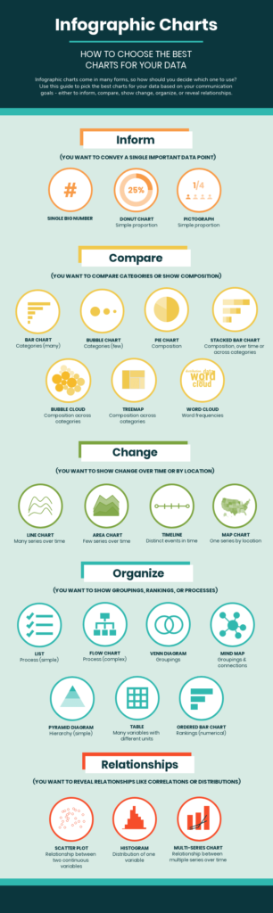
You can also download the cheat sheet from Venngage to help you pick the right kind of chart for your data.
Which type of infographic should you use?
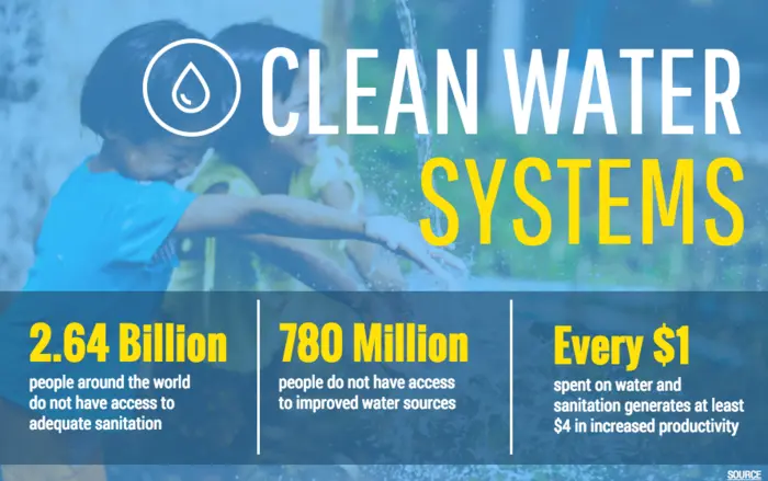
Similarly, it’s important to make the right choice while selecting an infographic too. For instance, you can use statistical infographics to raise awareness, encourage a sense of urgency and encourage action.
- This statistical infographic shares a shocking statistic, compelling people to consider the cause (water pollution).
- You can use a timeline infographic in your impact report to highlight the milestones you’ve achieved in a particular year.
- Maps can be used in infographics to capture regional data or make comparisons between regions.
Build a Narrative
You can’t slap some numbers on a chart and call it a data visualization. What’s important is building a narrative around that data and extracting value from it. This will help you capture attention, engage your audience, and encourage action.
When you combine the right visuals and narrative with the right data, you have a data story that can influence and drive change.
It’s a good idea to create a storyboard to document the logical flow of the information. The key is to keep the visual simple and focused to avoid overwhelming readers.
Let’s say you’re creating an infographic to highlight a burning issue. Start with introducing the problem and use relevant data insights to support that information. End the story with a strong call-to-action, such as asking people to donate or show their support.
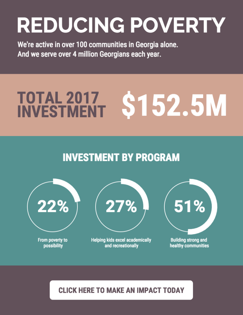
Take a look at this simple infographic that draws attention to an important issue. Notice how it shares two alarming statistics followed by a small solution, encouraging people to act upon it.
Make It Aesthetically Pleasing
No points for guessing but if you want your nonprofit data visualization to be read, it needs to be clear and pleasing to look at. You need to make it easy for people to scan and interpret it. You’ll want to avoid messy, crowded and distracting visualizations.
Design Tips
Here are some design tips to consider while creating data visualizations:
- Include icons to emphasize important points
- Use bold fonts to make the information engaging and easy to read. You can use different fonts for the headers and body text to differentiate sections but don’t use more than three font types
- Use colors in line with your brand guidelines to emphasize points, categorize information or show progression
- Implement visual cues in the form of shapes, symbols and colors to draw attention to important points or sets of data
See how this example sticks to a consistent color scheme and uses a combination of different types of charts and diagrams to convey a more rounded story.
Insert a Call-to-Action
You created a powerful data visualization but before you finalize it, don’t forget to add a call-to-action in the end.
Inserting a clear call-to-action lets people know what’s expected of them. It gives your data visualization purpose and is a great way to build relationships with donors and volunteers. The call-to-action you insert should reflect the objective of the type of data visualization you use.
Here are some types of calls-to-action you can include:
- Ask people to donate
- Provide information on volunteering opportunities
- Encourage people to follow you on your social media platforms
- Build your email list by asking viewers to subscribe to your newsletter
Take a look at this visualization which ends with a clear call-to-action. It provides context on the issue and asks people to show their support by clicking on the button which further leads to a donation page.
The Takeaway
Leverage nonprofit data visualization to inspire action.
Nonprofits need to move beyond mundane, heavy content and engage their audience through visual storytelling.
But it’s also important to ensure that the data visualization you create augments the story and helps communicate the message effectively. This comes from choosing the right type of visualization for your data set and communication.
These five tactics will help you establish credibility, gain trust and inspire action through functional and visually-appealing data visualizations.
What You Should Do Now
01. Come to Nonprofit Website Office Hours
We cover a new topic every few weeks. Plus get a live answer to any website-related question you're wrestling with.
02. Book a Website Call
Find a time to discuss your nonprofit's website needs. Discover what's worked for other nonprofits like you and see how easy building your new site can be.
03. Start a Free Website Trial
Try our nonprofit website platform for yourself. Instantly get access to every feature to see if it's the right fit for your needs. No credit card required.
Comments