Showing gratitude and recognizing supporters is a year-round process for many organizations. From donor acknowledgement letters to special events, saying “thanks” takes many forms, including your nonprofit annual report. To help you get more mileage out of your annual report throughout the months ahead, consider our five tips for repurposing your content.
Annual Report Formats
If you’ve been looking for ideas for annual report design, you know that there are a lot of options out there for packaging up your content:
- Formal multi-page print publication and/or PDF version
- Postcard-size update with a basic summary of the year
- Brochure-type overview with general financial information
- A blog post or page on your site with an annual recap
- A modern and smartly designed infographic
- Online annual report microsite with interactive elements
And choosing a design direction isn’t even the most important consideration! You likely have multiple audiences in mind, like donors or members, partners, program participants and foundations. This diversity makes it hard to pick just one approach to your annual report and successfully share it with everyone you’d like to reach.
Want to know how other organizations have worked through this problem? Check out these expert tips and annual report approaches from fellow nonprofits:
- Annual report examples from the Nonprofit Marketing Guide
- Oregon Zoo Gratitude Report case study from Agents of Good
- Pamela Grow’s assessment of an infographic approach from Brittany’s Hope
- How to plan your nonprofit’s next annual report via Nonprofit MarCommunity
- Annual report advice and case studies from The Chronicle of Philanthropy
- Nancy Schwartz talks about how to choose the right format for your donors
But no matter where you land with a final format and content, you can thoughtfully recycle and expand on your annual report content to get it in front of more people.
Repurpose Your Nonprofit Annual Report
Since you’re doing the work to make an annual report, maybe even investing to print it, we pulled together a few ways to repurpose your report, with examples from real nonprofits that use a variety of formats.
Share the Bigger Story
While your annual report may contain a constituent story or two, what does it say on a whole? Is there a common thread? Did you demonstrate your core values? Is there trouble on the horizon that you’re uniquely positioned to fight?
Your entire report is a chance to tell a much bigger story about what you stand for. To help translate it, repackage the content in ways that clearly communicate what you want the takeaway messages to be.
One way to do this is by publishing a blog post or series of posts that dives into deeper detail about the theme of your annual report. You could offer additional insight into how your cause makes an impact while giving you another opportunity to acknowledge the supporters that make your work possible.
Similarly, rather than just blasting out a link to the PDF of your annual report (or telling people that it’s in the mail), use an email announcement or a social media post to set the stage and tell the right story about your work. Don’t just tell supporters that everything is great and thanks so much and please give again in one breath. Tell them why the last year matters.
Example: The Conservation Fund
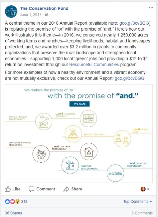
The Conservation Fund repurposed designs from their 2016 online annual report into a social media graphic on Facebook. The accompanying caption explains how it relates to a central theme from their report and the work they’ve been doing in the last year.
Get Social-Media Ready
Old school annual reports typically use charts and diagrams that can be hard to interpret without much background in finance or budgeting, especially when it comes to administrative or overhead costs. Or maybe you have compelling numbers about your impact but they don’t mean much to someone that doesn’t know your inner workings.
Avoid this trap by translating your data into visuals that are labeled in non-technical terms and can be explained with simple and straightforward captions. In addition to being more accessible, your content is also then ready for posting on a channel like Facebook or Instagram, which are good matches for posts that include both an image and an explanation.
Try easy-to-use and free or discounted tools like Canva or Piktochart. Here’s the general process:
- Pull out numbers about your impact or activities and pair them with icons or photos in a more visual or infographic-style. We put together a beginner-level Canva tutorial that can help you get started.
- Craft accompanying explanations to give the numbers context and show how your mission works in the real world. (Don’t forget to say thanks!)
- Sprinkle in your posts over the course of weeks or months and include a link back to the full report each time.
You might even get some comments, questions and shares from your followers, expanding your reach and growing your donor engagement.
Example: Association of Related Churches
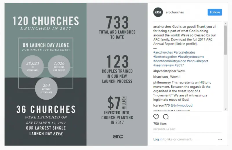
The Association of Related Churches (ARC) put a lot of work into their 2017 annual report and related pieces, which, in addition to the web page, included a trifold-type piece in print and as a PDF, a video and Instagram graphics. See one of these graphics in action, which is also a design used in the report itself.
Film a Forward-Looking Interview
While nonprofit annual reports offer more factual recaps and let your donors know how you spent their gifts, reports also offer a chance to get supporters emotionally excited about what’s ahead. It’s a great time to let them know they are still needed — without necessarily asking for their next donation.
Using basic camera equipment, even a cell phone, try filming a 1-2 minute interview with a staff or board member from your organization to accompany your annual report. Rather than revisiting the information that’s in the report, however, offer insight into what’s next for your nonprofit in the coming year. To make it more personal, also ask the interviewee to describe something that they are most proud of.
The video can be informal and done in a single shot, which doesn’t require fancy editing or transitions. When it’s ready, upload it share it across your social media channels and anywhere you talk about your annual report on your website, blog or via email. If possible, include a link to it in the report itself.
Example: Playworks
Playworks put together a video with its founder/CEO for their 2016 annual report, which is offered as a PDF download on the website. The video is also highlighted and linked within the PDF as part of the introduction, which is a more personal and emotion-filled approach compared to the standard “letter from the executive director” approach.
Create a Content-Rich Landing Page
If you’re going to ask people to download your annual report, why not send them to a page that offers more than a little blue link to a file? As an added bonus, search engines will love it, too, since pages with more content on them also signal quality.
To be clear, you don’t need a complicated microsite or custom design to create a more welcoming experience for your supporters. Instead, the landing page for your annual report can offer the download as well as a summary and supporting content that reinforces your core message.
Consider pulling out a few highlights, a testimonial or an introduction from the executive director. Maybe you can include links to related programs or stories on your blog. Even better, is there a new call to action that makes sense for your annual report audience?
Basically, if you’re asking supporters to visit your site to get the new annual report, take advantage of the fact that your website offers value and functionality beyond the file itself. You might also pick up a few new supporters that find you through search.
Example: The Cornell Lab of Ornithology
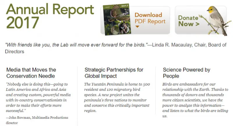
The Cornell Lab of Ornithology has a page dedicated to their most recent annual report (as well as links to reports from previous years) that includes prominent download and donate buttons, a quote, brief highlights, a beautiful photo and financial charts.
Update Your Impact Page
Does your website have an Impact page? It’s usually a page on your site, separate from financial information and IRS forms, where you share what your organization has achieved and how you measure success.
Effective Impact pages provide information in a variety of ways, from facts and figures to stories from your constituents and multimedia. As such, they are places that can (and should) be updated with the content from your recent nonprofit annual report.
Keep in mind that your Impact page, just like your annual report, should be more than a laundry list of the work you’ve done. Put your supporters front and center and be sure to say thanks for what they accomplished through your organization.
Example: Latin American Youth Center
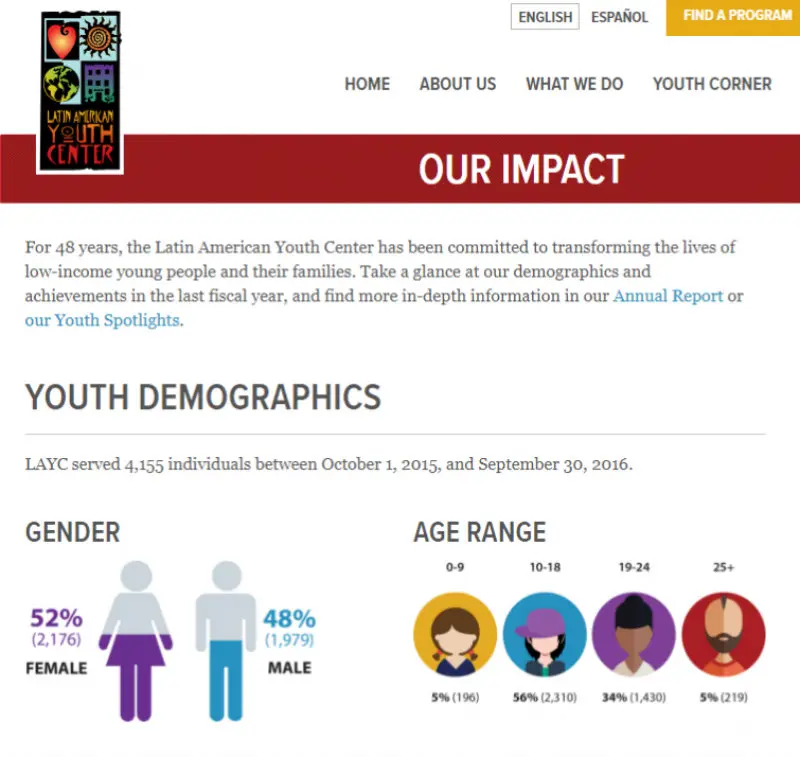
One of our website clients, the Latin American Youth Center, repurposes data about their constituents from their annual report for their Our Impact page. They also repurpose Youth Spotlights in their annual report and in a special category on their blog, giving people more opportunities to find and read them.
When it comes to content for your annual report, you’re not limited to the first format that you put it in — especially if you plan ahead. Reach more supporters by repurposing the content in ways that get them excited for the next year, using the strengths of different communication channels to educate and inspire.
What shape will your nonprofit annual report take this year? How are you planning to reuse your content for different channels? I’d love to hear your ideas in the comments.
What You Should Do Now
01. Come to Nonprofit Website Office Hours
We cover a new topic every few weeks. Plus get a live answer to any website-related question you're wrestling with.
02. Book a Website Call
Find a time to discuss your nonprofit's website needs. Discover what's worked for other nonprofits like you and see how easy building your new site can be.
03. Start a Free Website Trial
Try our nonprofit website platform for yourself. Instantly get access to every feature to see if it's the right fit for your needs. No credit card required.


Comments