Who is this group? Can I trust them? Will I regret giving them my support? Great nonprofit “About Us” pages are able to squash any misgivings with a simple, yet complete overview of who you are with links to various pages around your site for folks to learn more about you.
The About Us page is one of the first stops on your website for new visitors. It’s where people gather to assess your organization’s credibility and trustworthiness. It is an absolutely essential page to have on your website. Without a clear picture of who you are, your audience will have a difficult time connecting with your organization online.
But in my experience, this page rarely gets the love and attention that it deserves on nonprofit websites. Sometimes it’s even absent altogether! Or it becomes a dumping ground for miscellaneous content without giving a clear picture of who you are and what you’re working to accomplish.
About Us Content
So what should you include on the page? Since this page is aimed at those new to your nonprofit and work, start at the beginning.
- Give a brief overview of your organization, what you do, who you serve and why. Stick to the highlights and link to other pages on your site for lengthier descriptions (like Program or Our Model pages).
- Reflect your organization’s values within the content or list them explicitly on the page.
- Introduce your team, either in its entirety if you’re small or by linking to an Our Team page if you’re a larger organization.
- Highlight and link to subpages in the About Us section, like Impact or Partners pages.
- Spruce up the page with photos that connect to your work and mission or history. It’s also a great place for a short overview video if you have one.
- Offer a way to get to know your organization better, like by signing up for a newsletter, reaching out with questions or getting involved.
Who are you?
In the end, the page should answer one question: who are you? It should introduce your organization from a high level and encourage and offer ways to get to know your work and mission on a deeper level.
That means simple is often best. You can always link to related pages for those who are curious to learn more about certain aspects of your organization. Keep your descriptions brief and let your nonprofit’s personality and voice shine.
Build Out Your Website With Great Content
Check out the Essential Web Page Content for Nonprofits guide to get inspiration and best practices for other must-have web page content.
Nonprofit About Us Pages
Seeing is believing, right? Let’s take a look at these tips in action on real nonprofit About Us pages.
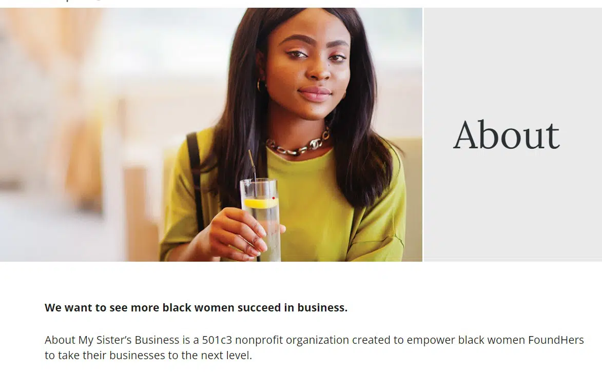
About My Sister’s Business
The About My Sister’s Business About page is clear and concise in its bold opening statement: “We want to see more black women succeed in business.” The page gives an overview of what they do before introducing their team and impact. They wrap up the page encouraging visitors to reach out with questions and ideas.
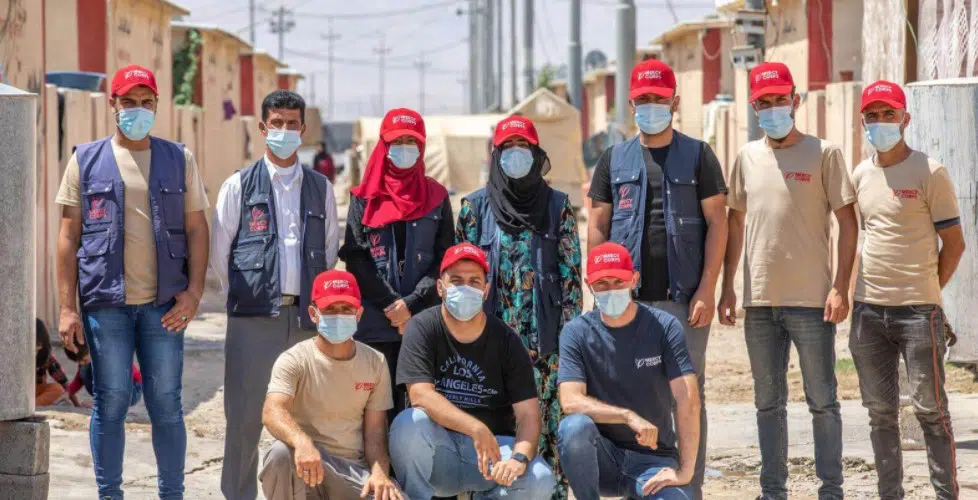
Mercy Corps
On its Who We Are page, Mercy Corps offers an overview of their mission and approach, including helpful stats for beginners, like 40+ countries and 5,400+ team members, to show their scale. A short overview video adds a nice visual element to the page and an opportunity to catch a glimpse of their team in action.
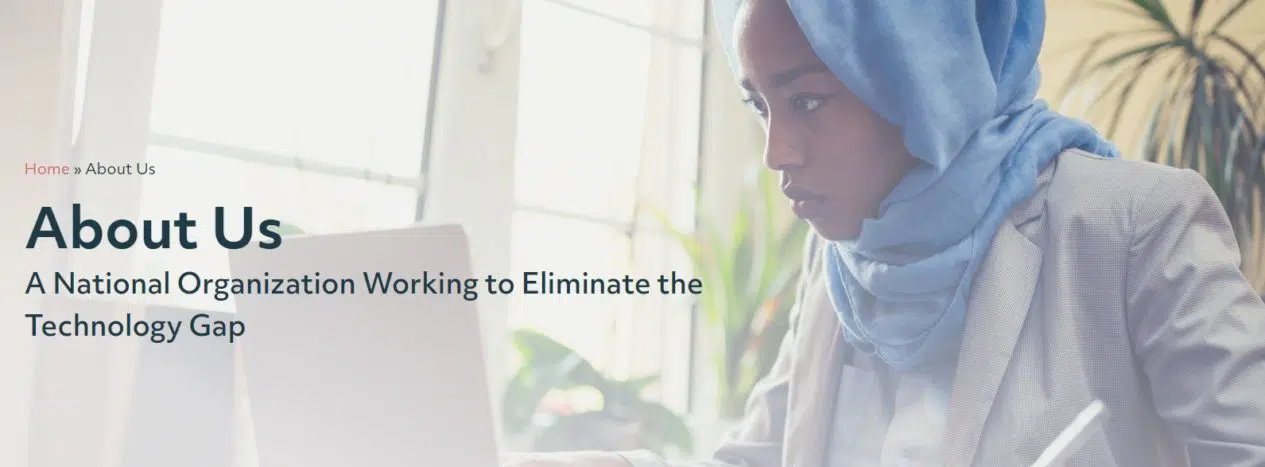
Digitunity
The Digitunity About Us page gets straight to the point, presenting itself as “A National Organization Working to Eliminate the Technology Gap.” They present their mission, vision and core beliefs before introducing and linking to key subpages in the section, like History, Our Team and Financials.
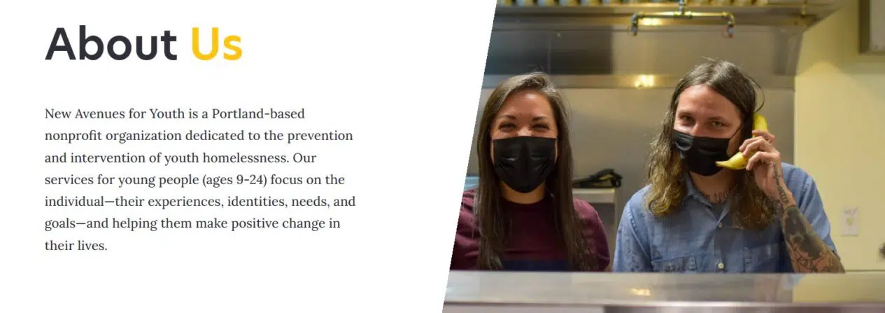
New Avenues for Youth
The New Avenues for Youth About Us page includes all of the obligatory introductions and links to relevant pages. But the photos that are peppered throughout highlight the organization’s personality and present a real picture of what life is like for youth at the center.
Connecticut River Valley Farmworker Health Program
The Connecticut River Valley Farmworker Health Program About Us page starts out with a clear elevator pitch of what they do, before diving into elements of their approach that make them different, a large map of where they work in the Connecticut River Valley and bios and photos to get to know each of their five team members.
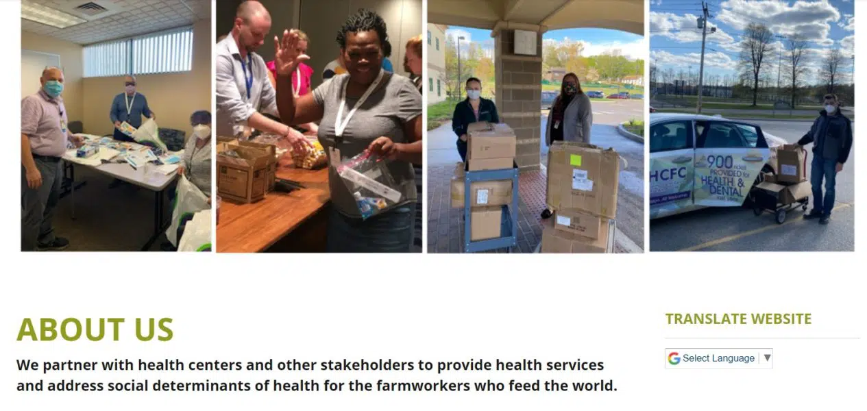
Does your nonprofit’s About page share an accurate picture of who you are as an organization? Spending some time to spruce up this key page on your organization’s website is a worthwhile endeavor, helping to create a positive and welcoming experience for new visitors to your site as you bring them into the fold.
Could your nonprofit About Us page use a refresh? Does it instill trust in your audience or show off your organization’s best qualities? Share your About Us pages in the comments section. I’d love to take a peek and answer any questions!
What You Should Do Now
01. Come to Nonprofit Website Office Hours
We cover a new topic every few weeks. Plus get a live answer to any website-related question you're wrestling with.
02. Book a Website Call
Find a time to discuss your nonprofit's website needs. Discover what's worked for other nonprofits like you and see how easy building your new site can be.
03. Start a Free Website Trial
Try our nonprofit website platform for yourself. Instantly get access to every feature to see if it's the right fit for your needs. No credit card required.

Hi Christine
Thank you for the informative article.
This is our current About Us page:
https://ryder-cheshire.org.nz/about-us
Having read your article and viewed the examples, I’ve reshaped the page (not live yet) to:
https://ryder-cheshire.org.nz/who-we-are
I still have to add some bios.
Hopefully its an improvement.
Jonathan
The new page looks great, Jonathan! Once you add the bios, it’s a nice answer to the question, “Who are you?”
This is interesting. It’s eye-opening and gives me a clearer outlook. This is how our current page looks like: https://wafkenya.org/introducing-waf/
Glad to hear the tips and examples were helpful Winnie!