Has your organization’s list of giving options grown beyond a simple donation form? When you get to a point where you want to tell supporters about things like bequests, matching gifts, sponsorships, capital campaigns, memorial gifts and more, it becomes increasingly important to put together a “Ways to Give” page that’s easy for website visitors to digest.
I often come across examples of “Ways to Give” or “How to Donate” pages from nonprofit websites that are more like wild jungles than carefully cultivated donor experiences. Even if it seems quick and easy to slap some information about giving on your website and call it a day, trust me when I say that no one wants to bushwhack their way through unstructured content. Instead, they’ll leave without understanding which of your giving options is best for them.
To help your supporters get on a clear path to giving, I’ve put together a few general guidelines to follow and will show you great examples from nonprofits that have created engaging and user-friendly pages.
“Ways to Give” Page Guidelines
You’ve probably read about donation page best practices like using clear calls to action and simple forms. Many of the same principles apply when it comes to writing and formatting a Ways to Give page for your website.
Here’s what some of the best nonprofit websites do effectively:
- Be approachable. A warm introduction and message of thanks can go a long way to making your page feel more like an invitation than a list of demands.
- Organize by priority. Put your most important or popular giving options front and center to help guide donors toward the path that will make the most impact.
- Link your donation form. Some visitors will land on your Ways to Give page and easily decide to donate now using your online form. Make it easy for them to get there!
- Demonstrate credibility. Work in supporting information about your organization to assure supporters of their investment, like donor testimonials, seals of approval, or a link to your Financials page.
- Don’t forget the visuals. Even just one compelling photo can inspire people to connect with your cause or envision themselves as part of your donor community.
- Be descriptive. There’s a lot of fundraising and development jargon out there that could make your wording inaccessible to potential donors. Put together brief descriptions of different giving options that you list on the page.
- Link various giving programs. If you have giving programs or campaigns with their own pages on your site or elsewhere, be sure to include links for people to keep moving through your content.
Nonprofit Examples
See how nonprofits have tamed their lists of ways to give using different approaches. Are there any formats that you could try on your nonprofit’s site?
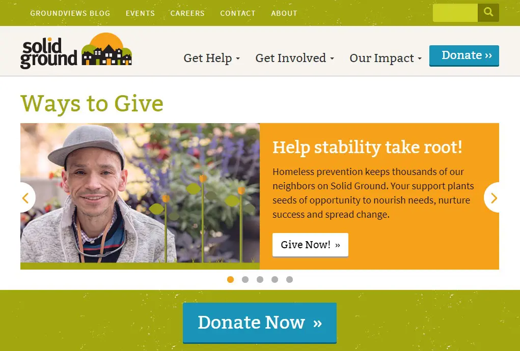
Solid Ground
This page is packed with colorful and engaging content, including testimonials at the top, a prominent donate button, a grid of featured options, contact information, financial details and a message of thanks.
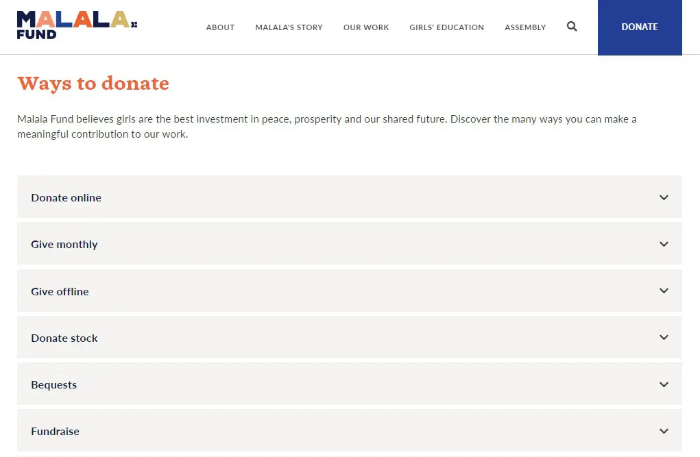
Malala Fund
This full-width page kicks off with a bold image and then simple accordions that expand with helpful descriptions (and even a way to check employer matches through Double the Donation). Accordions are also used for FAQs, followed by a contact form.
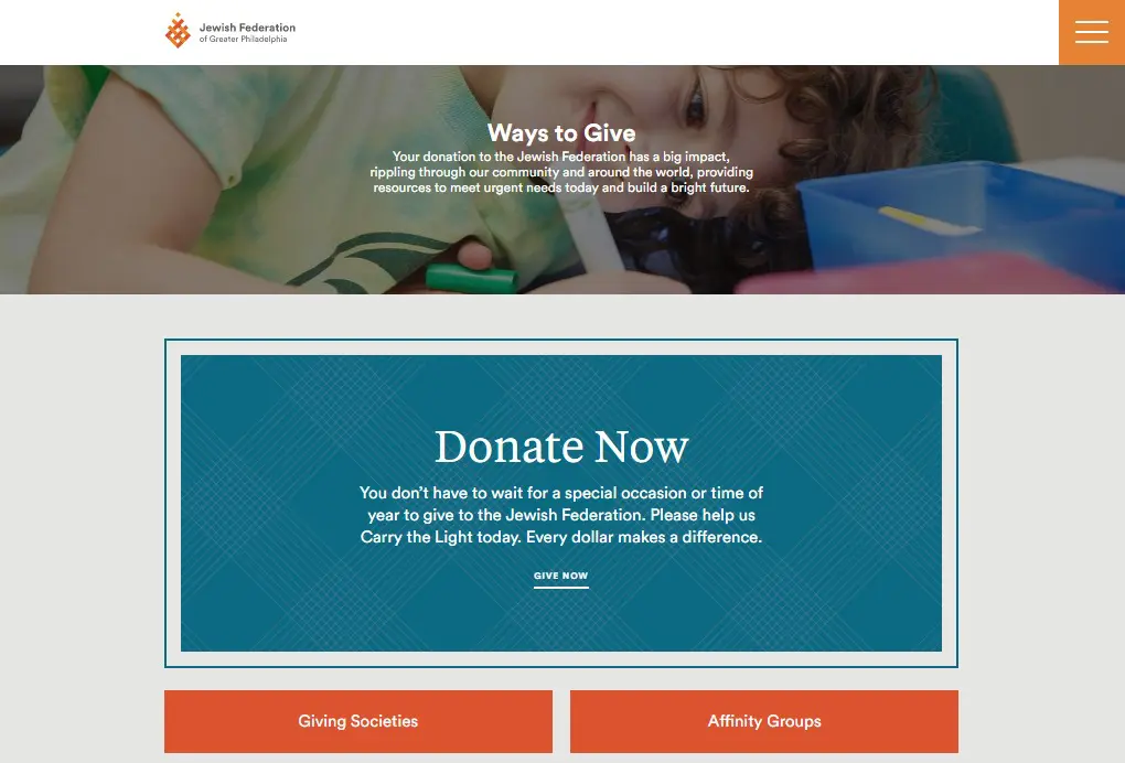
Jewish Federation of Greater Philadelphia
With a prominent option to donate right at the top, the remainder of this page offers quick links to additional options plus pairings of friendly photos with short descriptions of other programs.
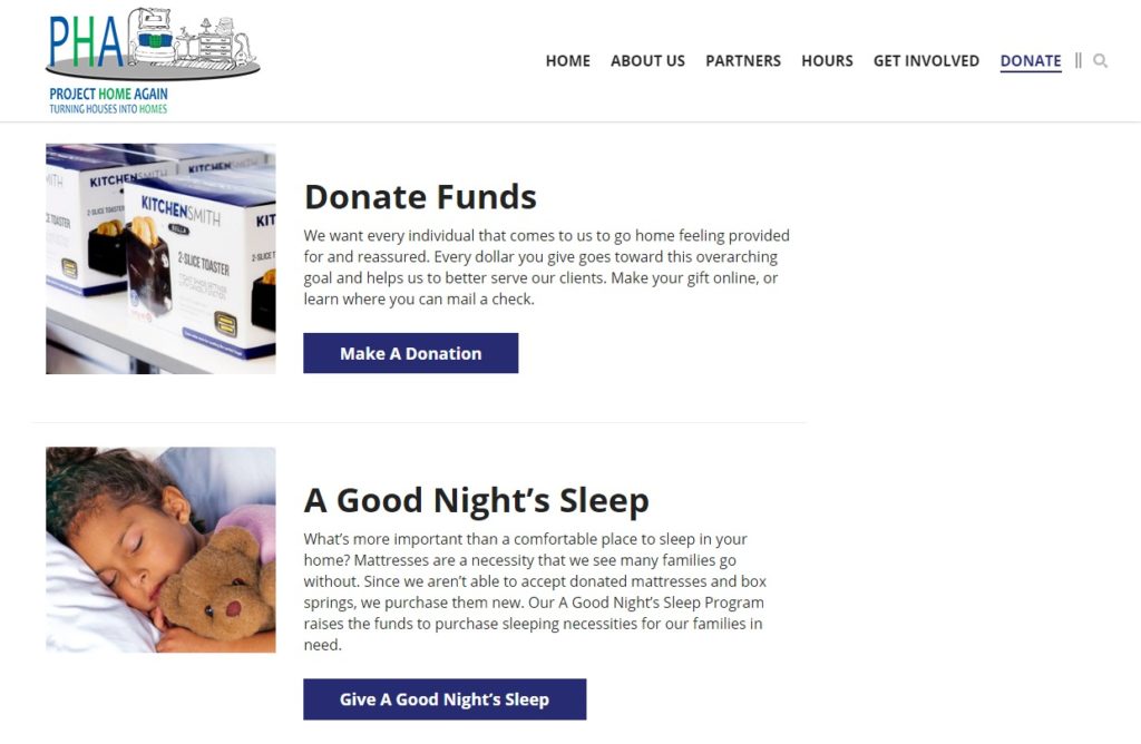
Project Home Again
If you need to include a series of different campaigns with their own online donation forms, take note of this approach that lists donation options with a representative image, description and button that links to a corresponding page for more details.
Edmonton Food Bank
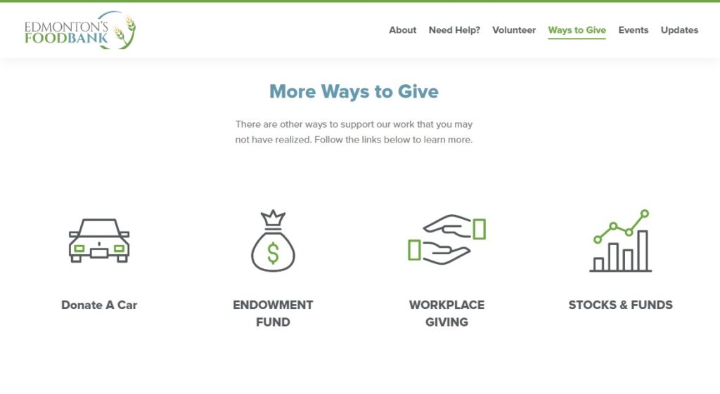
This page does a nice job covering ways to give beyond monetary gifts, linking to landing pages about food donations and volunteering. They also use icons to help list and link to even more choices.
The Canadian Canoe Museum
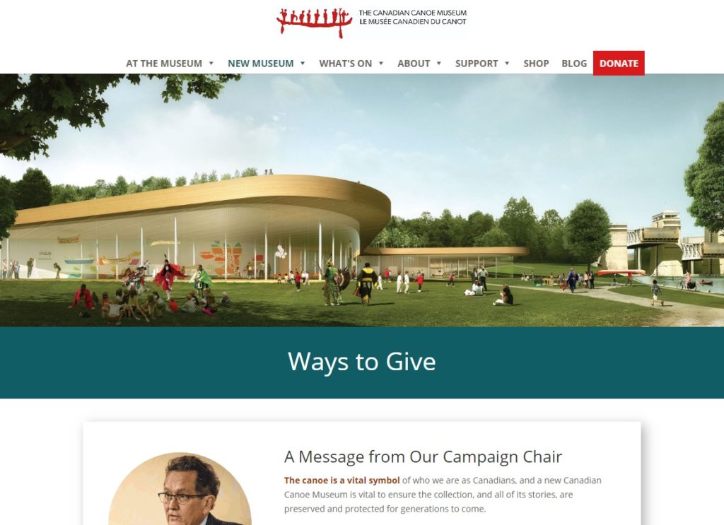
Launching a capital campaign with lots of giving options? Here’s an example of a page that includes an inspirational image, message from the campaign chair, a testimonial, custom graphics, downloadable materials, donor news and a final call to action.
National Alliance to End Homelessness
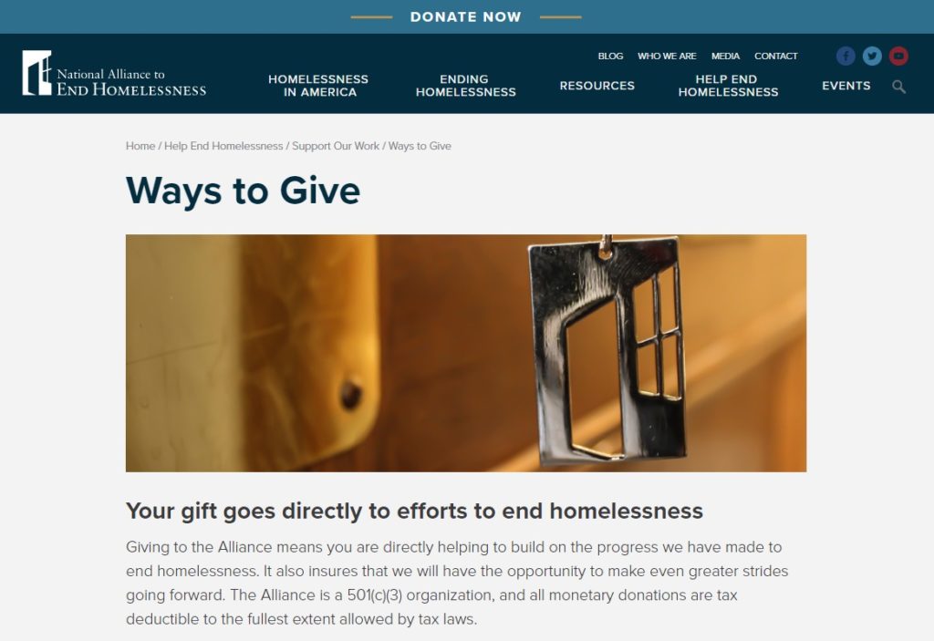
This example shows how to cleanly format text using a series of headings, descriptions and buttons with simple separators. A single image offers some visual intrigue and the short introduction reiterates their credibility.
Martha’s Vineyard Community Services
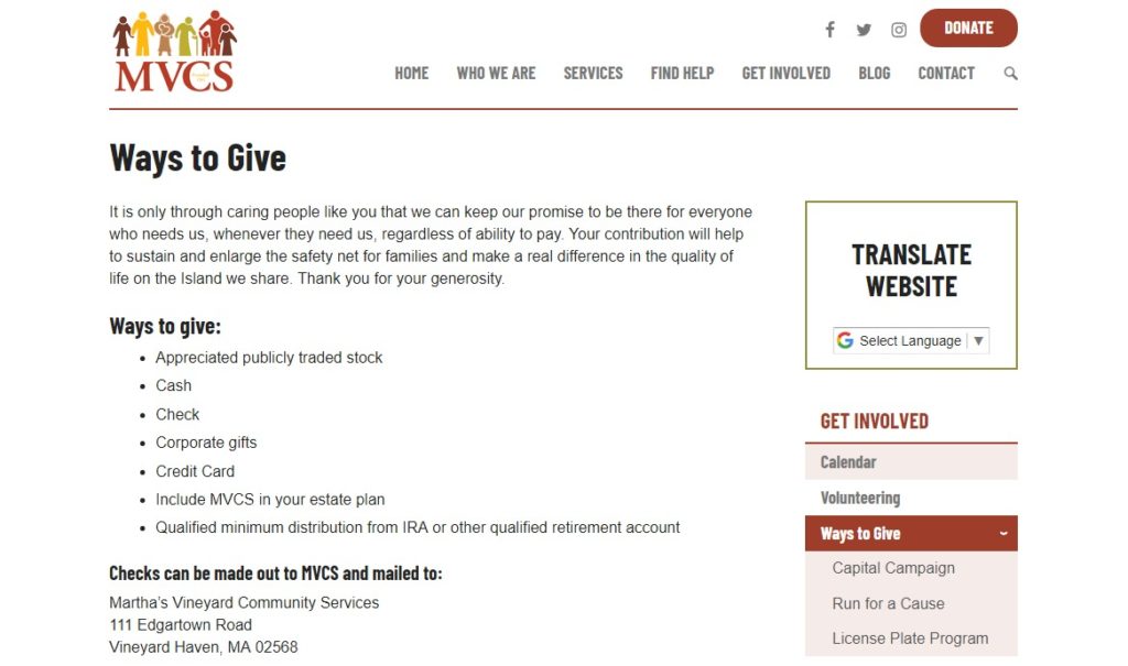
This page offers a mix of easy-to-digest options, starting with a warm welcome and bulleted list before transitioning into a more visual (and prioritized) list that combines images, short descriptions and links to specific campaigns and giving programs.
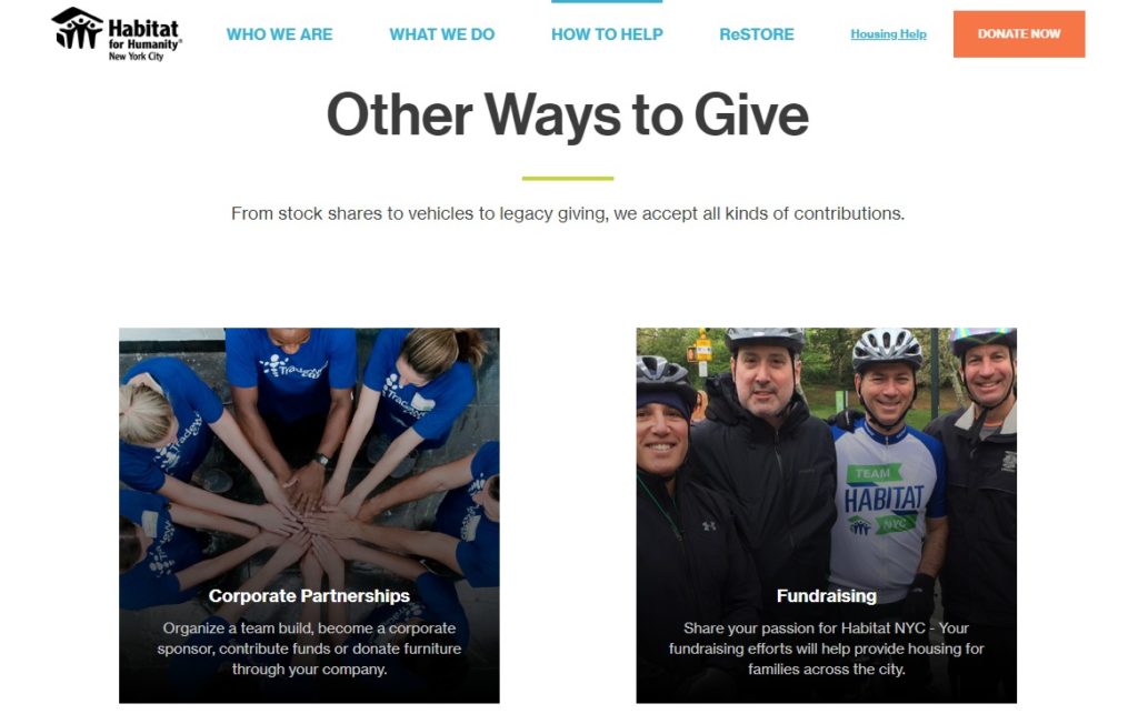
Habitat for Humanity New York City
Take a grid approach like this example that presents giving options in a 2-column format with images and captions that link to related pages. Their wording is approachable but clear, like using “Share some stock”.
If your nonprofit’s Ways to Give page feels overwhelming to you, imagine how your website visitors must feel. Creating effective donation pages for fundraising means helping supporters get to where they want to go, offering clear paths that enable them and you to reach your goals.
What’s the hardest part of creating a Ways to Give page for your organization? Have any additional examples you’d like to share? Let’s exchange challenges and ideas in the comments.
What You Should Do Now
01. Come to Nonprofit Website Office Hours
We cover a new topic every few weeks. Plus get a live answer to any website-related question you're wrestling with.
02. Book a Website Call
Find a time to discuss your nonprofit's website needs. Discover what's worked for other nonprofits like you and see how easy building your new site can be.
03. Start a Free Website Trial
Try our nonprofit website platform for yourself. Instantly get access to every feature to see if it's the right fit for your needs. No credit card required.

Hi Katy,
Thanks for including Solid Ground’s Ways to Give page in your round up! Lots of good ideas on all the other pages as well. We appreciate being in such good company! Whether working to solve poverty or preserve culture, we all rely on donor engagement to fuel our work.
Hi Mike,
I’m always glad to feature great work from inspiring causes. Thanks for taking a moment to say hello!