Your nonprofit website homepage has an important job to do. But is it trying to do too much at once?
A homepage that’s too cluttered and complex can ultimately confuse, distract and overwhelm your visitors — making this key page a whole lot less effective.
If you’re ready to simplify and strengthen your homepage, then you’re in the right place. Discover what your homepage actually needs to do, how to evaluate your current homepage and what steps you can take to level it up.
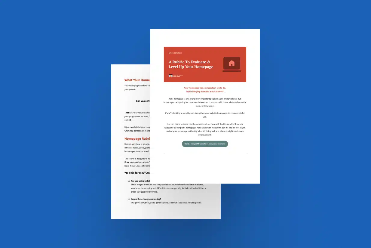
Nonprofit Website Homepage Rubric
Evaluate & Level Up Your Homepage
Video Transcript
This webinar was originally part of our Nonprofit Website Office Hours series. The transcript has been lightly edited for clarity.
Your homepage is obviously one of the most important pages on your nonprofit’s website. That puts a lot of pressure on organizations to get it right. It also increases competition for real estate on the page.
As a result, a lot of nonprofit homepages become way too complicated. Many are just unnecessarily complex and dense and cluttered, all of which actually makes this crucial page much less effective.
No doubt your homepage has a big job to do. But it doesn’t need to be as complicated as it may seem at first glance. And it actually only needs to do three things really well.
Today, we’re going to cover what those three things are, how you can evaluate your own homepage against those three things and what you can do if your homepage is falling short to level it up.

Common Homepage Myths
But before diving in, we’re going to take just a few quick moments to talk through some common myths about nonprofit homepages that often get in the way. This should help clear up some common misconceptions about the role of your homepage, and it should also help us just kind of get in the right headspace to assess and improve our homepages.
Myth #1: Everyone visits the homepage first.
So homepage myth number one: Everyone who visits our website will always land on the homepage first.
Now, folks who believe this myth will say things like, “If everyone comes to the homepage first, then we need to make sure it covers all of our programs or services or ways to get involved just in case.”
But this creates a really slippery slope to clutter. Because using this logic, your homepage needs to share everything you do all at once, which can get really overwhelming really quickly.
And I totally get where this comes from. But for most websites, this just isn’t true. There are all kinds of ways for visitors to find your site and a variety of pages visitors will land on to start their journey.
To combat this myth, I always recommend looking at the top landing pages in your website analytics just to see where most of your visitors are arriving on your site instead of assuming it’s always (or even most of the time) your homepage.
Myth #2: Our audience won’t visit other pages of the site.
Homepage myth number two: Our visitors won’t have the patience to navigate to other pages with more detail.
Now, folks who believe this myth say things like, “People have limited attention spans these days, so everything needs to be right here,” or available within three clicks. You’ll hear about the three-click rule.
This just often leads to a lot of info dumping on the homepage. And because you’re trying to provide a lot of detail about a variety of things on one single page, it’s going to get even more overwhelming and confusing.
And the thing is, visitors actually have relatively comfortable attention spans. It’s longer than you might think. You just have to earn it.
Ultimately, this is a big reason it’s helpful to focus less on the specifics of what you do on your homepage and more on why you do it.
This will actually pique folks’ interest and build a connection with your visitors who resonate with that “why” behind your movement. And then once you’ve made that connection, they’re much more willing to scroll and click and ultimately read and engage with your website.
Myth #3: Important news and announcements should take priority.
And the final myth here: Important news should always take priority on the homepage.
So folks who believe this myth will say things like, “We need people to know about this news item or event or initiative, so it needs to be featured at the top of our homepage.”
And this myth is actually fueled in part by the other myths we just talked about. If we think everyone will land on the homepage first and they won’t have the attention span to navigate around to other pages, then we have to put everything new and important right at the top, front and center, so no one will miss it.
But this actually makes it harder for folks to know who you are and what you’re about. Consider a first time visitor who lands on your homepage and is immediately asked to donate to your capital campaign or attend your annual gala.
They’re just not ready to do that. They don’t yet know who you are or the problem you’re solving, or if it matters to them. They’re just not ready to take that step and engage in that way.
And all of these myths are absolutely understandable. But they also lead a lot of nonprofits to make decisions about their homepages that actually make it harder for their intended audiences to connect and engage — which is pretty much the exact opposite of what we want our homepages to do.

What Your Homepage Needs to Do
So, what does your nonprofit’s homepage really need to do? Your homepage needs to clearly and quickly answer three questions in the minds of your people.
| Is this for me? |
| Can you solve my problem (or a problem I care about)? |
| What is the next step for me? |
That’s it. Your homepage doesn’t need to tell your entire story or list each of your programs or services individually.
If your homepage is doing its job, within a few seconds of landing on your homepage, your people should understand: First, that they’re in the right place; then, you can be trusted to help them. And with that understanding, your visitors should know what step comes next in their journey with you.
It’s really tempting to make our homepages a lot more complicated than that. But honestly, in most cases, simplifying your homepage will actually help you better engage your visitors.
That’s why we often say when in doubt, leave it out. Less is often more with a homepage.

And if there’s one thing you remember today, I would make it this: When in doubt, leave it out. If you’re on the fence as to whether something needs to be on the homepage, that’s usually a pretty clear signal that there’s a way to find a better home for that around the site.
Again, those three questions we need to answer for visitors:
| Is this for me? |
| Can you solve my problem (or a problem I care about)? |
| What is the next step for me? |
Now that we’re clear on what your homepage needs to do, it’s time to talk about how to actually do that.

How to Evaluate Your Homepage
We’re going to talk about whether or not your homepage is pulling its weight, and we’re going to drill deeper into each of those three questions to talk through how to evaluate your homepage against each of those three questions.
Plus, we’ll cover simple steps you can take to level up your homepage if it’s falling short in any of these areas. And we’re going to share a bunch of examples you can use as inspiration for future updates. (Some of the folks that are going to be used as examples are actually on the call, which is super cool!)
And if you’re creating a new homepage instead of evaluating your existing one, this can also serve as a kind of roadmap in that process. But as we dive in, just a couple of quick notes here.
First, there is no one-size-fits-all approach to homepage design. Every organization has different needs and goals and preferences and technical constraints that will influence how their homepage is structured.
That’s actually why we haven’t structured this as a homepage template that we’re going to give you. There’s a lot of homepage templates out there. But there’s really not a one-size-fits-all approach.
As we walk through this criteria today, our hope is that you can use it to grade your homepage. But take whatever you need, whatever is applicable to your organization, and leave the rest. Because again, remember, when in doubt, leave it out.
Is This for Me? Homepage Assessment Questions
Let’s dive into the first question we’re trying to answer for our visitors: Is this for me? Am I in the right place?
How well does your homepage answer this first question? There are some key things to look for when evaluating that.
Are you using a static image in your hero section?
The first question in terms of answering “Is this for me?” for your visitors: Are you using a static image in your hero section?
When we say hero section, we’re talking about the main area at the top of your website’s home page. It’s the first thing visitors see when they land on your home page and usually includes an image, some text, sometimes a call to action.
Some homepages rely on videos that play automatically or a slider that rotates through a bunch of different slides. If that’s happening on your homepage, you would not check this one off.
Static images are much less likely to distract or confuse your visitors than videos or sliders, which can be annoying and difficult to use — especially for folks with disabilities or who use assistive devices.
They can also negatively impact load times, especially on slower connections. But beyond all of that, there are all kinds of studies out there showing that hero sections with rotators or sliders actually get less attention and engagement than static hero sections do.
To fix that, in most cases, you’ll want to use just a single, static hero image instead of a video or a carousel or slider in your site’s hero section.
Is your hero image compelling?
Related to the hero section and the image here, the next question is: Is your hero image compelling?
This image sets the tone for a visitor interacting with your homepage. And if it’s falling short, maybe you’re relying on a pretty generic photo for now. Or maybe your image is blurry or pixelated. Maybe your image is mostly filled with text to promote an upcoming event or a fundraiser or something like that.
If that’s happening on your homepage, you wouldn’t check this one off.
Most people understand that imagery is powerful. And a generic photo, or one that’s too small to fill the space, or one that’s loaded with a bunch of text, is going to be harder for folks to connect with.
There’s also accessibility issues with text in an image, which can be really hard for visitors using assistive devices to engage with. A lot of times, that text just won’t be readable by screen readers and could be missing key information for folks with different kinds of disabilities or folks using assistive devices.
How do you fix this? Swap your photo for a high-quality, compelling image that’s relevant to your mission and sized properly for your website’s hero section.
Obviously, it’s amazing if you can use a real, authentic image that you’ve taken. But it’s also definitely possible to check this box with a stock photo.
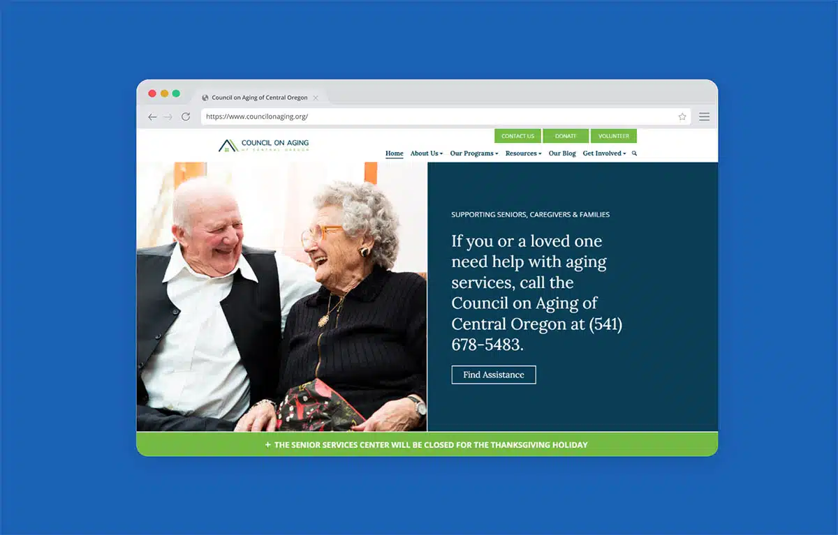
Here’s an example from one of our clients, the Council on Aging of Central Oregon. This photo comes across as so heartwarming to me. It immediately makes me smile and draws me in.
This is exactly the way we want seniors in our community to feel. And if this is a cause that’s near and dear to my heart, it’s going to get me to lean in and spend some time engaging. So this is a great, great image.
Is your one-liner quickly visible on the homepage?
Next up: Is your one-liner quickly visible on the homepage? This brief one-liner gives your audience some footing once they arrive on your homepage.
It should be visible without scrolling so they have the context they need to start to understand what you’re up to, how you’re different and why they would care. Again, we want them to be able to answer that question, “Is this for me?”
If yours is falling short, try putting a compelling one-liner right in the hero section of your homepage if you can. Generally, the hero section is going to be a better spot than putting it in your logo, which can get really small and hard to read.
The other thing to consider is that it’s often a lot more difficult to update your logo than text on a homepage. So if possible, put that one-liner right in the hero section of your website’s homepage.
Is your one-liner clear and brief?
And staying on the one-liner train for just a moment: Is your one-liner clear and brief?
Your homepage visitors will lean heavily on your one-liner to get just a quick sense of why they should care about your cause. It really carries a lot of weight in how they experience the rest of your homepage. It’s that framing item that’s going to help tee up their experience with the rest of the homepage.
Being clear and brief matters a whole lot more than being clever here.
A lot of times with this type of content, folks get really hung up on being clever with it. But again, clarity and brevity are going to matter a whole lot more.
And if your one-liner is doing its job, your visitors should at least start to have a sense of who and how you help, what makes you unique and if it’s a cause they care about.
So if yours is falling short, focus on clarity. As Jordana, who is on the call, says, “Clarity creates connection.”
And Jordana was actually on our last Nonprofit Website Office Hours, which was all about dialing in your messaging. It was awesome, super helpful, very tactical. I’d definitely recommend checking that out if you’re wrestling with how to describe your work. I think it’ll really help point you in the right direction.
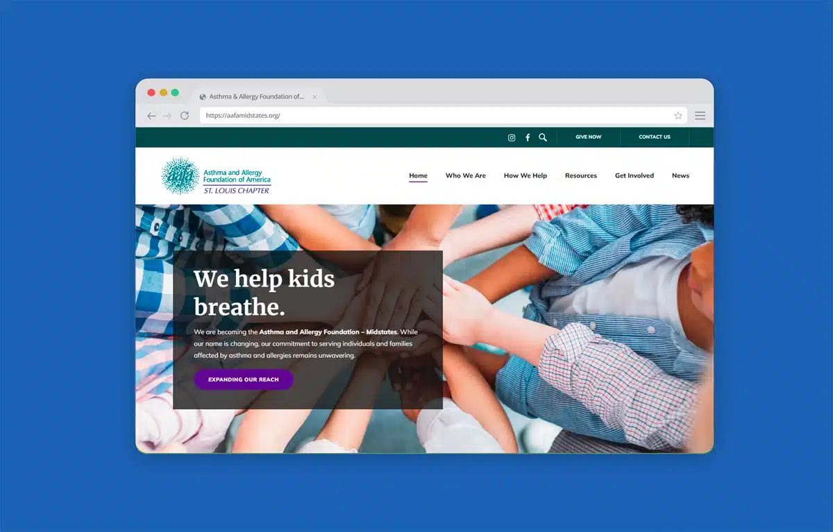
Here’s an example from one of our clients, the St. Louis Chapter of the Asthma and Allergy Foundation of America. And their one-liner is short and sweet: “We help kids breathe.”
It’s clear. It’s compelling. It does not tell you everything that they do — but if this is a cause you’re passionate about, it’s going to get you to lean in. It’s going to pique your curiosity. It’s going to get those visitors who care about this cause to give you a bit more of their time and attention.
Have you broken up the page with clear headings?
Next, have you broken up the page with clear headings? Clear headings make it easy for visitors to quickly skim through your various homepage sections and will help folks find the information they’re looking for.
On top of that, it helps give them just a broad understanding of what you’re all about and what they can expect to get out of spending some more time just reading through your homepage.
If yours is falling short, add some headings to introduce each major section of your homepage wherever it’s appropriate. Use your judgment. But the whole point here is to make your homepage easier to skim before a visitor commits to fully engaging with it.
Do your headings use language your visitors would?
And finally, sticking with headings here: Do those headings use language your visitors would?
Clear language that’s familiar to your visitors will help them get a sense of who you are, what you do and whether they’re in the right place much more quickly and easily.
It’s also more likely to show visitors that you understand them, to make them feel welcomed and connected to your cause — which will ultimately help them feel like, “Yes, this is for me. I’m in the right place.”
And this applies to more than just your headings, honestly. It applies to all of your content. But we’re going to talk about that in just a couple of minutes.
If your homepage is falling short here, then think like your audience instead of your internal staff and try to strip out as much jargon as you possibly can.
This is where having conversations with your community can go a really long way. If you can, record those conversations and then key in on the language that folks are using to describe your work and what they care about. Then, reflect that back in your headings and your page content.
All of these things combine to help your visitors know that they’ve landed in the right place, that your website and, more importantly, your movement is for them. It makes it more likely that they’ll give you some attention and get further involved.
Can You Solve My Problem (or a Problem I Care About)? Homepage Assessment Questions
Once folks know they’re in the right place, the next item they want to know is, “Can you solve my problem (or a problem that I care about)?”
Can I trust that you have the tools or resources or experience that’s required to help me or those that I care about? Have you helped others like me before?
So, how well does your homepage answer this second key question for visitors? Let’s walk through another set of yes/no questions to help suss that out.
Do you provide a brief overview or intro to your work?
First, do you provide a brief overview or intro to your work? Getting into the weeds of your programs and services is generally too much too soon on a homepage.
A lot of organizations give way too much detail about their programs or services, which ends up just as a wall of text that is overwhelming for visitors.
Instead, we recommend giving a brief overview, which invites the right visitors to keep reading and keep exploring. From there, they can dive deeper if they want to learn more. You want to pique their interest and give them a sense of the various ways that you help, as opposed to getting into the weeds of all of the nuances of your programs or your services.
If yours is falling short, start by adding short sentences, maybe just a sentence or two, to introduce your work. And if you have lengthy descriptions on your current homepage, try trimming them down to just give a sentence or two.
Remember, visitors do not need to understand everything. You just want to give them that big picture so that they can start to understand how you address the problem they’re facing or that they care about.
And when in doubt, leave it out. Only include the most important information someone will need to make sense of the ways that you help.
Do you highlight what makes your organization unique?
Next up, do you highlight what makes your organization unique? We call this your differentiated value.
It lets visitors know how you’re different from other organizations they might turn to for help or decide to get involved with. And if that resonates with them, it’s more likely they’ll choose to get involved with you, since you’re offering them a unique opportunity to solve a problem that they care deeply about.
If this is falling short on your current homepage, add some content that touches on your differentiated value and invites visitors to learn more.
It could be a short video or a brief section of text. When thinking about what makes you unique, it could be that you have a unique perspective on the problem that you solve, or a distinctive approach, or maybe programs that are somehow different, or you have some sort of specialized expertise in a particular area.
Developing that succinct, compelling sentence or two that helps capture what makes you different can be really helpful in a lot of contexts, honestly, but is definitely true on your homepage.
Just make sure that the difference that you highlight here is something that your visitors will care about. The key here is to make sure that it resonates with your people, the people that you want to attract.
If you don’t know what your differentiated value is, this is another area where talking to your community can be a great way to uncover it. You can say something like, “There’s a lot of ways you could solve this problem. Why’d you choose to get involved with us?”
And you may honestly be surprised by what you hear back. But it was clearly enough to motivate those folks to want to get involved with you. And chances are, it could also be something that motivates a lot of folks that are like them to want to also get involved in the future.
If you’re wrestling with your differentiated value, that’s normally where I would recommend starting.
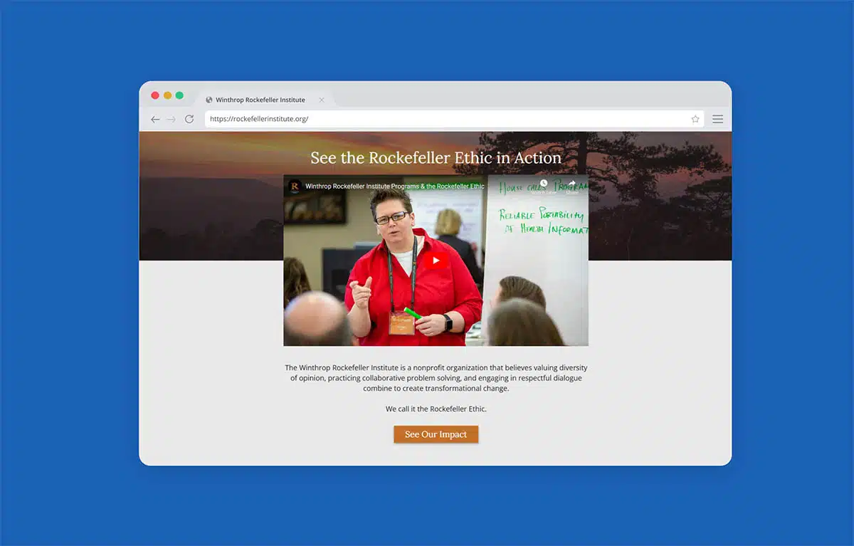
Here’s actually an example from one of our clients, the Winthrop Rockefeller Institute. They’re highlighting here what they call the Rockefeller Ethic, which is a unique problem solving methodology that they use.
They highlight it in this text and video on their homepage. It’s something they’re really leaning into in the first third of their homepage, and then they actually weave it throughout a bunch of additional content on various pages around their website.
It’s not necessarily something that will resonate with every single visitor — but that’s okay!
For folks who value diversity of opinion and are looking for innovative ways to solve longstanding issues they’ve historically struggled to solve, this could very well feel like that fresh, new approach that’s worth exploring further, just the thing they’ve been looking for.
Do you use language your audience would?
This is the part of Nonprofit Website Office Hours where our internet cut out. That’s right. Even though we are a tech company, we are not immune to technical difficulties. So I’m gonna jump back into the part that we missed.
Next up here, do you use language your audience would? Just like we talked about with our headings, it’s important to use the language your audience uses.
It’s a very clear sign for audience members that you understand them and what they’re looking for. Plus, it just makes it a lot more likely that they will recognize the information they’re looking for when they see it.
If your homepage is falling short, do your best to listen to your community here. Borrow their language, and then use the phrases and the terminology that they use.
That’s going to be your best bet here to make them feel recognized and show that you can solve their problem or a problem that they care about.
And with that, we will jump back into the recording from Nonprofit Website Office Hours.
Do you share statistics that demonstrate your impact?
Next up, do you share stats that demonstrate your impact?
Why does this one matter? Numbers like this are a direct way to illustrate your results and to demonstrate to visitors that you can and have solved a problem that they care about.
You’re not just asking them to trust you or to take your word for it. You’re showing that you’ve been able to generate meaningful outcomes in the past.
This makes it a whole lot easier to trust that you’ll be able to generate similar or better results in the future. It can also give folks a sense of the scope of your work or who benefits from your work.
If you’re not collecting impact stats yet, or if you’re just getting started and you don’t have impact stats yet, that’s totally fine. You can always start by showcasing the scope of the problem that you’re addressing.
But if you do have stats, we recommend highlighting two or three of the most compelling ones on the homepage and then linking folks to view more if they would like to dive deeper.
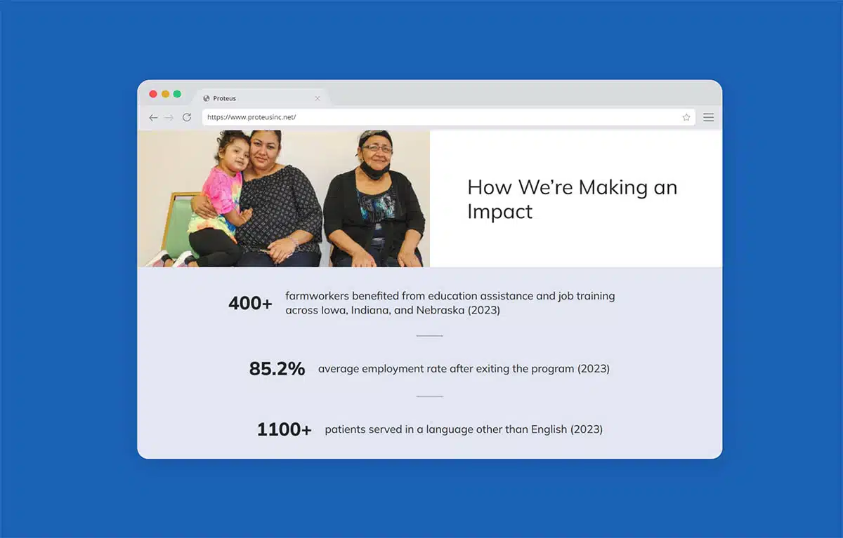
Here’s an example from one of our clients, Proteus. They are featuring some great stats on their homepage.
And the thing I think is so cool about the way that they’re using their stats is without knowing anything about their mission, you can get a sense of what they do just based on these stats.
The first one says that 400+ farmworkers benefited from education assistance and job training across Iowa, Indiana, and Nebraska. You sort of already know a big piece of what they do just based on that one stat.
And coupled with the next two here — 85% average employment rate after exiting the program, 1100+ patients served in a language other than English — it shows that they’re making a meaningful impact in the community they serve.
And these are some pretty compelling stats if this is a cause you’re passionate about. On top of that, it demonstrates that the work they’re doing is clearly working.
Do you feature community stories or testimonials?
Coupled with those stats, do you feature community stories or testimonials on your homepage?
Community stories and testimonials bring an essential human element to your work. They can help visitors clearly see and feel your impact. And paired with those stats we just talked about, you cover both the quantitative and qualitative sides of your work.
These stories and testimonials help folks connect on a more emotional level. And the statistics show that these stories aren’t isolated occurrences. You aren’t just getting results for this one person — they’re also happening across your community as a result of your work.
If homepage is falling short here, start collecting stories from community members, program participants, service recipients, volunteers, donors, etc., and then feature one or two of them on your homepage.
You can (and should!) also add them throughout other, relevant parts of your site, like program pages or your impact page. Whenever you have a relevant story or testimonial that connects to the content of that page, just sprinkle it in there.
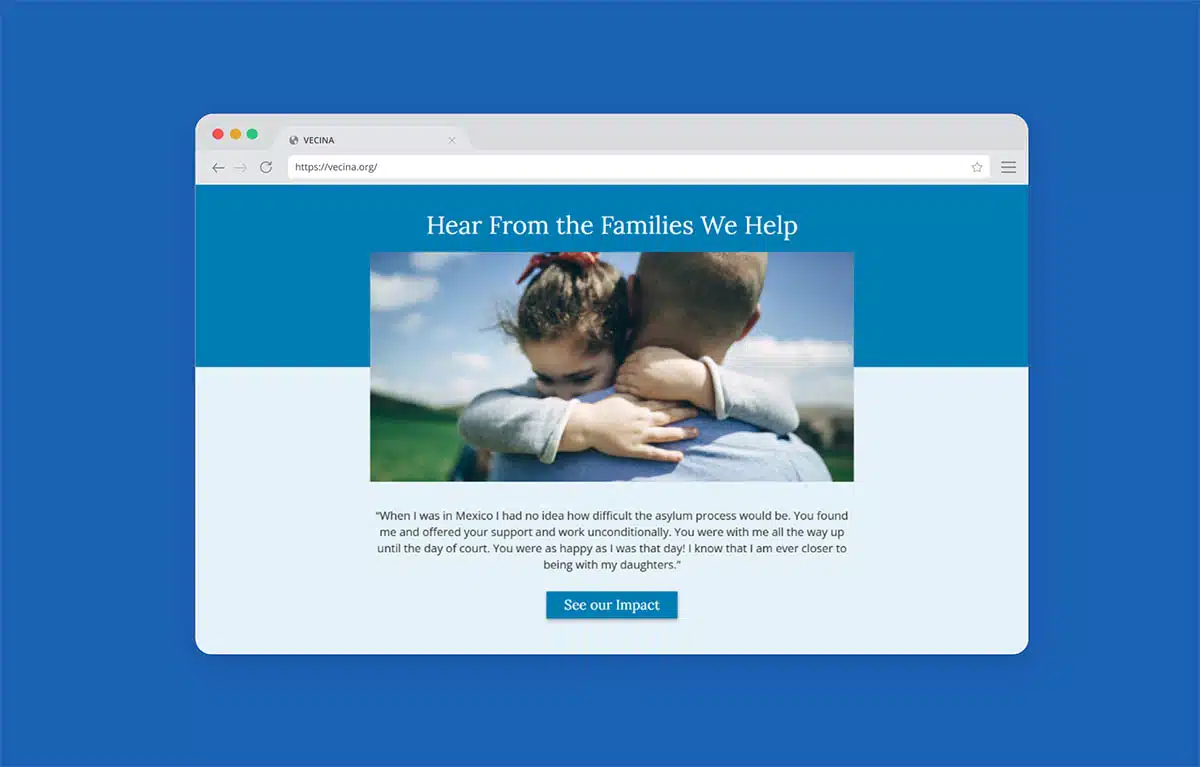
Another one of our clients, VECINA, does a great job of this. They have this awesome testimonial on their homepage from one of the families that they’ve helped.
It talks about the asylum process, how VECINA helped this person all the way through their day in court, and how they’re closer than ever to being reunited with their daughters. And then they link visitors to their Impact page if they want to dive deeper, read additional testimonials and learn more about their impact.
If this type of work tugs at your heartstrings, then this quote will likely resonate and get you to give a bit more of your time and attention.
Do you share the names or logos of any partners or awards?
Last up in this section, do you share names or logos of any partners or awards? This one is really all about building credibility and trust with your visitors.
Many homepage visitors may still be getting to know you. Showcasing relevant awards, ratings or recognition that you’ve earned, or relationships with community partners they may know, can help put their mind at ease and demonstrate your trustworthiness through these third-party relationships or endorsements.
Honestly, it makes them feel less like they’re taking a risk in supporting you because other people have already put their trust in you. You’ve sort of already been vetted.
How do you fix it if your homepage is falling short here? Share names, share logos of your key partners on your homepage, or specific awards or ratings — whatever will be most meaningful to your website visitors and instill trust can really work well on this front.
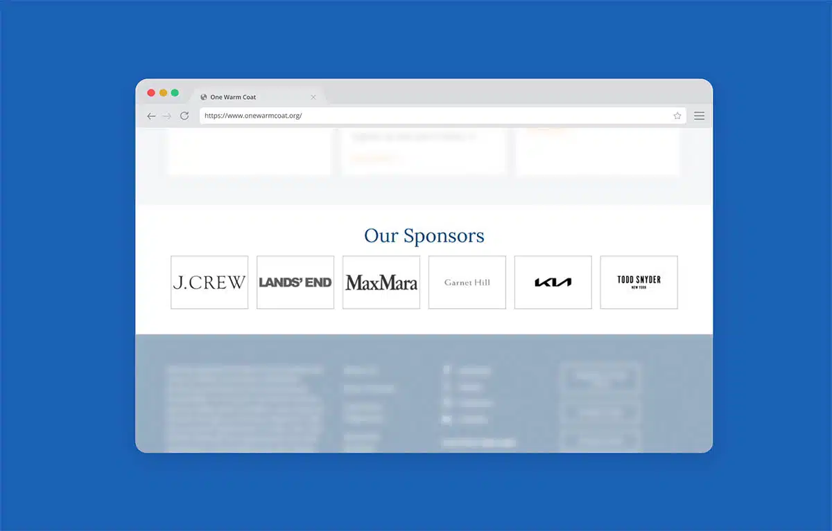
Here’s a quick example from one of our clients, One Warm Coat. You may never have heard of One Warm Coat before, but I bet you’ve heard of J. Crew and Lands’ End and Kia.
Just seeing those names listed out and knowing they’ve sponsored One Warm Coat gives them instant credibility. And if you’ve done all the hard work to build partnerships and sponsorships and earn awards, make sure you’re celebrating those. It can go a really long way in building trust with your visitors.
What is the Next Step for Me? Homepage Assessment Questions
We’re onto the third and final question that your homepage needs to answer: what’s the next step for me? How do I get more information or get involved?
Remember, your homepage is not the only page on your website. There are likely a lot of other pages that offer more information for the right visitors. Your homepage’s job at this point is to route those audiences to the next right step in their journey. Not all possible next steps — just the most helpful next step for them in that moment.
As you can imagine, it’s key to know your audience as well as possible here. Get really clear on who they are, what they care about and what they are turning to you to help them solve.
How well does your homepage answer this final question? We’ll just walk through a few quick questions to help you see.
Have you only included the most important calls to action for visitors?
First, have you only included the most important calls to action, or CTAs, for visitors?
As the number of possible choices increases, so does the mental energy it takes to make a decision. And when visitors have too many choices, oftentimes they won’t end up doing anything.
If you’re not seeing the engagement you’d like to see on your homepage, start by identifying the most important next steps for visitors to take based on what they’re trying to solve for, and then focus primarily on those calls to action.
I want to quickly point out that we said to focus on the most important next step for visitors — not necessarily the most important next step for your organization. There’s likely a lot of overlap here, but the more you can think from your visitors’ perspective, the better.
And remember, this is not your only shot at getting a visitor to take a key action on your site. They can always use your website’s navigation or calls to action within your pages if they’re looking for a next step other than the ones that you’ve highlighted. Your goal is just to get them to continue their journey on your site, whatever that looks like for them.
Is the most important CTA prominently displayed?
Next, is the most important call to action for your primary audience prominently displayed?
It’s fine to share a variety of calls to action and let visitors take the next step that’s most relevant to them. But if your most important call to action is buried too deep on the page, or hidden among your other calls to action, it’s gonna be a lot harder for your people to find it.
Again, if you’re not seeing as much engagement, start by getting really clear on the most important call to action for your visitors and then prioritize it as much as you possibly can.
The way you do this will depend on the design of your homepage. But it could include things like making it larger, giving it more space, calling more attention to it graphically through color, or the placement of the call to action. You just want to make sure that you’re highlighting the most important next step and giving it a little more weight.
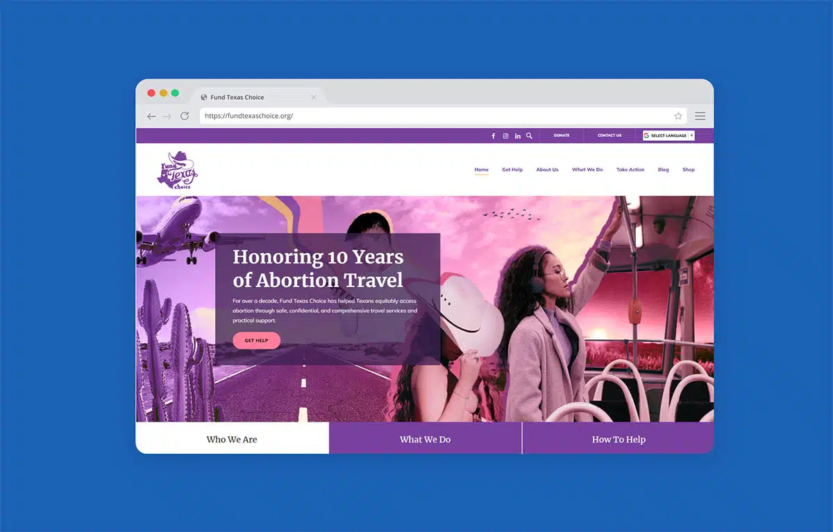
Here’s an example from another of our clients, Fund Texas Choice. You can see that Get Help button right away in the hero section of their homepage.
That doesn’t mean that other actions and links throughout their homepage aren’t important! But they’re clearly signaling to their visitors just what’s most important for their audience by prioritizing it here.
Do you avoid using “Click here” link text?
Next, do you avoid using “Click here” as your link text? “Click here” link text lacks clarity. It does not give visitors clear enough information about what to expect when they click.
Clear, active language, on the other hand, is going to help your visitors become part of the action. It’ll make it more likely that they’ll engage. You want them to know what they’ll find on the other side of that click. And then, obviously, you have to deliver on that once they click through.
But if you’re not seeing as many clicks as you would like, this can be a quick item to clean up. Update the text that’s used on your homepage buttons and links to provide enough context for visitors to know what they can expect on the other side of that click.
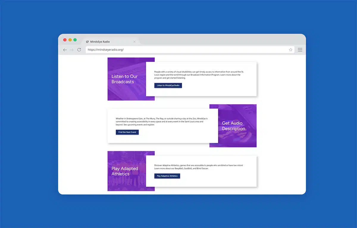
Here are a few examples from our client, MindsEye Radio. There are three buttons here. The first one says “Listen to MindsEye Radio.” The next says “Find the next event.” And the final one, “Play adaptive athletics.”
These are just so much better than a generic, “Click here” button and make it much more likely someone would click through.
Do your links include visual cues to indicate they’re clickable?
And finally, do your links include visual cues to indicate they’re clickable? Simply put, visitors can’t take a next step if it isn’t clearly marked for them. They can’t click something they don’t know is clickable.
This is true for links, it’s true for calls to action, it’s true for buttons across your entire website. But it’s especially important on your homepage.
So if yours is falling short, make sure that your buttons and links are styled in a way that signals to visitors that they’re clickable.
Usually, this will be doing things like underlining links in a color that contrasts with your standard text or adding a hover state or a rollover state to clickable elements, like links and buttons.
Along these lines, we generally recommend you don’t text on your site that isn’t clickable because that can be confusing to visitors, since underlining is a pretty common signal that text is, in fact, clickable.
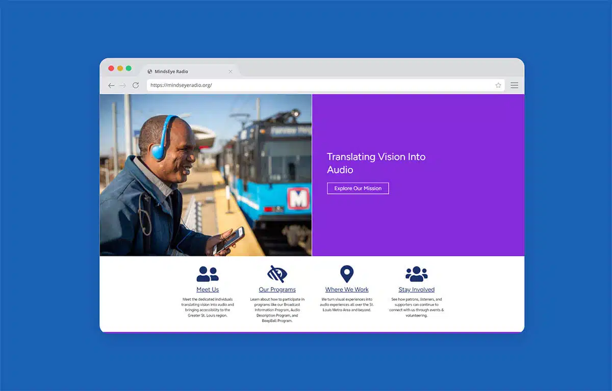
Sticking with MindsEye here, they do a really nice job of indicating clickable elements above the fold on their homepage.
When you roll over that button in their hero section, it animates subtly to show that it’s clickable. Those icons are clickable, and they change color when you mouse over them.
The links are underlined, they show up in their link color, and they change color when you roll over them. There are a lot of different indications to show that those items are clickable.
It’s also worth mentioning this is an example of accessibility as a standard best practice.
Clearly identified links and helpful links make their site usable and accessible for visitors with disabilities who are one of MindsEye’s key website audiences. So they’re doing a really nice job of just meeting the needs of all visitors here.
That’s it! Now you can walk through each item in that Nonprofit Website Homepage Rubric, evaluate your current homepage and make some quick improvements.
A lot of these are not major changes. Some small tweaks can really go a long way in better engaging your visitors and ultimately helping you nail your nonprofit’s homepage.
And remember, when in doubt, leave it out. You knew I had to say that one more time, right? All right. Thanks, friends.
What You Should Do Now
01. Come to Nonprofit Website Office Hours
We cover a new topic every few weeks. Plus get a live answer to any website-related question you're wrestling with.
02. Book a Website Call
Find a time to discuss your nonprofit's website needs. Discover what's worked for other nonprofits like you and see how easy building your new site can be.
03. Start a Free Website Trial
Try our nonprofit website platform for yourself. Instantly get access to every feature to see if it's the right fit for your needs. No credit card required.
Comments