This post was updated on April 2, 2026 to reflect current web design best practices and updated examples for nonprofit websites.
A website is an invaluable tool for a nonprofit centered on arts and culture. Arts organizations are highly visual by nature, whether we’re talking about museums, children’s art education, performance organizations or art preservation. So it stands to reason that arts and culture websites should be visually appealing to best demonstrate their relevance in the sector and connect with the target audience.
Let’s say a modern arts organization promotes community involvement and education. If their website uses jarring colors and graphics and is hard to navigate, visitors are going to notice the contrast with their mission and start to question its legitimacy. An out-of-date or unattractive website has the potential to hurt an arts nonprofit and make people apprehensive about signing up for programs, volunteering and donating.
Winning Design Qualities
A well-designed website for an organization in the arts space (and beyond) makes a good first impression with visitors, establishes the nonprofit’s credibility and sets the stage for a lasting relationship, leading the visitor through the site with strategic calls to various programs and ways to get involved.
When we review the design of an arts and culture website, the following qualities tend to win us over and keep visitors browsing.
- A color palette that sets the tone for the site’s content
- High-quality visuals, like photos and graphics
- A website structure and navigation that makes it easy to get around the site
- Attention-grabbing calls to action that are well-placed throughout the site
- Creative touches that reinforce the organization’s mission and audience
- A responsive design that works well no matter what device you’re browsing from
- A commitment to accessibility so all visitors can engage with your content
While flashy new design elements are fun, exciting and can work well for an organization with web design and development talent in-house, oftentimes, a simpler design is best for the longevity of your nonprofit’s site. But whatever design elements you decide to experiment with, I’d encourage you to skip the rotating header image in favor of a more accessible header design.
It’s possible (and practical!) to let your organization’s creativity and artistic spirit shine through with a classic, modern and streamlined design.
Well-Designed Arts and Culture Websites
Here’s a look at six of our favorite arts and culture websites, including the qualities that won us over. For help with the website terminology, be sure to check out our post on web design vocabulary.
Creative Capital
Creative Capital’s website matches the boldness of the artists it supports, with a rich color palette and design details you don’t see on a typical nonprofit site.
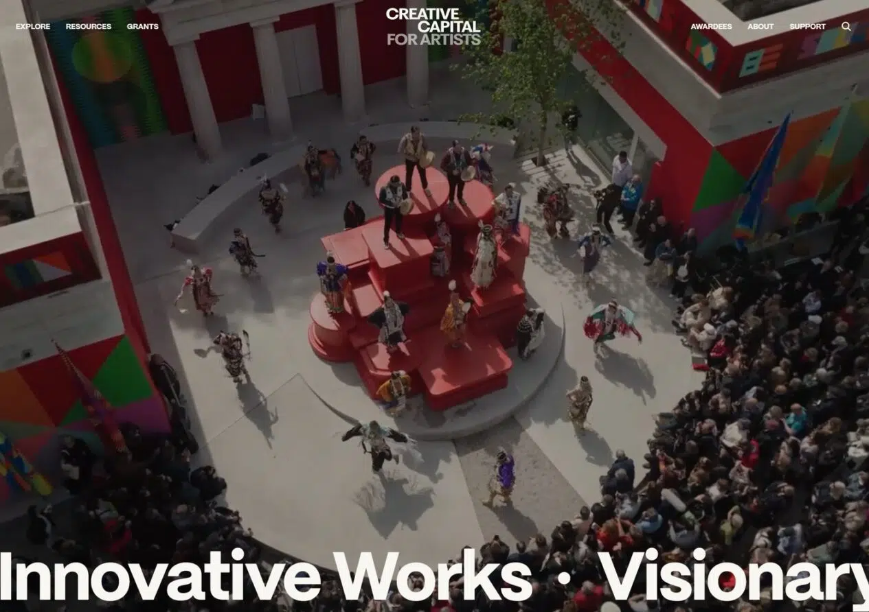
Winning Qualities
- Each section of the site uses its own color palette, from deep green to soft blue to pink, creating a gallery-like experience as visitors move through the site.
- Full-bleed photography and large typography create a more immersive experience.
- The site puts artists front and center, including a searchable index of over 1,000 funded awardees.
- A video header on the homepage sets the tone immediately, showcasing the work Creative Capital supports.
- Clean, balanced navigation makes it easy for both artists looking for grants and supporters looking to give.
P.S. Arts
No matter where you land on the P.S. Arts website, the colorful and creative design lets their focus on the kids they support shine through.
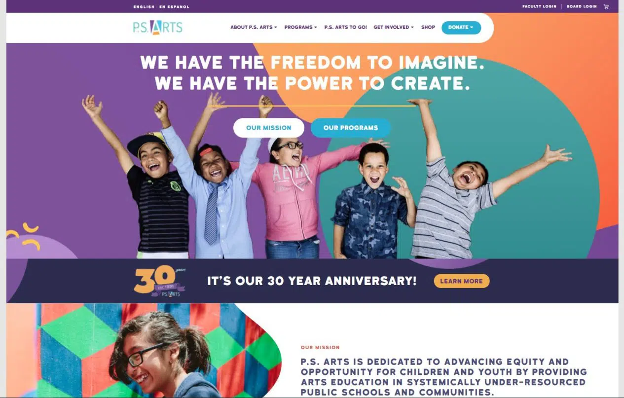
Winning Qualities
- A bright color scheme makes for a trendy, kid-friendly color palette that’s very pleasing to the eye.
- The homepage design allows visitors to get to know the organization before presenting dynamic and engaging calls to action.
- The Donate section in the primary navigation is called out with a colorful button design to draw attention.
- The intersection of photos and graphics throughout the site adds a fun and creative element.
- Clean dropdown menus make for easy navigation around the website.
Alvin Ailey American Dance Theater
The Alvin Ailey website captures the energy and emotion of live dance, letting stunning photography and video do the talking.
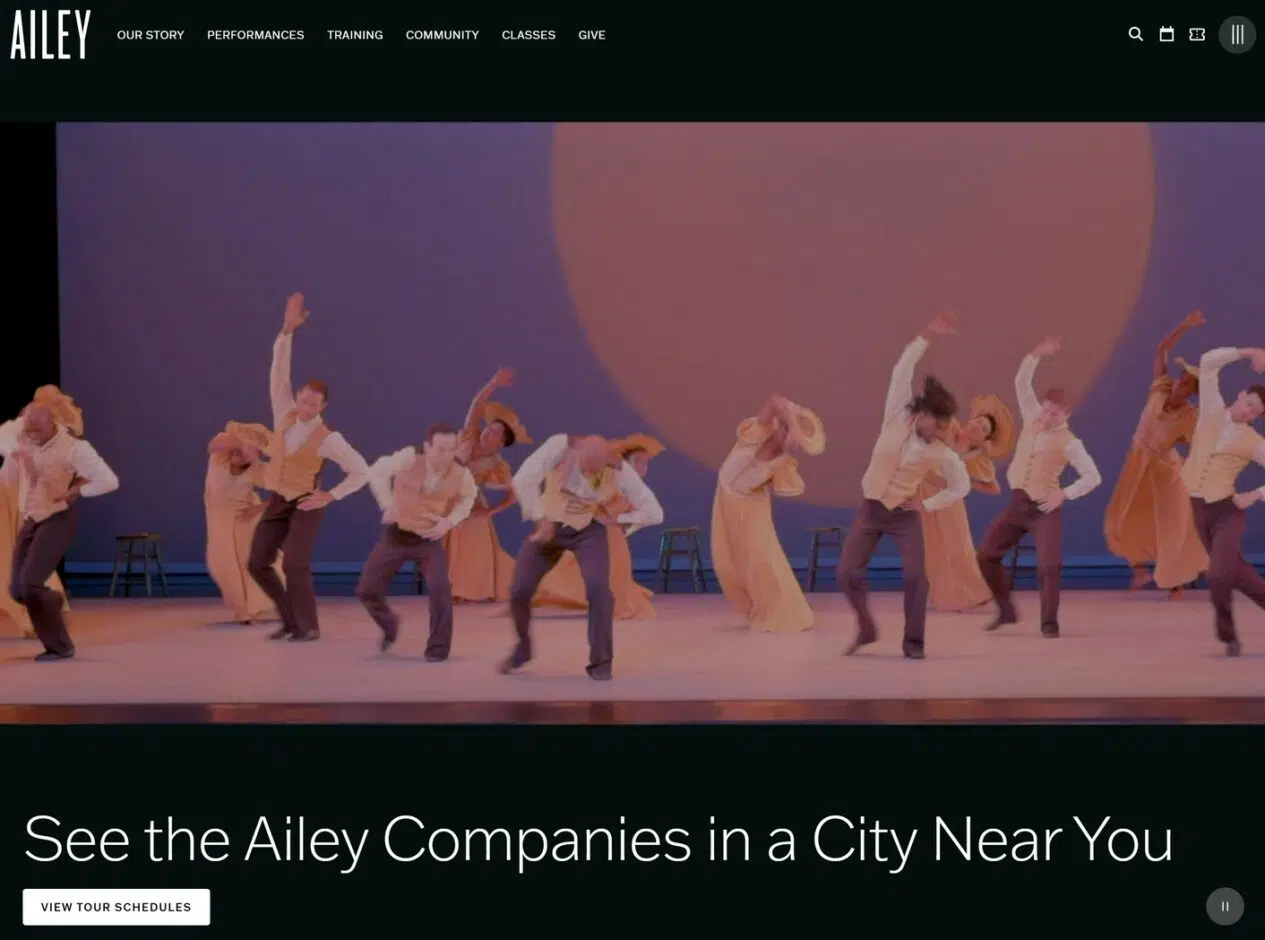
Winning Qualities
- A dark, elegant color scheme provides the perfect backdrop for vivid dance photography to take center stage.
- Video headers on multiple pages bring the energy of a live performance to the screen, with pause buttons for accessibility.
- Clear navigation organized by audience need (Performances, Training, Community, Classes, Give) makes the site easy to explore.
- Each major section includes its own sub-navigation, making it easy to find specific performances, programs or ways to give.
- The design is consistent across interior pages, with the same clean aesthetic and attention to photography throughout.
National Trust for Historic Preservation
The subtle and classic design of the National Trust for Historic Preservation site puts action front and center.
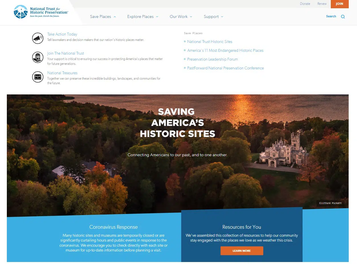
Winning Qualities
- The slight zoom on the header images draws the eye to their most pressing advocacy action.
- A streamlined mega menu, complete with helpful icons to add interest to each section, makes the site easy to navigate.
- Most important calls to action are included in the secondary navigation and carried throughout the whole site.
- High-quality photos of the places they protect are peppered throughout the site to keep interest and highlight the significance.
The Welders
The Welders website does an excellent job harnessing the organization’s energy with fun design touches.
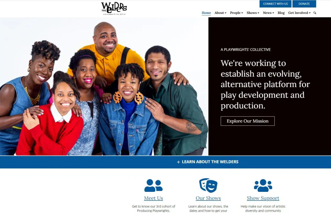
Winning Qualities
- A bold and playful color scheme sets off the upbeat tone of the website.
- The secondary navigation includes clear calls to donate and connect with their team.
- A clean and well-organized primary navigation makes for easy maneuvering around the website.
- Fun group photos on the homepage offer a sense of community around the playwrights’ collective right off the bat.
Contemporary Art Museum St. Louis
The Contemporary Art Museum in St. Louis carries its fresh and streamlined style through to its website design.
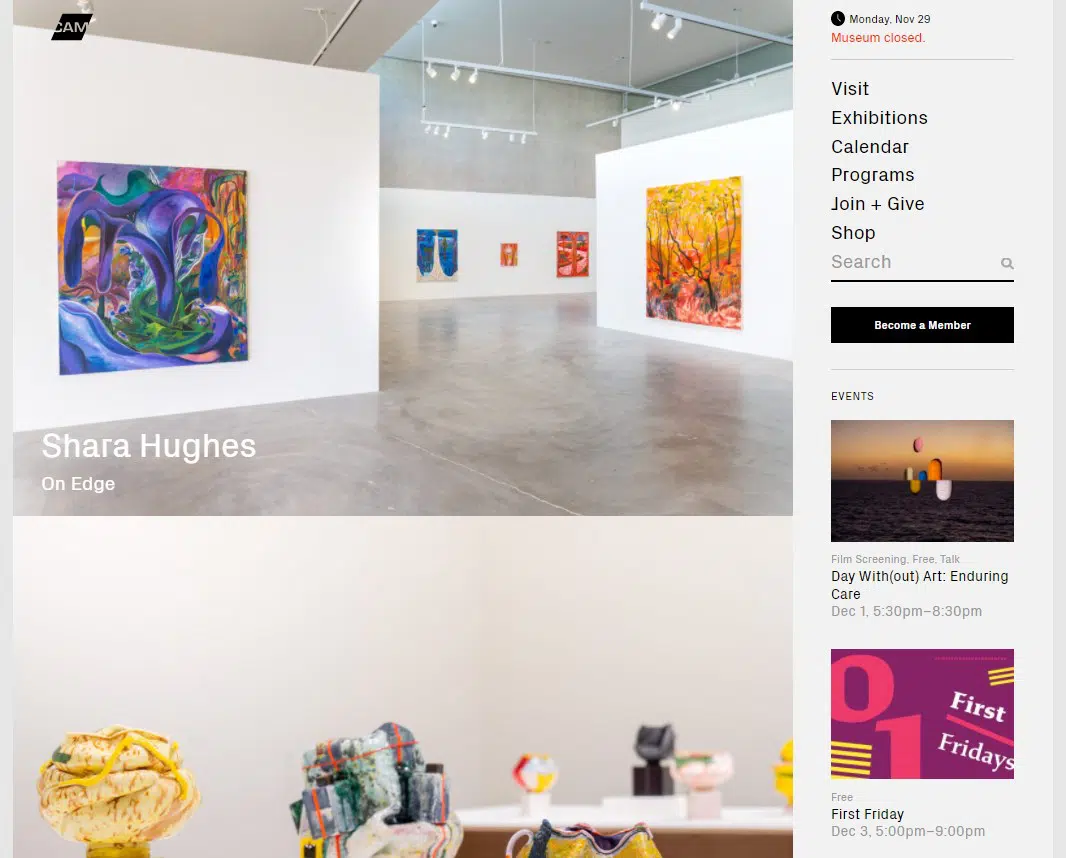
Winning Qualities
- A sidebar menu throughout the site puts exhibits front and center and makes it easy to navigate and search.
- Professional photos showcase each of the exhibits on display and help programs come to life.
- Opportunities to get involved and engage with the art are consistently highlighted in the sidebar.
- Captions are included on images to help with accessibility and note the artist and photographer.
While website design is subjective at its core, consider the experience of your visitors first and foremost throughout your design process to create an engaging site for your community.
There are many ways to mix and match various design principles together to create intriguing and innovative arts and culture websites. If you find some of these examples inspiring, try to incorporate various elements into your website and add your organization’s twist.
Key Takeaways
- Let your creative identity shape the design. The best arts and culture websites don’t just look professional. They feel like the organization. A dance company’s site can be bold and cinematic. A children’s arts nonprofit can be bright and playful. Let your art form set the tone.
- Put your actual work front and center. Real photography and video of performances, exhibits and programs connect with visitors in ways that stock images never will. Every example above leads with visuals of the work itself.
- Keep navigation simple, even if your organization is complex. Many arts nonprofits juggle performances, classes, community programs and fundraising. Clear navigation and well-placed calls to action help visitors find what they need without getting lost.
- A clean design can still be a creative one. You don’t need flashy effects to make an impression. Thoughtful color choices, strong typography and high-quality imagery go a long way toward a site that’s both beautiful and easy to use.
Have you played a role in creating an arts and culture website for your organization? Let us know your trials and triumphs in the comments below.
What You Should Do Now
01. Come to Nonprofit Website Office Hours
We cover a new topic every few weeks. Plus get a live answer to any website-related question you're wrestling with.
02. Book a Website Call
Find a time to discuss your nonprofit's website needs. Discover what's worked for other nonprofits like you and see how easy building your new site can be.
03. Start a Free Website Trial
Try our nonprofit website platform for yourself. Instantly get access to every feature to see if it's the right fit for your needs. No credit card required.
Your blog has great information for nonprofits! Websites are vital to many aspects of the success of nonprofits. We have just linked to your blog post in our most recent article “Website Content and Insurance for Nonprofits”.
http://www.steelbridgeins.com/blog-0/website-content-and-insurance-for-nonprofits
Thanks for your kind words Phil. And thanks for including our post in your own. Really appreciate it.