When you have a big annual event, advocacy effort or fundraising campaign, creating a landing page for it on your website can simplify your marketing by sending people to a central location. And like all great digital tools, nonprofit landing pages are most effective when they have a solid plan and follow a few best practices.
If your nonprofit is new to using landing pages in your marketing, it’s easy to get caught up in what your landing page should look like before you think about anything else. For all of us non-designers out there, it gets pretty overwhelming to think about how you’re going to make a page that looks good—rather than the more important questions about what it should include to reach specific goals.
Ever stumbled on a landing page for a nonprofit’s old annual appeal? Or visited a landing page without a clear idea of what you’re supposed to do next? Don’t let that be your organization. Get started on the right foot by learning some nonprofit landing page basics and management tips that should drive your strategy… and then the design.
Essential Landing Page Elements
Before you start to think about what content you need to gather, here are the core attributes you should aim for when making a landing page for your website.
- Brevity. A landing page is not a traditional narrative. Be straightforward with the information you need to share to make it easier to move people to the next step. You can always link to additional details that open in a new window.
- Urgency. Got a deadline or pressing need? Communicate a sense of urgency to help keep visitors interested and from clicking away from your page before they act.
- Scannable and accessible. Break up your page into digestible chunks that take people on a purposeful journey. And please, please don’t lock up text in graphics and images, which won’t be readable on small screens or for people with different visual abilities.
- Strong call to action (CTA). You’ve got their attention, now what? Make a clear and obvious ask of your visitors using CTA phrasing that’s compelling but also precise. (“Save the Rainforest” is a stretch if you want them to join your mailing list.)
- Easy form or next step. Follow up on your CTA with a user-friendly way to complete the ask. Whether you want people to donate, register or give you their contact information, it should be painless and well-tested to make sure it works.
- Clean and simple. When in doubt, simple is always better. Don’t complicate the experience for visitors by trying to up-level the look without purpose. Leave the “wouldn’t it be cool if…” ideas until you’ve got the basics down.
At the end of the day, the core goals of your landing page should be to engage and move people to act. Don’t work against yourself by forgetting about how you’re going to encourage website conversions. It doesn’t take professional design training to evaluate whether or not you’re on the right track, but it does require some extra thought about who you’re trying to reach and if your page is set up to make them successful.
Best Practices for Landing Page Management
Now that you’ve started thinking about the big picture of your nonprofit landing page, the next step is to determine how you’re going to manage your page from start to finish.
In order to make good management decisions, it’s crucial to be able to turn to a marketing plan for whatever program, event, campaign or issue that your landing page addresses. For example, a good annual appeal strategy would offer insights about marketing tactics, timing, and donor follow-up that shape how your landing page is created, used and maintained. If the plans are still fuzzy, that’s a sign you’re not quite ready to move forward.

Nonprofit Marketing Plan: The Complete Guide to a Strategy That Works
Get more tips for making and implementing nonprofit marketing plans in our free online guide.
Give the page a home in your site structure
It’s tempting to just throw up a new page on the site and not worry about finding a place for it within your existing website structure. This approach can work if you have a great marketing strategy for driving traffic there, but it makes it hard for people to find the page on their own.
Consider placing it with similar content on your site, like putting a campaign page with other pages about ways to give. You’ll help people find it again by including it in your navigation as well as making sure to build links across your existing website content.
Carefully choose a page name and URL
This is less crucial for one-time events and campaigns, when you’re not likely to use the page again in the future. But for a landing page you plan to repurpose later on, make your life easier by choosing a page name and URL that’s easy to remember and doesn’t have to change. For example, leave out the year from the URL for your annual campaign or event and you’ll be good to go next time around.
If your landing page URL is too cumbersome for marketing purposes, you could set up a shortened version using a service like Bitly.
Decide a date to publish and test the page
It’s surprisingly easy to send out an email or invitation with a link to a landing page… and discover that the page hasn’t actually been published yet. Ideally you’ll be able to publish your landing page at least a few days ahead of things like printed materials, press releases, advertising and social media posts.
See our recommended timeline and checklist for event promotion.
Give yourself enough time to test the page on different devices and browsers. Make sure all of the components are working, especially forms that are connected to other services like payment processors and email marketing platforms.
Plan to thoughtfully retire your page
An abandoned nonprofit landing page is the equivalent of mailing out an old newsletter or forgetting to send a thank you note to a donor. When your landing page is no longer needed as a tool for action, it can still be useful for follow-up or celebration. Consider updating it after the fact with a thank you message or recap of any results or progress. You could even transition the call to action to something new to keep your supporters engaged.
Simply deleting the page will result in a broken link. At the very least, you should plan to put a redirect in place that ensures anyone looking for the page or using the old link lands somewhere relevant.
Types of Content for Nonprofit Landing Pages
Wondering what exactly you should put on your landing page? There’s no set formula, or even a word count to target. (Though if you’re planning to optimize your page for search with a specific phrase, you’ll want at least 300 words.)
Start with the basics and build out from there, keeping in mind that the previous rules on brevity and being scannable still apply.
- At least one core visual, like a header image or short video clip
- The 5 W’s of your event or campaign (Who, What, When, Where, Why)
- The How (what you want people to do and the method for doing it, like an online form)
- Links to related information or helpful downloads, using buttons or other accessible formatting to help people identify them
- Acknowledgement of sponsors or partners
- Contact information for people to learn more or ask questions
For even more content tips, stay tuned for a future post that takes a deeper dive into event landing pages from top to bottom!
Content Examples
When we designed our new Scholar theme for nonprofit websites, our team paid special attention to how a range of organizations might want to build landing pages, especially without a lot of design know-how. To get an idea of how you might combine different kinds of content on a landing page, check out our examples for a big annual event and an advocacy-type campaign.
Annual Conference
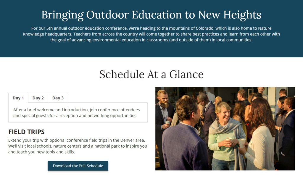
In addition to covering core details about where and when, this event landing page example includes the option to download a schedule, has an interactive map, features the sponsors, and uses a simple button to send people to a registration form.
Awareness Month
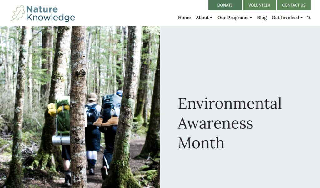
Need to get people up to speed on an issue and get them to act? This awareness month landing page example starts off with a video before offering ways to get involved, sharing an advocacy toolkit, asking people to make a gift, and linking to related blog posts to learn more.
You don’t have to be a trained designer or creative superstar to build effective nonprofit landing pages on your website. By focusing on best practices and taking the time to manage your landing page from start to finish, you’ll already be ahead of the game. Forget trying to be flashy and get started with the essentials—freeing up some much-needed time to focus on your goals and how to get there with a great marketing strategy.
What questions do you have about putting together nonprofit landing pages? Have any inspirational examples you’d like to share? See you in the comments!
What You Should Do Now
01. Come to Nonprofit Website Office Hours
We cover a new topic every few weeks. Plus get a live answer to any website-related question you're wrestling with.
02. Book a Website Call
Find a time to discuss your nonprofit's website needs. Discover what's worked for other nonprofits like you and see how easy building your new site can be.
03. Start a Free Website Trial
Try our nonprofit website platform for yourself. Instantly get access to every feature to see if it's the right fit for your needs. No credit card required.


Comments