
Website formatting is the undercover hero of nonprofit websites. While it can be a bit of a hurdle to get in the swing of things initially, how you format your website content makes a huge difference for your users. It can literally be the difference between a visitor falling in love with your cause or feeling immediately overwhelmed and leaving.
On any given web page, great formatting can transform an insurmountable wall of text into approachable and enjoyable-to-consume web content.
Website Formatting Best Practices
Every well-designed web page has a few key characteristics in common. Implementing those best practices across your nonprofit’s site not only makes the site look great, but can also make your content more accessible to your community.
Use the bulleted checklist at the end of each section to ensure you have that element covered on your page.
Scannable content
Online content is different from print content. Online readers want scannable content they can quickly skim to gather key details and themes before deciding whether to devote the time and energy to reading the full page. Did your eyes go straight to the headings and bulleted lists on this page, too?
Breaking up text on the page with headings enables all of the scanners to easily consume your content. Whenever the topic on the page shifts, use a new heading to mark that shift.
When multiple heading styles are available, begin with Heading 2 (Heading 1 is typically reserved for page titles) and work your way up to follow accessibility guidelines.
To make content easier to scan, any long and overwhelming sentence with a list should be transformed into bite-sized, skimmer-friendly pieces. To do this, break out lists of three or more items with bullet points or with a numbered list.
If you’re able to use columns within your content, they’re especially helpful when your lists get long or you want to list different options with a visual element, like an icon or photo.
Check Your Scannability
Online readers expect content that they can scan to gather the information they need from the page. Let’s check your page and give the people what they want.
- The page uses headings to separate each topic covered.
- Each heading is clear and doesn’t use jargon.
- Scanners don’t have to go more than 3-4 paragraphs before seeing a heading.
- Lists on the page are formatted with bullet points.
- Long bulleted lists of 6+ items are formatted with columns.
Limited bolding and italics
Excessive bold and italic text (especially at the same time) is overwhelming for readers. The same goes for adding flashy colors to text. Instead of drawing attention to the text, it ends up making it hard to read and even harder to achieve consistency in your formatting. Your page will come across looking disorganized, and big chunks of bold or italic text can also hurt the accessibility of your content.
Check Your Bold and Italicized Text
So let’s run a quick check to make sure that doesn’t happen.
- Bold text is only used to emphasize important phrases or sentences that help make the copy more scannable.
- No instance of bolded text is longer than one sentence.
- Italics are reserved for special terminology and the proper formatting of publication titles or other proper names.
Visuals
Online readers are visual. Whenever possible, add interest to your page by including visual elements. Along with headings, lists and columns, visuals do wonders to break up content on the page and prevent that scary wall of text.
That can mean a range of different elements, like:
- Photos
- Videos
- Icons
- Graphics
- Button
- Custom call to action formatting
Visuals make the page more engaging and help illustrate your key messages or call to action. For example, alongside a call to give, you might include the photo of a client that the text references and a button that links visitors to the Donate page.
Resources for Visuals
It’s much easier to add visual interest nowadays with user-friendly editing tools like Canva. See the step-by-step process for using Canva to format photos for your nonprofit website.
Plus, there’s a variety of stock photo sites, like Pexels or Unsplash, around the web if your nonprofit doesn’t have your own photos or visuals to share.
Check Your Visuals
Let’s check the visual elements on your page.
- The page includes at least two visual elements (and ideally more than two!).
- Visuals make sense in relation to the content and are strategically placed within it to draw attention to key sections.
- Images are sized correctly for your website and not too large, which can slow down the page.
- For a smaller image, make sure your text wraps nicely around it.
- Images have sharp focus and are compelling.
- You make use of white space around visual elements to prevent the page from feeling cramped.
Attention-grabbing calls to action
Each page on your website should have one call to action (CTA) that you’re asking visitors to complete after taking in the content on the page. Does it stand out from other content on the page to all of the scanners out there? Drawing attention to this key content can help to convince visitors to take your most desired actions and boost conversion rates across your site.
Even if your website doesn’t have a special way to call out these CTAs, other elements we’ve discussed, like a heading and bit of encouraging text accompanied by an image and button can draw attention to that important next step.
Check Your Call to Action
How does the call to action on your page look?
- The page has one compelling call to action.
- It’s easy to see what that call to action for the page is because it stands out from other content on the page.
Related content linked
To help website visitors travel through your website, most pages should have links to other places around your website. Internal links have the bonus perk of preventing duplicate content on your site since you can add links to other pages for visitors to learn more.
Check Your Internal Links
Learn the best practices for links on your site and run a quick check for your page.
- Does the page include at least 1 link to another page on your site?
- Does the linked text make it clear what a visitor will find when they click it?
- Is related content linked rather than reiterated on the page?
The anatomy of a well-designed web page isn’t rocket science, but it does take time and effort. Hopefully the checklists above help you make sure your pages are ready to shine!
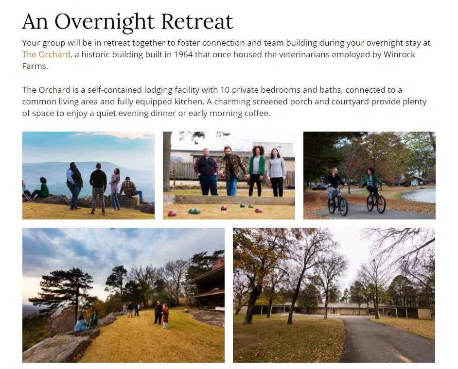
Example of a Well-Designed Page
I might be a little biased since they use our nonprofit website platform, but the Winthrop Rockefeller Institute does an excellent job creating engaging pages across their site. For example, let’s look at the Winthrop Rockefeller Retreat page.
- The page is easy to scan with headings and bulleted lists.
- Bolded text draws the eye to need-to-know details of the retreat, but it’s not used in excess.
- A video, photo gallery and accordion feature add visual interest to the page.
- An online form is housed directly on the page as the clear call to action.
- Rather than rehashing all of the lodging details for the retreats on this page, they link to another page for that information.
Keep Formatting Consistent
While there are best practices that can be applied to any website, there are also lots of formatting choices based on your organization’s preferences. You don’t want content to appear disjointed or unorganized with formatting styles that shift from page to page.
To ensure that formatting is consistent across the entire site, as well as to make it easier for multiple people to help out with entering and formatting new content on your website, consider creating a simple style guide to note all of the above best practices, along with formatting preferences specific to your organization.
Your style guide might include things like when to use bold or italic text and the placement of buttons or images within the content. Noting a standardized way to format text can ensure that your site as a whole appears more cohesive.
Website Content for Beginners
Jumping into creating nonprofit website content that actively works toward your organization’s lofty goals is no easy feat. Luckily, our guide breaks down top tips for getting started and building out a bank of web content that gets results, from why it matters to planning out pages and writing content.
Have any questions about formatting your site? Or any specific challenges you’ve come across recently with getting your pages to look how you’d like? I’ll do my best to help out in the comments below.
What You Should Do Now
01. Come to Nonprofit Website Office Hours
We cover a new topic every few weeks. Plus get a live answer to any website-related question you're wrestling with.
02. Book a Website Call
Find a time to discuss your nonprofit's website needs. Discover what's worked for other nonprofits like you and see how easy building your new site can be.
03. Start a Free Website Trial
Try our nonprofit website platform for yourself. Instantly get access to every feature to see if it's the right fit for your needs. No credit card required.
Thank you for bringing value to us! For a small thriving nonprofit, your organization helps me in so many ways. I hope someday you can help us take our npo to the next level.
I would love for you guys to critique our website: http://www.hungerfreephilippines.org
Thanks for the kind words, Josephine! If you have a specific page on your site where you’re struggling with formatting, I’d be happy to take a look and offer a few tips.
While we don’t currently offer website reviews as a service, we can talk with you about how a website on our platform could look and work for your organization through a customized website demo. If you’re interested, feel free to book a demo for a time that’s convenient for you.