
When your organization isn’t getting a ton of website engagement, it’s frustrating to figure out what to do next. There’s a tipping point where pushing visitors too hard to do something—donations, email signups, event registrations—becomes annoying and they’d rather leave your site than see another pop-up or intrusive message. But have you considered using your website sidebars?
For many nonprofits, the sidebar area of a web page is either treated as an afterthought, empty of any meaningful or helpful content, or becomes a dumping ground for competing calls to action (CTAs).
Taking a strategic approach to website sidebars gives you the chance to focus visitors on the most relevant actions that you’d like them to take and messages you want them to see. Learn more about best practices for these underutilized pieces of website real estate and discover eight ways of using sidebars to boost activity.
What is a Sidebar on a Website?
Let’s start with some web design vocabulary.
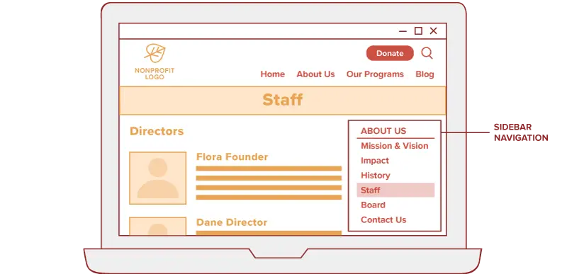
A sidebar refers to an area of a page (commonly on the right-hand side) that’s separate from the main content. Not every page design has a sidebar, like your homepage, but it’s a common default template that many website platforms offer.
At a minimum, this is space for a navigation menu that helps visitors find their way through the section of the website that they’re currently viewing.
But it can be so much more than that. When used strategically, website sidebars house information that you don’t want to get lost within the main body of the page.
For example, a sidebar on your Get Involved page might feature upcoming events. Have a new or special page to promote? Sidebars are a useful way to get visitors to important places on your site without having to rearrange your main navigation.
Sounds great, right? So why don’t more nonprofits leverage these spaces? I think it boils down to a few things, namely that folks aren’t sure what should go there and that they forget about sidebars when planning their web page content.
What to Include in Website Sidebars
The most typical content for a web page sidebar is a navigation menu that helps visitors quickly access different pages in the current section of the website.
What comes next in the sidebar depends on your primary goal of the page and the most relevant next step for your visitors to take. Asking for donations wouldn’t feel right on a program application page or press room, but highlighting upcoming events makes sense for a blog and Get Involved page. It’s critical to hone your calls-to-action based on the larger context of the page and the journey that your visitors are taking on the site.
As you look around your nonprofit’s website, consider if the following types of sidebar content match your intent for a page and the interest of visitors on that page.
General donation call-to-action
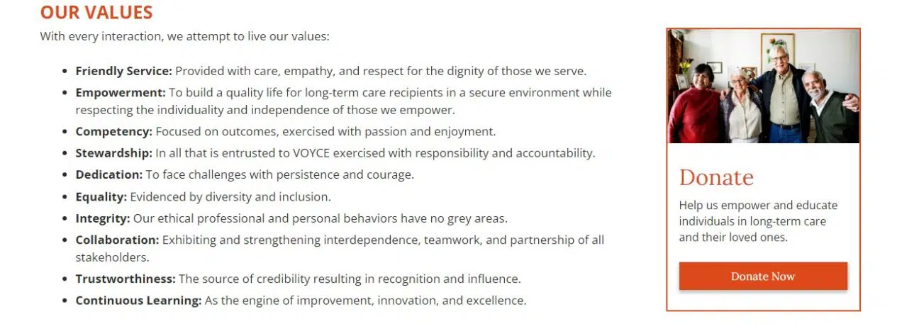
Most nonprofit organizations kickoff a sidebar content strategy with a donation call-to-action (CTA) that asks visitors to make a gift to support its mission and links to an online donation form. This kind of broad appeal is well-suited to pages in the About section of your website, as shown in this example from VOYCE.
Collect email signups
Similar to a general donation CTA, many organizations use sidebars across their sites to collect email addresses. A simple newsletter sign-up form can quickly grow your subscriber list, and this type of CTA is a much easier ask for people who are newer to your cause and aren’t ready to contribute.
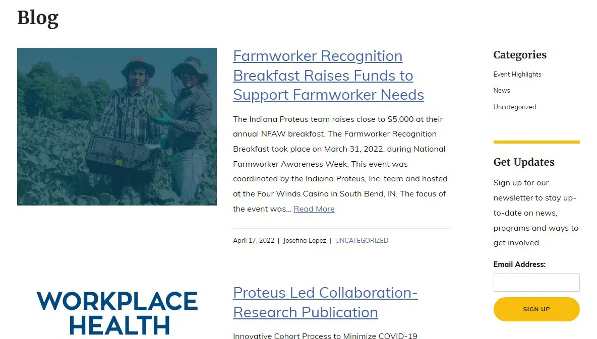
Website visitors who browse your blog are also good candidates for email newsletters. Use the sidebar of your main blog page and individual blog posts as places for an email signup form that feeds people right into your email newsletter service. As an example, see how Proteus takes this approach on its blog page.
Campaign-specific call-to-action
Sidebars are an ideal place to draw attention to short- and long-term campaigns, like a Giving Tuesday campaign, capital campaign, pledge drive or something similar. For example, an anniversary campaign could use the sidebar to push visitors to a special landing page about the organization’s impact or promote a matching gift.
Keep in mind that the more specific you get with your sidebar content, the more you’ll want to be strategic about where it shows up. By limiting sidebar CTAs to the most relevant pages instead of putting them everywhere on the site, you limit overexposing your visitors to constant demands on their attention.
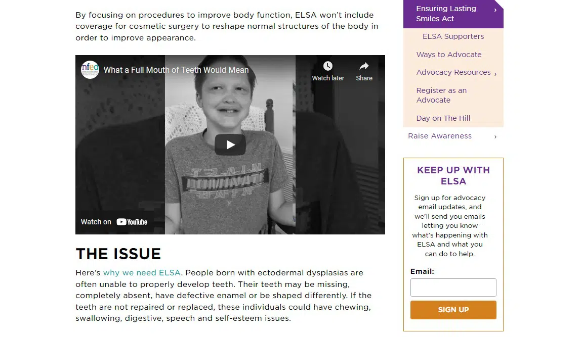
The National Foundation for Ectodermal Dysplasias uses an advocacy-specific sidebar CTA in the advocacy section of its site to engage visitors with their legislative efforts.
Program-specific call-to-action
Pages about your nonprofit’s programs or services are full of information that describes what you offer, who you serve, your approach and more. In many cases, that means that your main call-to-action is pushed to the end of the page, like submitting an application or reaching out to a staff member for more information.
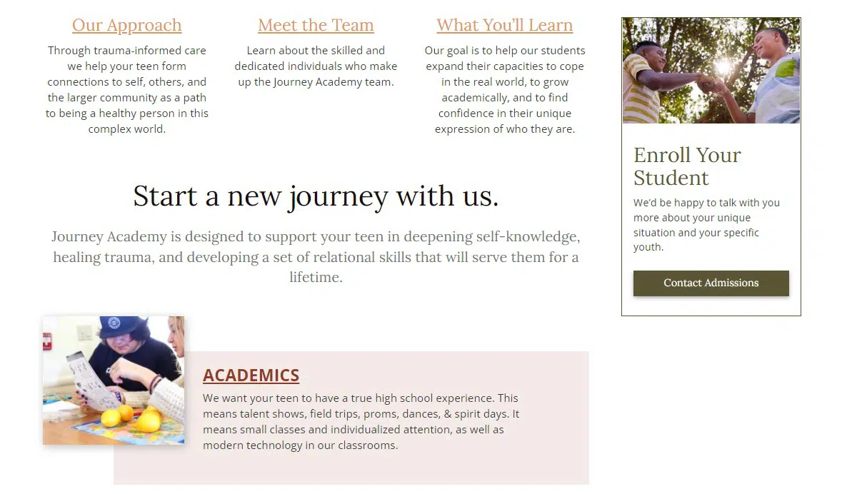
To reinforce your CTA, use the sidebar to promote the same action using similar language but formatted in a different way that catches the eye. An example from TLC Child & Family Services shows an admissions-related sidebar CTA for their school that aligns with the CTA used within the page content.
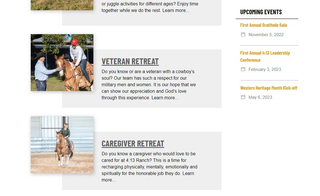
Display upcoming events
If you’re looking for ways to promote an event, webinar or conference on your website, use your sidebars to spread the word and link people to a related page for more information. Ideally, you’ll also be using your nonprofit’s site to collect event registrations, which means that people don’t leave your website in the process.
Check out how 4:13 Ranch promotes upcoming events in the sidebar of their Program page. Because this site is built with Wired Impact’s website platform and uses our event system, they can quickly add an automated list of events to sidebars on the pages of their choosing. Hopefully you can do something similar on your site.
Recruit volunteers
Find more potential volunteers and put them on the path to signing up to help! Among the ways of using your website to boost recruitment is advertising opportunities across your site and not just on a Volunteering page.
Need volunteers for an upcoming event? Recruit in the sidebar of event-related pages. Looking for volunteers for a specific program? Add it to the sidebar of the program page or blog posts about the program. Think about the typical journey to becoming a volunteer with your organization and use sidebars to light the way.
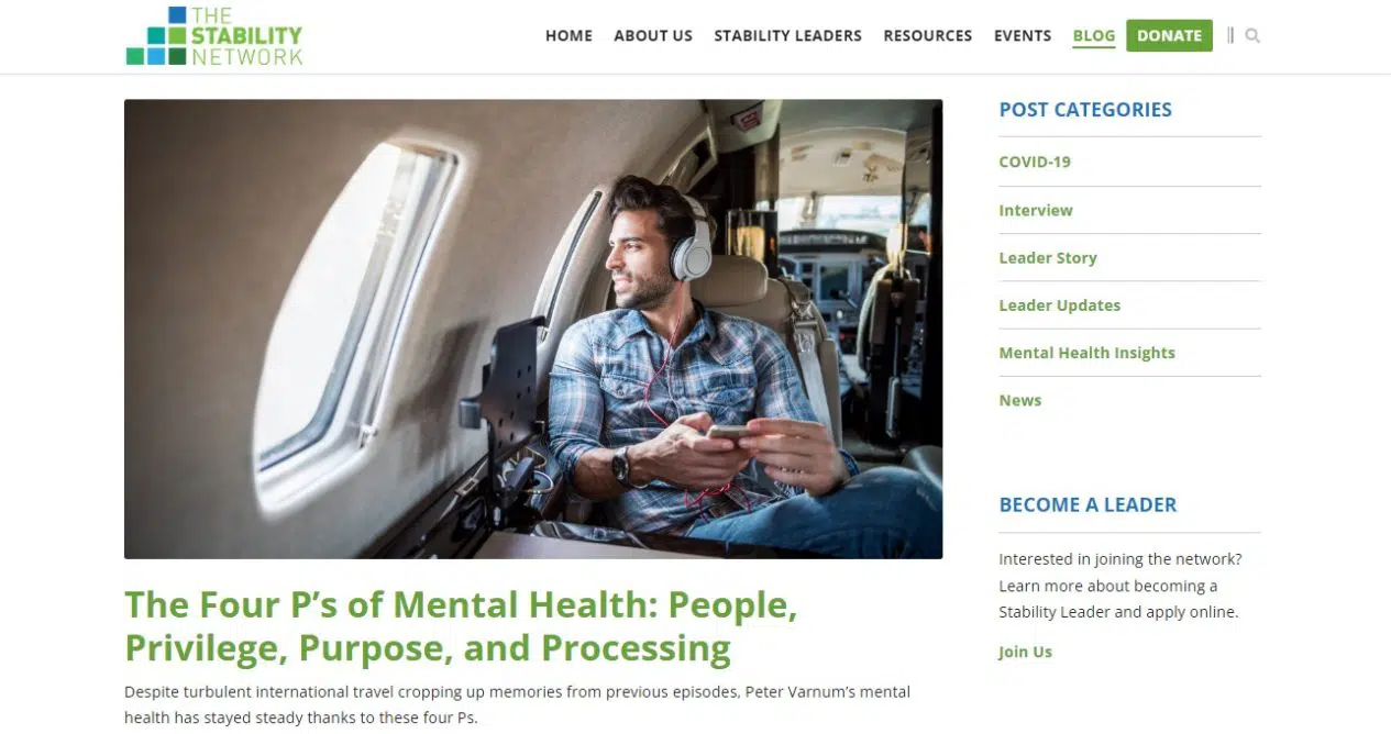
See how The Stability Network recruits blog readers to join their network using the sidebar on the main blog page as well as on individual posts.
Highlight a resource
If your nonprofit provides helpful resources to the people you serve, such as printed or digital guides, books, reports and toolkits, feature them in your website sidebars to make them more discoverable. You could focus on promoting the most recent resource across your site, or tailor a recommended resource based on the page or section of the site that someone is visiting.
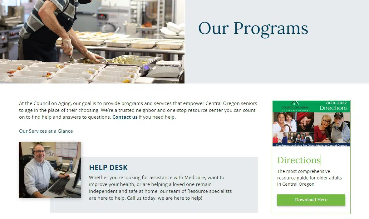
The Council on Aging of Central Oregon promotes its “Directions” community resource guide on Program pages that their target audience is likely to visit.
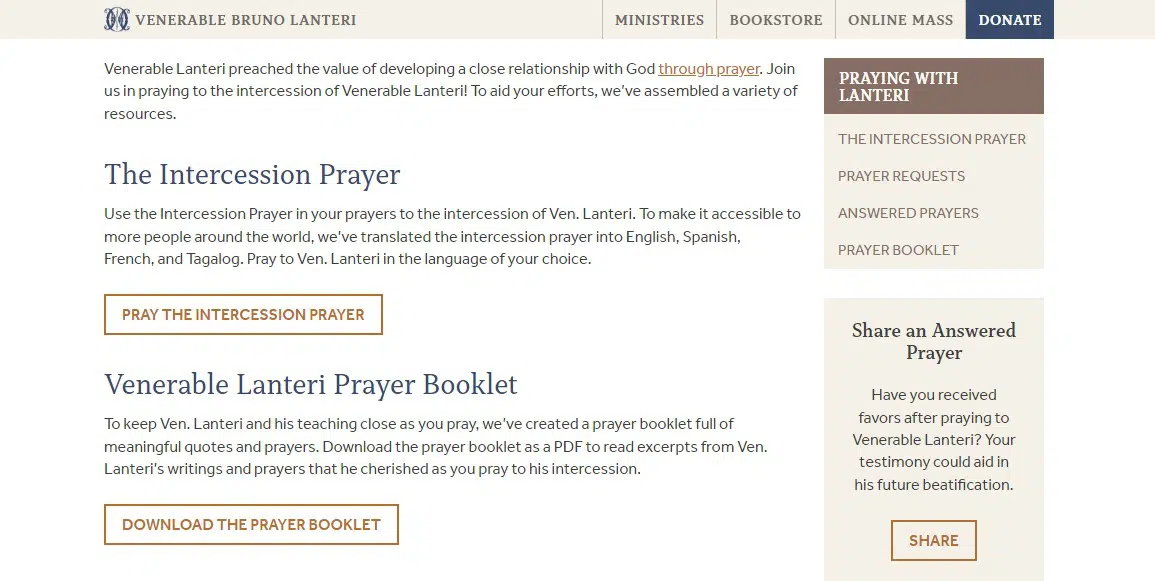
Showcase/collect stories and quotes
Build credibility with your website visitors and inspire them to act by repurposing testimonials or highlighting stories that show the importance and impact of your mission. Pair your copy with an image and keep the text on the short side by using an excerpt or teasing out the full story with a link to read more.
Alternatively, you could use the sidebar to collect stories and quotes from your community when this kind of CTA is placed on pages that this audience is likely to visit. For example, the Oblates of the Virgin Mary direct people to “Share an Answered Prayer” on their page of prayer resources.
Special Considerations for Sidebar Design
As you start imagining the possibilities for your website sidebars, there are a few additional things to keep in mind to make sure you see results.
- Displaying on tablets and mobile devices. What happens to your sidebar on smaller screens? Even with a responsive design, it’s common for sidebar content to be moved to the bottom. For a long page, that might push an important call-to-action too far down to be noticed when scrolling on a phone.
- Avoiding banner blindness. The prevalence of online ads has trained people to ignore anything that looks like advertising, especially in the sidebar where ads are commonly placed elsewhere on the web. Experiment with different types of sidebar elements, like a photo paired with text or text-only calls-to-action, to see what resonates with your visitors. And change them up over time to draw attention.
- Creating a clear and concise next step. Stay focused on the value proposition of your sidebar messages, and keep the copy to a minimum so visitors can quickly scan the sidebar as they read a page. Format links so that they are visually easy to find, or use a button to draw attention to the action you want someone to take.
- Accessibility of sidebar text and images. If you create a graphic for your website sidebar, remember that adding text to an image will make it inaccessible. Be sure to add alt-text to help everyone get the message. Similarly, if you use a photo background with text on top, you’ll want to use strong color contrast to keep it readable.
Making better use of sidebars won’t solve all of your website engagement woes, but it’s an often overlooked place where you can start driving traffic to take well-defined actions. If you’re just getting your feet wet with this area of web design, start with general CTAs like donations and email signups. For more strategic sidebar strategies, zero in on the audience and goal of each page to craft the right CTA.
Over time, you’ll learn which approaches and messages work best for your website goals and the goals of different website visitors.
What questions or concerns do you have about using the sidebars on your nonprofit’s website? Any examples of great sidebar CTAs that you’d like to share? I’d love to see other strategies that are working for your organization. Let’s jump into the comments!
What You Should Do Now
01. Come to Nonprofit Website Office Hours
We cover a new topic every few weeks. Plus get a live answer to any website-related question you're wrestling with.
02. Book a Website Call
Find a time to discuss your nonprofit's website needs. Discover what's worked for other nonprofits like you and see how easy building your new site can be.
03. Start a Free Website Trial
Try our nonprofit website platform for yourself. Instantly get access to every feature to see if it's the right fit for your needs. No credit card required.
Comments