
Sharing a great story is one way to demonstrate the difference that a nonprofit can make in the community. But it’s not the only type of information that can inspire people to support your mission, reach out for help or champion your cause. How can nonprofits use data to show their impact?
As someone who creates and manages content for your organization’s website, you’ve probably been on the receiving end of an email asking to share a report or publication online. It can be tempting to simply offer it as a download or embed it on a page somewhere and cross it off your list.
However, there are many opportunities to unlock data and statistics from their PDF jails and translate them into meaningful bites of information across your website. Learn how to transform your piles of numbers into website content that inspires and educates.
Impact Stats for Nonprofits
Annual reports, financial statements, surveys, white papers, program evaluations, and original or third-party research are all common sources of impact stats for nonprofits. Some organizations like Tipping Point have even started creating nonprofit impact reports for donors, partners and other audiences. Regardless of where your data comes from, turning it into website content has some unique benefits.
As a complement to other types of website content, data allows you to add a level of credibility to the way you present your mission and programs. While storytelling is an important part of building trust and describing impact, using stats helps make your stories more generalizable and demonstrates the potential of your organization to do even more.
So what kinds of data should you be looking for? From simple stats and numbers to charts, graphs and maps, there are tons of ways to visualize your data. The most important questions to ask yourself are:
“What does this data say about our work?” and “What do I want someone to do with this information?”
Make sure it has a place within the narrative you’re trying to share so that it enhances the journey of your website visitors and pushes them to the next step.
How Can Nonprofits Use Data as Website Content?
As you’ll see, there are tons of ways to repurpose and share your nonprofit’s data and statistics without being too academic or in the weeds for the average visitor. We brainstormed eight different ways to use impact data to drive your big picture goals and paired them with real examples for inspiration.
- Homepage content
- Impact page
- Financials page
- Program content
- Advocacy content
- Blog posts
- Online maps
- Fundraising pages
1. Homepage content
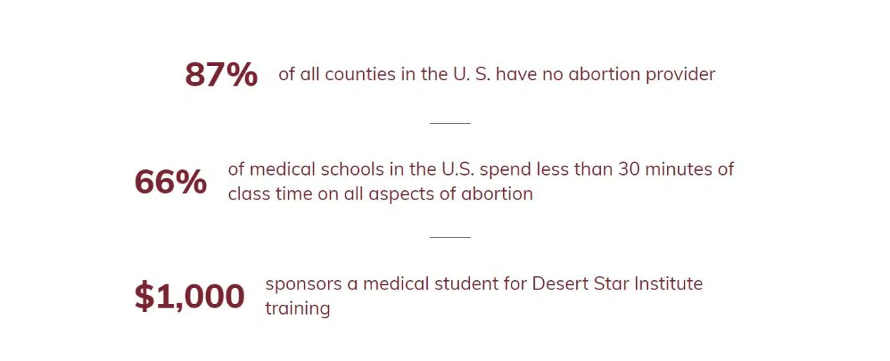
In our recipe for effective homepage content, we recommend using impact numbers on the homepage to give visitors a quick way to assess a nonprofit’s credibility. Depending on the data you have available, you could tell a story in numbers about the need for your programs and donations, as we see with Desert Star Institute for Family Planning.
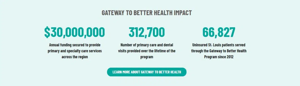
Or you might choose to feature key metrics from a recent report, like the St. Louis Regional Health Commission, with a link to see the full results.
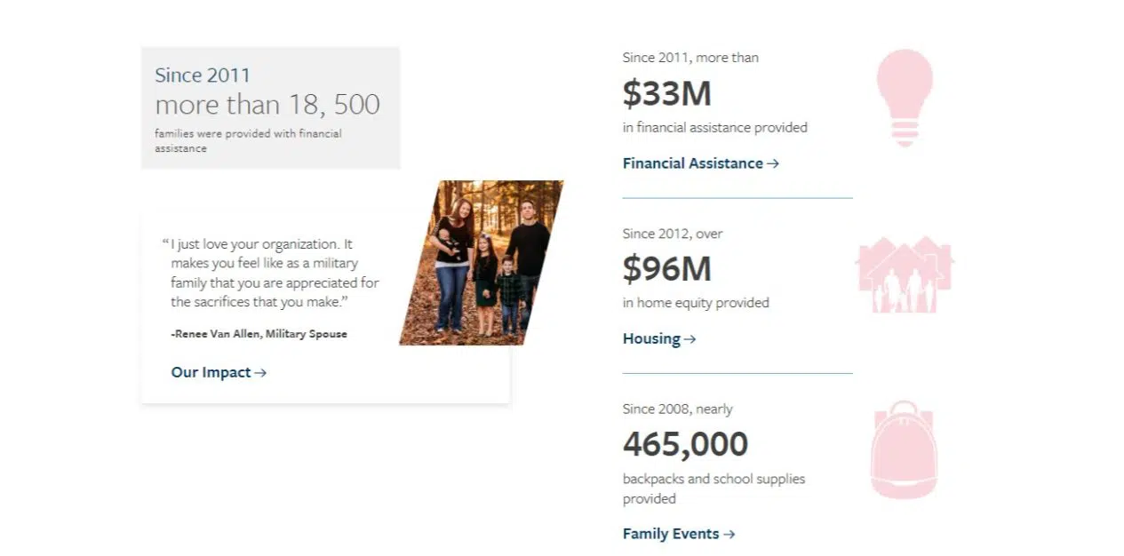
Operation Homefront makes their impact information even more prominent by combining stories and stats.
2. Impact page
Using data on a website’s Impact page seems like a no-brainer, but it’s surprising to see how many organizations don’t do much more than offer a report for download or just offer an infographic without explanation.
As we’ll cover more in the last section of this post, you can reach more people with your impact data if you present it in ways that are accessible and easy to digest.
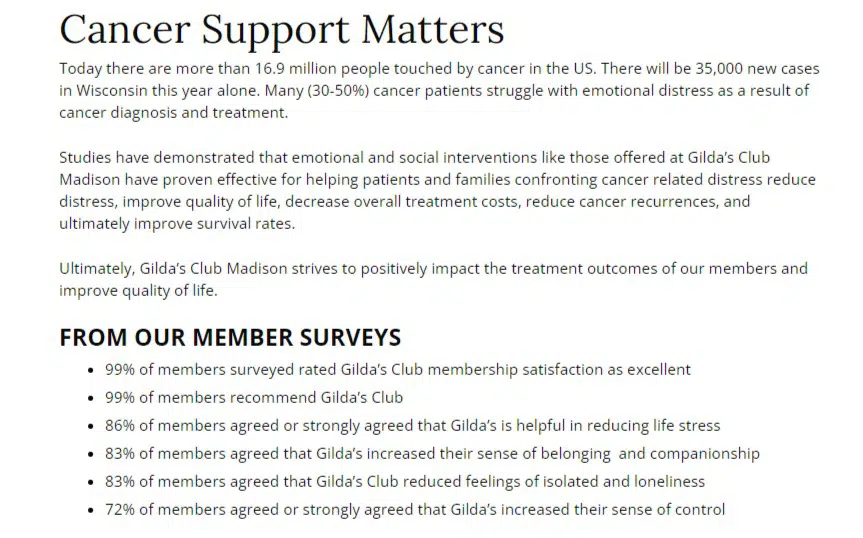
The Gilda’s Club Madison Our Impact page demonstrates how to present survey data from program participants within the larger story of how and why they offer cancer support.
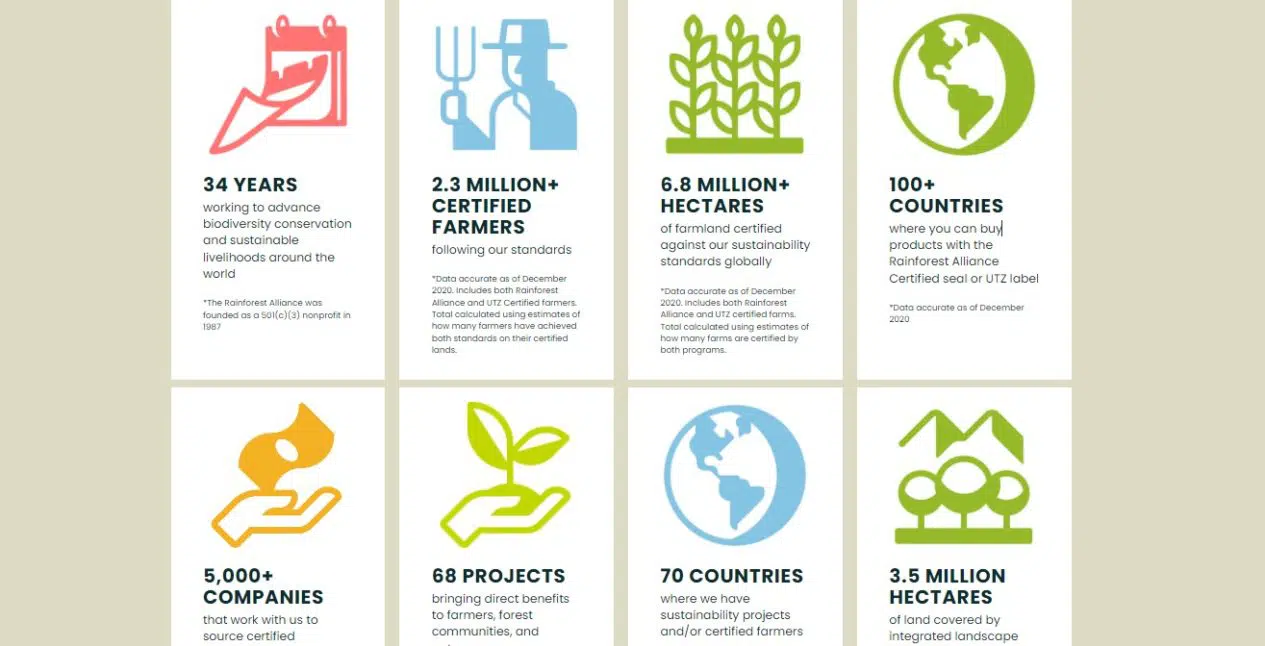
The Rainforest Alliance presents an impact dashboard with supporting content around their approach to measuring their work and reach.
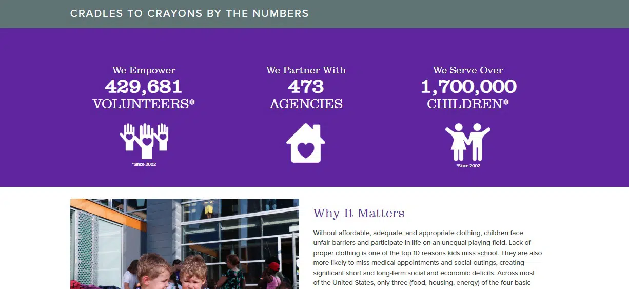
Cradles to Crayons combines background on their model before jumping into numbers and then transitioning into why it matters and taking action.
3. Financials page
A Financials page, much like an Impact page, can easily become a dumping ground of links to downloadable reports and statements. While that’s a practical approach, it’s not particularly inspiring and doesn’t make it easy for visitors to learn what you’re trying to communicate.
Annual reports typically offer visuals like charts that can be reused and added to the page with accompanying captions or explanations. You can also leverage this space to reiterate the “return on investment” of your programs by including non-financial outcomes of your work.
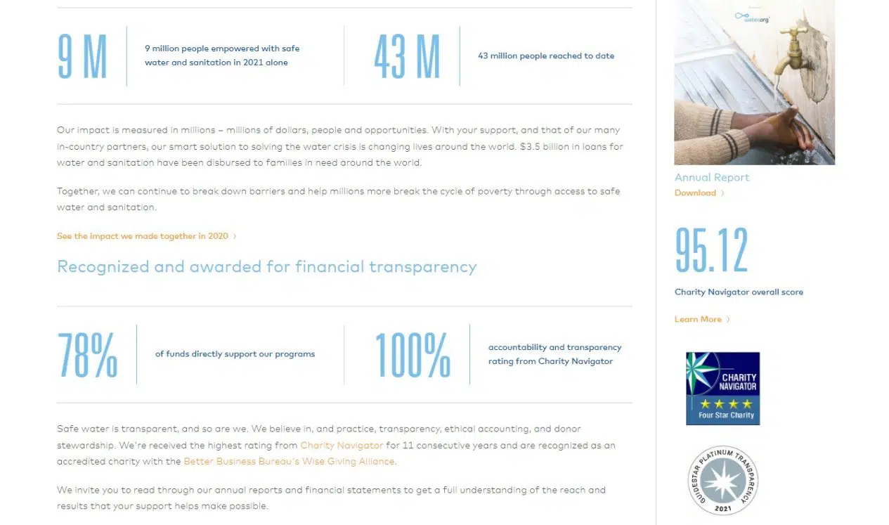
Water.org pairs its documents with quick stats and content about transparency.
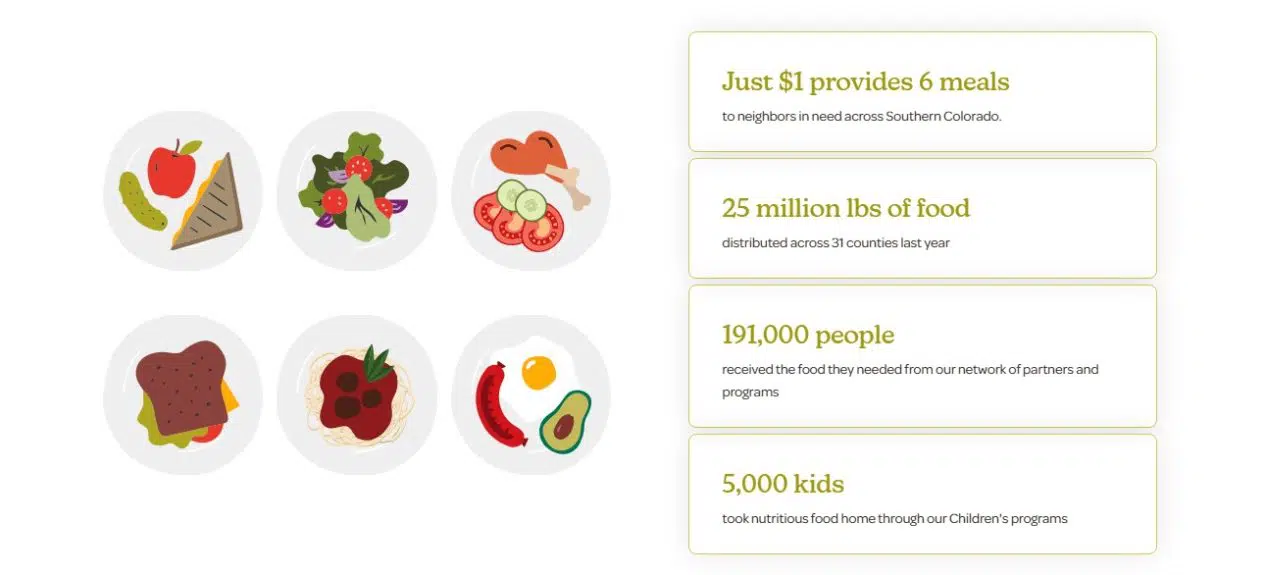
Care and Share Food Bank for Southern Colorado does a nice job speaking to donors with links to their reports and financials along with the results of their programs.
4. Program content
Now that we have the more obvious examples out of the way, how can nonprofits use data in other places on their websites? An easy place to look for opportunities is within web pages that relate to your metric or data point, like program and service pages. Try working your data into these pages contextually to add an extra depth of information, whether you’re talking about how many people you’ve reached or the effectiveness of your approach.
Special Olympics includes data about their program locations as well as outcomes on their Healthy Communities page. Alternatively, VOYCE includes statistics about the need for their Ombudsman Program to help introduce how they can help and why.
5. Advocacy content
Nonprofits that work on policy initiatives know that their impact often comes down to a numbers game: how many supporters you can rally and the number of public officials willing to act to make a change. Make sure to use this data within website content about your advocacy efforts as a way to communicate why the issue is important, encourage new people to get involved, and show the difference you’re making.
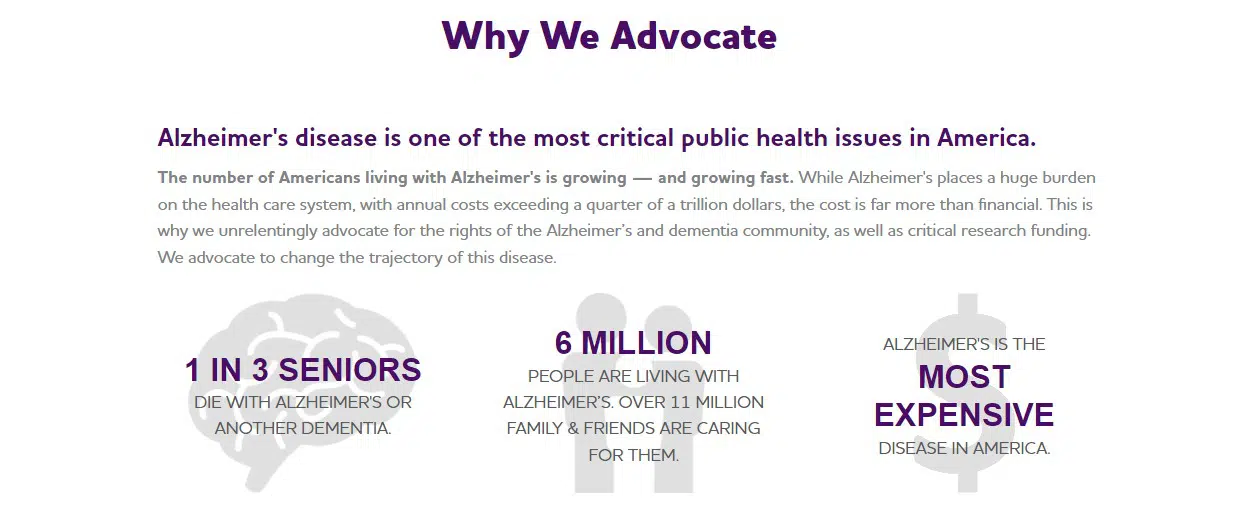
The Alzheimer’s Association uses statistics about the disease to make its case for changing policies at state and federal levels.
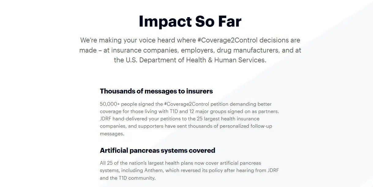
JDRF uses data about participation in their advocacy campaigns to show the collective impact of joining them as an advocate.
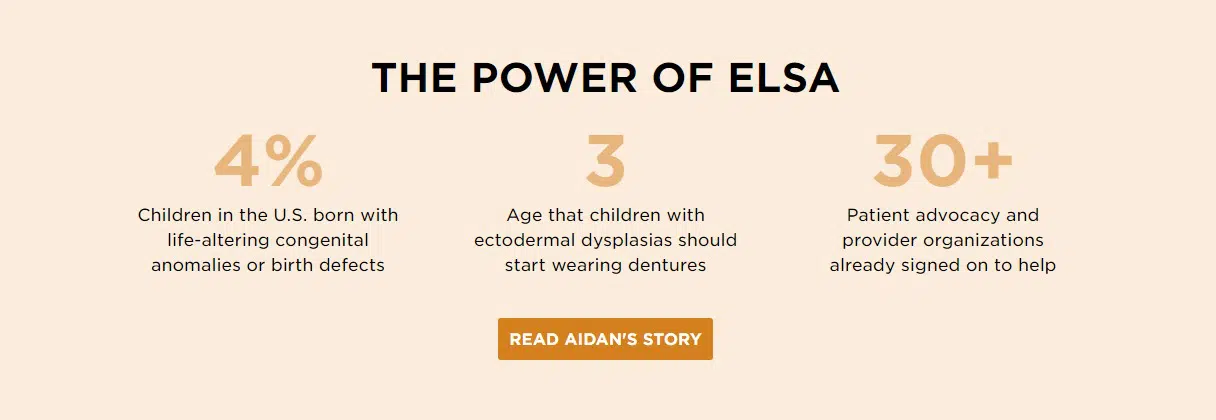
The National Foundation for Ectodermal Dysplasias showcases key numbers about the need for their proposed legislative changes and the support they’ve already received.
6. Blog posts
Blogging offers flexibility when it comes to repurposing data and leveraging it for effective storytelling and thought leadership. You can use a blog post to publish a case story, break down the latest numbers in a report, or even talk about how you measure success as an organization.
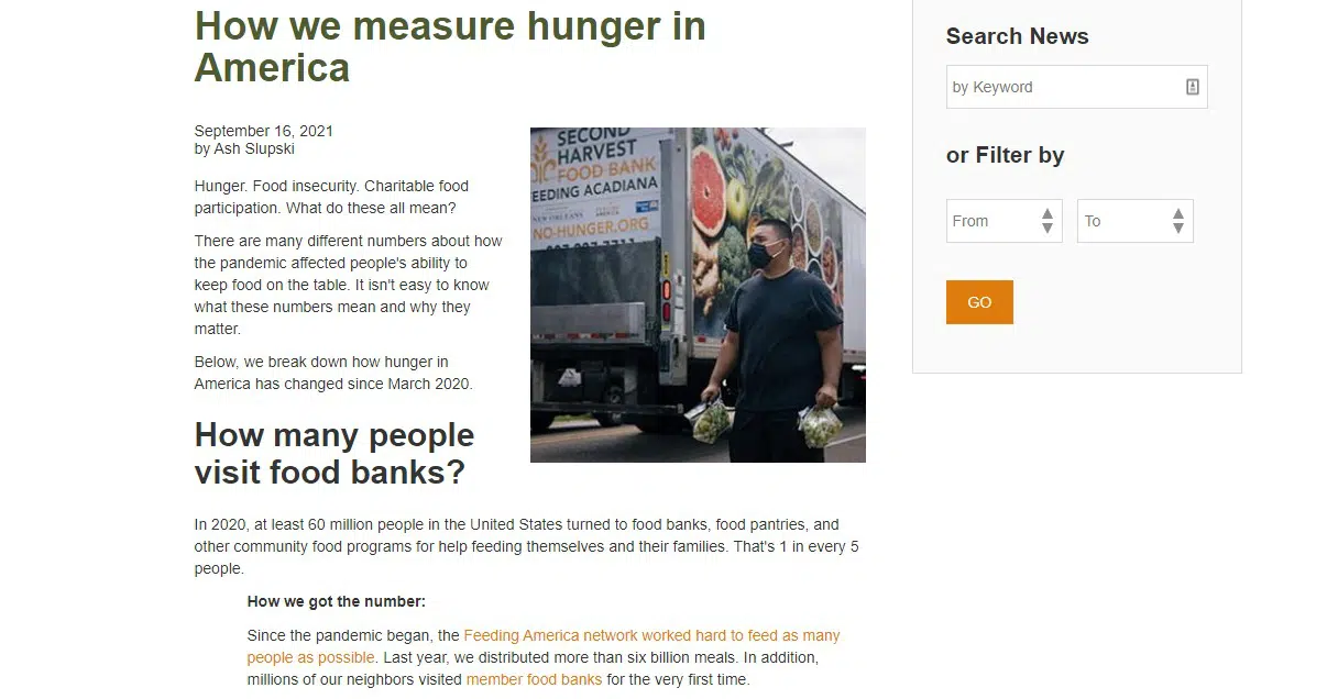
For the latter, Feeding America has blogged about “How We Measure Hunger in America” to talk about the numbers and call on people to get involved.
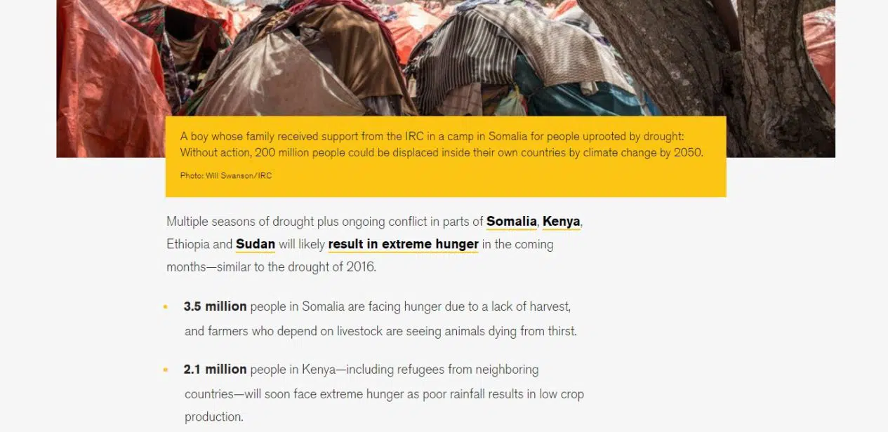
You could also take the approach of the International Rescue Committee and pair data about the problems you’re trying to solve with images to put a face to the numbers.
7. Online maps
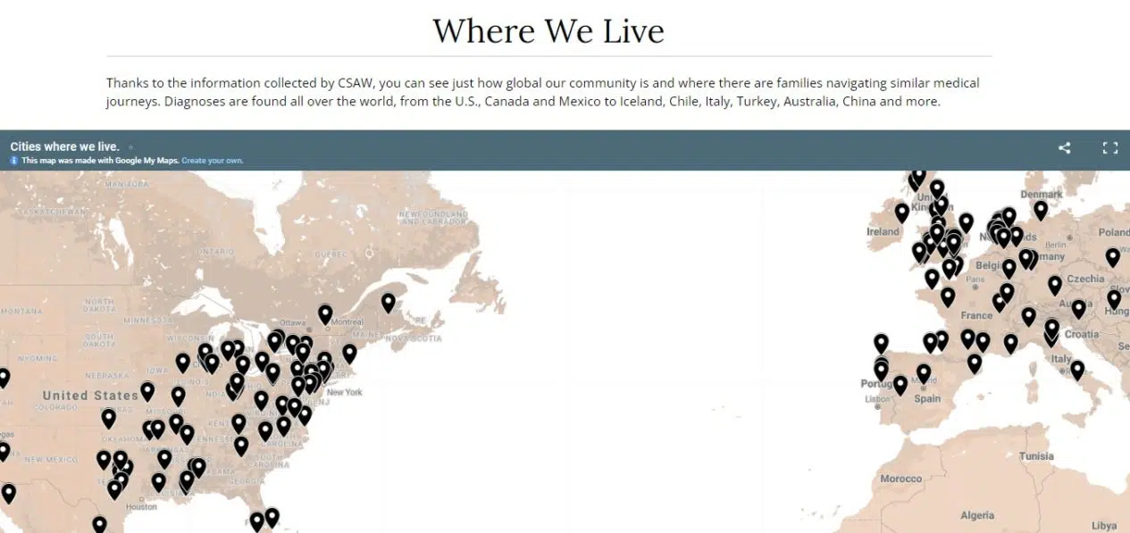
Have geographical data to share? Online maps, especially ones that are interactive, can offer valuable insights into your impact as an organization. We offer tips and examples of using maps in a related post, and another recent example can be found on the Community page of the Advancing CTNNB1 Cures and Treatments site.
The organization uses a map to demonstrate the number and locations of families in their network in addition to content about their impact supporting kids and parents.
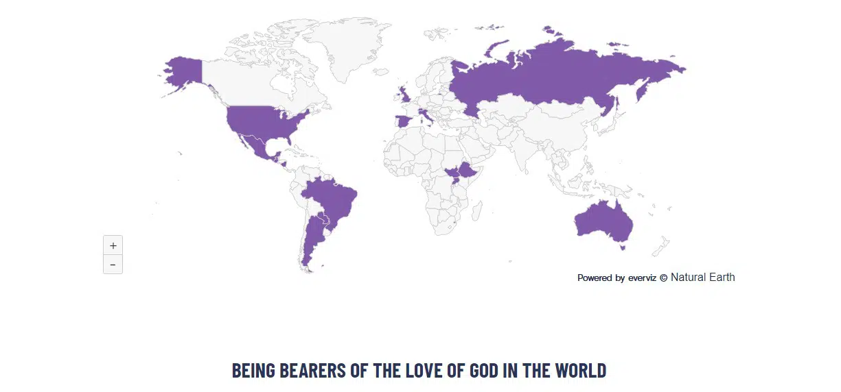
The Missionary Sisters of the Sacred Heart of Jesus takes it a step further with an interactive map of its sponsored ministries around the world, where visitors can click to learn more about the impact of their investments.
8. Fundraising pages
While we recommend keeping your online donation page as streamlined as possible, that doesn’t mean you can’t use data to make your case for donations. This can be as simple as explaining what a specific donation amount means for the services you offer, or reminding a supporter that their gift contributes to a well-defined issue you’re trying to solve.
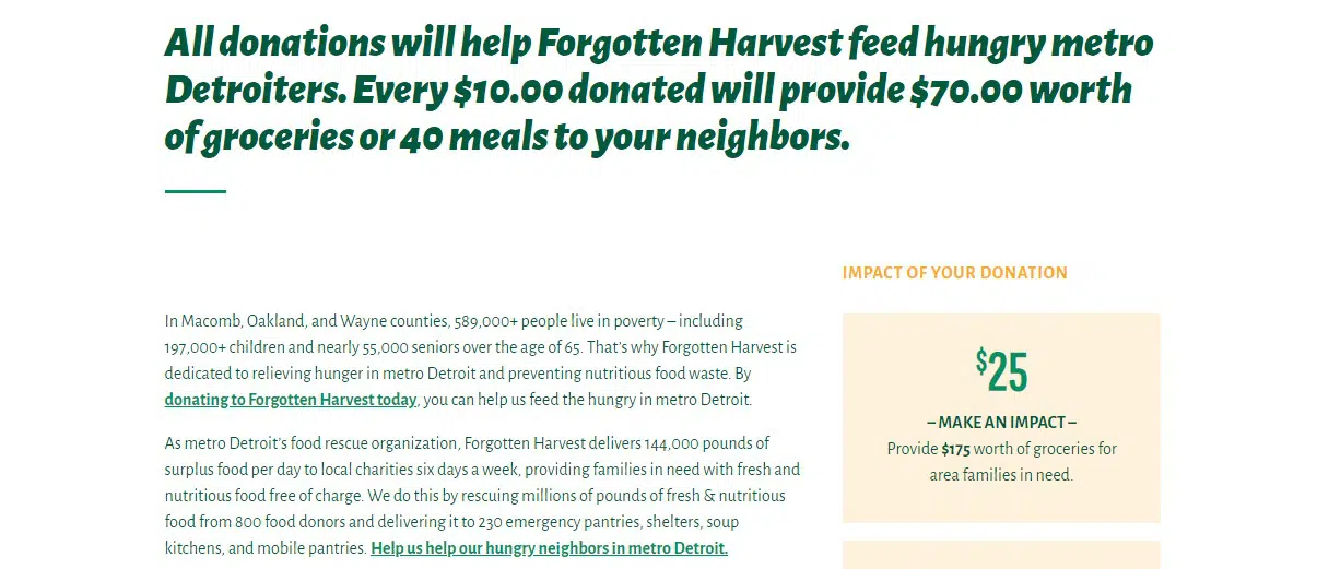
Forgotten Harvest uses data as part of their fundraising narrative to encourage people to give, and they also highlight how different dollar amounts can be leveraged to make even more of an impact through their programs.
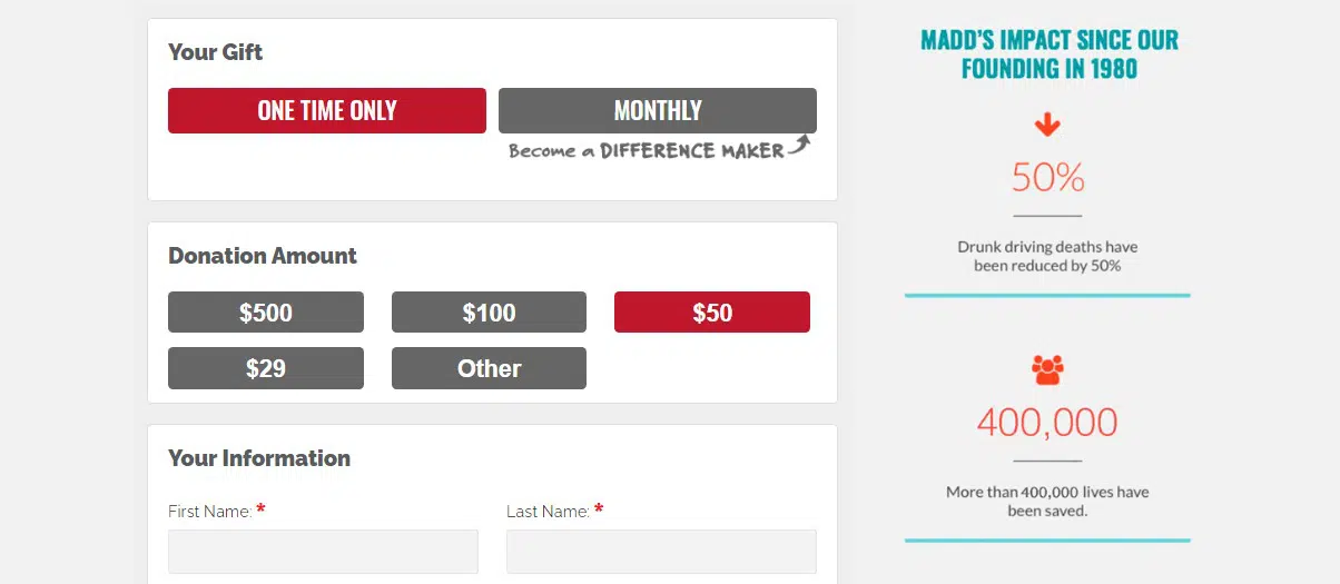
On its Donate page, Mothers Against Drunk Driving uses the sidebar area to include a few extra data points about its impact along with a Guidestar seal to encourage trust.
Sources, Accessibility & Transparency
Ready to work data and statistics into your website? Before you publish, there are a few additional tips and best practices to keep in mind.
- Include references and link directly to sources, like offering a full report to download, which adds to the overall trustworthiness of your data. Aim to be consistent across your site, such as following a specific citation style and link format for each source.
- Use live text when possible to share your data in accessible ways. Only sharing images, PDFs or embedded files locks up the information for visitors who might not be able to view it properly because of visual impairments or lack of language translation.
- Add a layer of transparency by explaining the data collection process. The Rainforest Alliance and Tipping Point shed some light on their approaches to what they measure and why, but your explanations and definitions could be in a simple blog post that’s linked to as needed.
Have you struggled to turn data and statistics about your organization into compelling content? How can nonprofits use data in other ways to meet their marketing, outreach and fundraising goals? If you have ideas or other examples to share, I’d love to hear from you in the comments.
What You Should Do Now
01. Come to Nonprofit Website Office Hours
We cover a new topic every few weeks. Plus get a live answer to any website-related question you're wrestling with.
02. Book a Website Call
Find a time to discuss your nonprofit's website needs. Discover what's worked for other nonprofits like you and see how easy building your new site can be.
03. Start a Free Website Trial
Try our nonprofit website platform for yourself. Instantly get access to every feature to see if it's the right fit for your needs. No credit card required.
Comments