The nonprofit website design world is riddled with terminology and jargon, which can make it feel more daunting than it already does. But it’s not as complicated as it may seem from the outset. Our goal here is to break down the basic web design vocabulary you should be familiar with, in plain English.
Foundational Website Terminology
First, we’ll cover simple website design terms that will help you talk about your site more precisely.
Backend
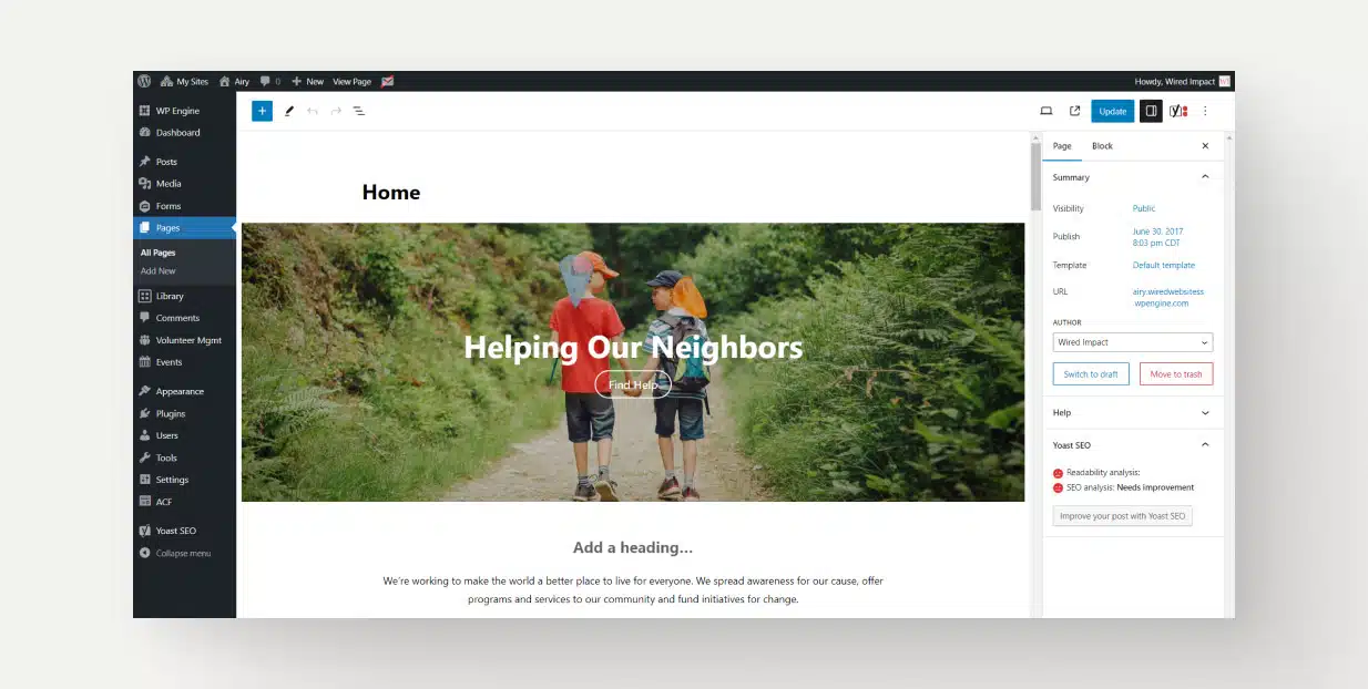
The administrative side of your site. This is what you see when you log in and where you go to make changes.
Frontend
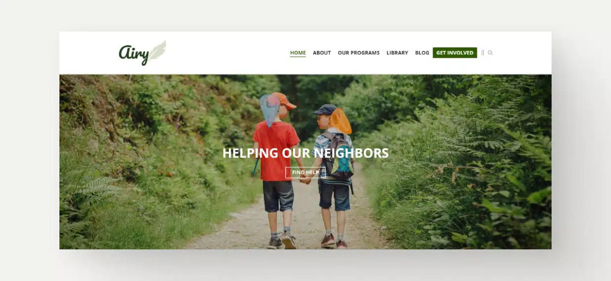
The public-facing side of your site. This is what your visitors see when they visit your site.
Responsive Design
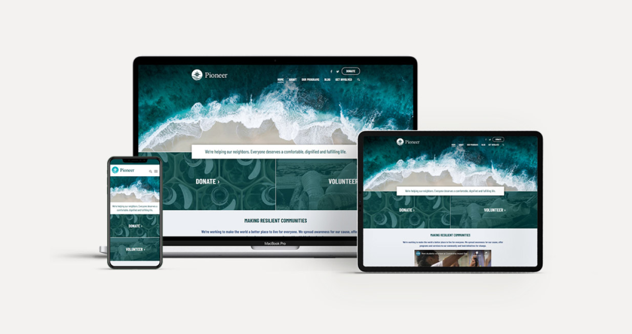
Responsive design is a way of creating websites so that they look good and work well on any device—whether it’s a smartphone, tablet, laptop, or desktop computer. It means that the layout of the site automatically adjusts based on the size of the screen it’s viewed on.
Accessibility

Accessibility means making websites, apps, and digital content usable by everyone, including people with disabilities. It ensures that people with visual, hearing, mobility or cognitive challenges can access, understand, and interact with digital tools or content, even if they’re using assistive devices to help them as they navigate.
Website Layout and Structure Terms
This section covers key terms related to the website’s anatomy and the relationships between different kinds of pages.
Homepage
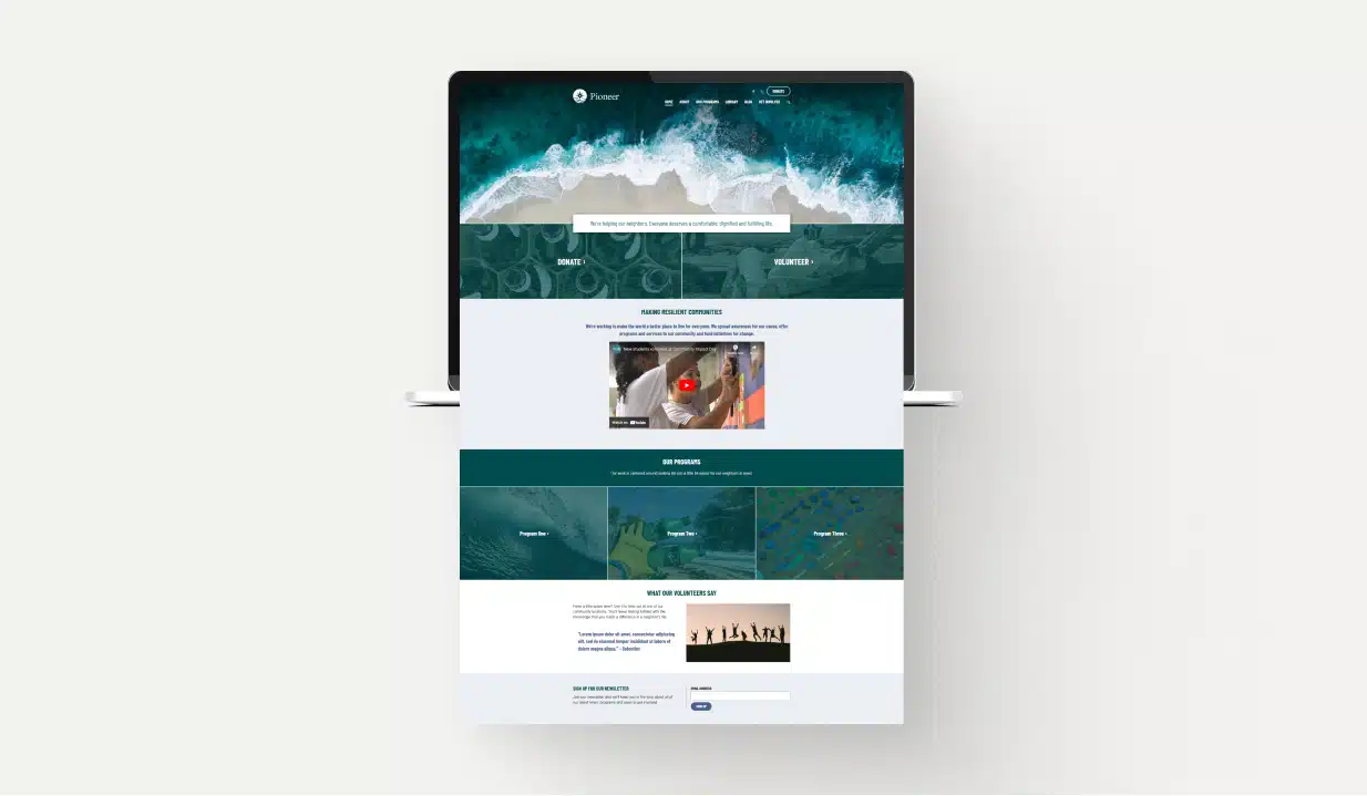
A homepage is essentially the cover of your website. It’s usually the most unique page on your site, giving visitors an immediate sense of who you are as an organization. A homepage also guides them to other important information throughout the internal pages of your website. Learn more about nonprofit website homepages.
Hero Section
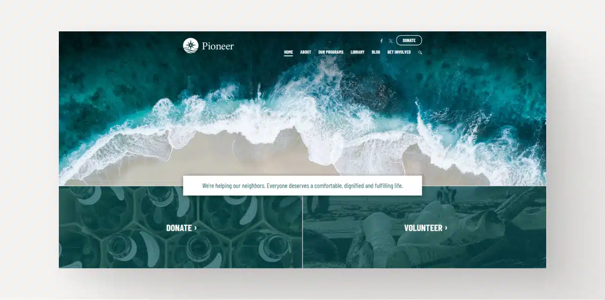
A Hero Section is the main area at the top of your website’s homepage. It’s the first thing visitors see when they arrive, and it usually includes an image, a heading, and sometimes a call-to-action button (like “Donate” or “Volunteer”). It gives visitors a quick sense of what the website is about, helping them feel confident they’re in the right place and encouraging them to explore further.
Parent, Child and Grandchild Pages

Using family terminology can help describe the relationships of pages to one another. Let’s use three pages as an example: Get Involved >> Volunteer Opportunities >> One-Time Opportunities.
- Parent Page: A parent page has other subpages nested beneath it. It represents a broader topic, with the subpages (or child pages) providing more detailed information.
“Get Involved” is the parent page of “Volunteer Opportunities”. - Child Page: A child page is a more specific subpage that lives under a parent page. It breaks down a part of the parent page’s broader topic and gives more detailed or focused information.
“Volunteer Opportunities” is the child page of “Get Involved”. - Grandchild Page: A grandchild page sits two levels below a higher-level page (its “grandparent”).
“One-Time Opportunities” is the grandchild page of “Get Involved”.
Header

A website header is located at the top of each page of the website. The header typically looks the same from page to page and contains an organization’s logo as well as the Primary and Secondary navigation menus, creating a central hub to get around the website. It may also be referred to as “Top Navigation Bar”, “Top Menu”, “Navigation Menu”, and similar variations.
Footer
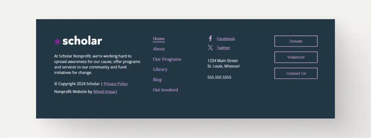
Similar to the header, the footer typically stays the same page to page, but it appears at the very bottom of every single page of the website rather than the top. A footer is generally a very structured section of the site that serves as the last opportunity to get various information to your site visitors.
Some organizations opt to keep this as simple as possible, with only copyright information. Some create large footers, repeating the primary navigation, a call to action or two, and a statement that they are a 501(c)3 to help build credibility. Social media links are another popular item for website footers.
Sidebar
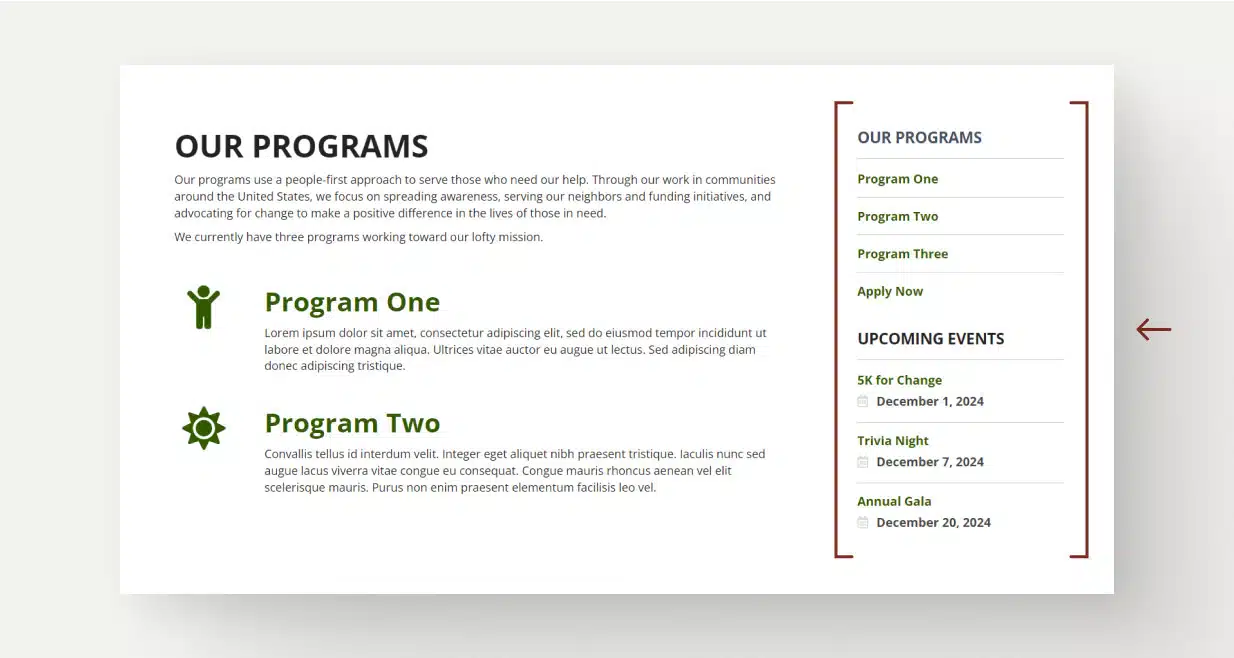
A sidebar can be a very diverse piece of a website and typically appears on a site’s internal pages. A sidebar is used to house important pieces of information that an organization doesn’t want to get lost within the body. It’s vital that this space be used wisely. If it becomes too cluttered, it can be overwhelming to visitors and less effective.
In a sidebar, you may find additional navigation, relevant CTAs, upcoming events, or even additional bits of highlighted content.
Favicon

The favicon is a small icon that appears in the browser tab next to a website’s title. It helps with brand recognition and makes it easy for users to locate your site when multiple tabs are open.
Download the Terminology Infographic
Want a recap of all of this website terminology? Download an infographic that explains all of these key website design terms in an easy-to-understand format.
"*" indicates required fields
Navigation and Menus Vocabulary
Let’s explore different types of menus and navigation terminology that help users find the information they’re looking for.
Primary Navigation

The primary navigation is the main menu that helps visitors find their way around your website. It typically appears at the top of the site (in the header) and contains links that organize your pages into categories or sections, like “About,” “Our Programs” or “Get Involved.” This menu helps users understand how your site is organized, making it easier for them to find the information they’re looking for by providing a clear overview of all the key areas of your website.
Secondary Navigation

The secondary navigation is an additional menu that supports or complements the primary navigation. It can include helpful items for users that you may want to highlight. A lot of times you’ll find action items like Log In, Donate, or Contact Us.
Dropdown Menu

A dropdown menu is a type of navigation menu where additional options “drop down” or expand when you hover over or click on a main menu item. It helps keep the navigation clean and organized by hiding extra links under a broader category.
Mega Menu
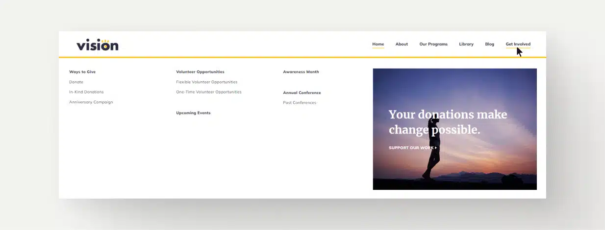
Like a dropdown menu, a mega menu appears when a user rolls over a primary navigation item. But instead of a simple list of child pages, visitors can see a map of all the child and grandchild pages in that section. Mega menus often include additional design elements like icons or a call to action. These types of menus are best for organizations with lots of detailed content to share about their programs and services.
Hamburger Menu

A hamburger menu is often used in mobile screen sizes to save space. It’s a button that has three horizontal lines stacked on top of each other (like a hamburger). When you click or tap it, it opens a larger menu with the navigation options.
Breadcrumb

A breadcrumb is essentially a trail at the top of any given web page that shows a user where that particular page lives within the site structure. For instance, if someone is on a page about a nonprofit’s mission, the breadcrumb at the top might say Home / About / Mission and Vision. It’s an additional (but optional) way to let users understand where they’re at on your site.
User Interaction Elements
In this section, we’ll cover terminology to describe the components that help users take action on your website.
Links

A link is a piece of text, an image, or a button that you can click on to take you to another page or a different part of the same page. Usually, linked text is underlined or a different color, and should have a hover state to indicate their clickability for accessibility purposes.
Search Bar

A search bar allows visitors to type in keywords or phrases to find specific information within the site. When a user types a word or phrase into the search bar and submits it, the website returns a list of relevant pages or content that matches the search term. This functionality is helpful for site visitors who may know exactly what information they’re looking for but don’t want to browse through your navigation.
Hover State

A hover state (also called a “rollover state”) is the slight animation that is triggered when a user rolls their cursor over a link. This helps ensure that site visitors know what they can and cannot click on throughout your site. A hover state can be as simple as a button changing color or as complex as design elements moving or fading in and out.
Call to Action (CTA)

A Call to Action (or “CTA”) is exactly what it sounds like; a visual element asking users to complete an action. Common CTAs for nonprofit websites may invite users to subscribe to your newsletter, donate to your cause, sign up to volunteer or download specific educational materials, just to name a few.
Terminology for Web Design Approaches
We typically see organizations take one of three different paths when building a new website. So let’s dig into that terminology briefly.
For a deeper dive, check out Building a Nonprofit Website: Top 3 Approaches.
DIY Website Builder
The first approach is a DIY or “Do It Yourself” website builder. Think something like Squarespace or Wix here. Now these tools are not built specifically for nonprofits, but they are pretty common for organizations who are just getting started and don’t need something that’s totally tailored for nonprofits.
Custom Nonprofit Website
The second approach is building a custom website. This is building a new nonprofit website from scratch and is an approach that most organizations are familiar with. This could mean working with an agency or a freelancer, but with this approach, generally you’re starting with a blank canvas and can build a new website from the ground up.
This is typically the most expensive approach and will carry the longest timeline.
Nonprofit Website Platform
The final approach here is a nonprofit website platform. This is a newer approach overall. Think of it as website software built specifically for nonprofits.
In full disclosure, this is the approach we take here at Wired Impact these days.
Generally this is a subscription service. So you’re going to pay monthly, but it’s going to include a bunch of the ongoing website costs that typically you would pay for individually if you built a custom website.
Any way you slice it, creating a website can be a daunting task. Choosing a website partner and deciding how you want to portray your organization on the web for all to see is no easy feat.
Hopefully with this list of web design vocabulary, you’ll feel more confident talking with potential website partners as you work together to create something you’re proud to show the world.
Are there additional words or phrases that should be added to our list of website terminology? What terms do you find confusing? Let us know in the comments and we can help out.
What You Should Do Now
01. Come to Nonprofit Website Office Hours
We cover a new topic every few weeks. Plus get a live answer to any website-related question you're wrestling with.
02. Book a Website Call
Find a time to discuss your nonprofit's website needs. Discover what's worked for other nonprofits like you and see how easy building your new site can be.
03. Start a Free Website Trial
Try our nonprofit website platform for yourself. Instantly get access to every feature to see if it's the right fit for your needs. No credit card required.

That’s a nice list of terms. Thanks for your insight.
Thanks for the comment, Scott! I’m glad you found the post helpful.
Love it ! really helped my understanding.
Mia, I’m so glad to hear this was helpful! Thanks so much for leaving a comment!
Alex
Great post, thanks for sharing this useful information. It’s really helpful for me.
Thanks for the feedback, Eleanor! We love hearing when our posts are able to help people out.
Alex
GREAT post very helpful. thanks sooo much.
I’m so glad to hear this was helpful for you! Thanks for the comment, Rose.
great post. please what’s the difference between a drop down and a drill down?
That’s a great question. A drop down menu simply refers to the menu that “drops down” from the parent navigation items to reveal child pages as a user explores a site’s navigation. I believe a drill down menu is technically a type of drop down menu, in which the user clicks or hovers over a drop down menu child page item, and another list of grandchild page options appears. This guide should help explain some of the structure vocabulary (Parent page, child page, etc.) in case that’s helpful for you!
You mention the sidebar but I doin’t see any terms form the main component. What would you call it and how would you describe that? It’s the meat and potatoes of the website after all.
Hi Michael, that’s a great question. You can refer to the larger section with all of your main information as the “page content” or “body content”. This would refer to the chunk of text and imagery that makes up the main portion of each page throughout your site.
Hope this helps!
what we call to a section of landing page which seen on the first impression, like we don’t have to scroll down, like first visible screen?
Hello, Harshit. I believe what you’re referring to is called “above the fold”, an old newspaper term that followed us to the web. It refers to the content on the screen that a visitor can see when they first land on a web page, without scrolling.
This vocabulary list is perfect for beginners!
Thanks Hazel! Glad to hear the vocabulary list came in handy.